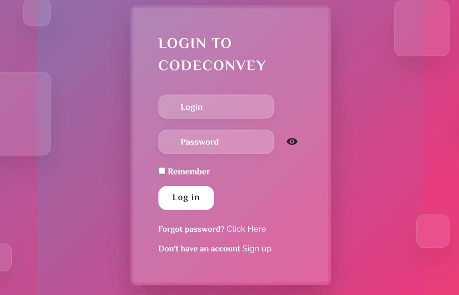
Glassmorphism is a modern web design concept in which the elements are designed in a morphism style with glass effects. There are multiple libraries to make elements morphism, but here we will create a glassmorphism login form using HTML and CSS only. To make this form more attractive, we will add animated boxes.
The HTML Structure
In HTML, create a div element with the class name "box" and place six div elements inside it with a class name "square" for each. We’ll style these div elements as square boxes and animate them.
After that, create a container and place a form element wrapping with a div tag with the class name "form". Similarly, create inputs for username, password, remember me, submit and place a relevant Font Awesome icon just after the input. Wrap each input and icon with a div element and define its class name "inputBox". Ultimately, wrap the box and form container into a section tag as follows:
 <section>
  <div class="box">

    <div class="square" style="--i:0;"></div>
    <div class="square" style="--i:1;"></div>
    <div class="square" style="--i:2;"></div>
    <div class="square" style="--i:3;"></div>
    <div class="square" style="--i:4;"></div>
    <div class="square" style="--i:5;"></div>

   <div class="container">
    <div class="form">
      <h2>LOGIN to CodeConvey</h2>
      <form action="">
        <div class="inputBx">
          <input type="text" required="required">
          <span>Login</span>
          <i class="fas fa-user-circle"></i>
        </div>
        <div class="inputBx password">
          <input id="password-input" type="password" name="password" required="required">
          <span>Password</span>
          <a href="#" class="password-control" onclick="return show_hide_password(this);"></a>
          <i class="fas fa-key"></i>
        </div>
        <label class="remember"><input type="checkbox">
          Remember</label>
        <div class="inputBx">
          <input type="submit" value="Log in" disabled>
        </div>
      </form>
      <p>Forgot password? <a href="#">Click Here</a></p>
      <p>Don't have an account <a href="#">Sign up</a></p>
    </div>
  </div>

  </div>
</section>
Basic CSS Styles
Before styling the Glassmorphism login form, we need to set up basic CSS styles for the body, container, and animated boxes. So, import Google fonts and Font Awesome CSS for icons using the import function. Target each DOM element using * and define 0 value for both margin and padding to quickly reset CSS. Similarly, select the body element and define its background, and set overflow hidden.
@import url("https://fonts.googleapis.com/css2?family=El+Messiri:wght@700&display=swap");
@import url("https://cdnjs.cloudflare.com/ajax/libs/font-awesome/4.7.0/css/font-awesome.min.css");
* {
  margin: 0;
  padding: 0;
  font-family: "El Messiri", sans-serif;
}

body {
  background: #031323;
  overflow: hidden;
}
Now, select the container class and define its relative position along with the 360px width and 380px minimum height. Display it as flex, justify-content to the center, and define the width, min-height, border radius, and box-shadow properties as follows:
.container {
  position: relative;
  padding: 50px;
  width: 360px;
  min-height: 380px;
  display: flex;
  justify-content: center;
  align-items: center;
  background: rgba(255, 255, 255, 0.1);
  backdrop-filter: blur(5px);
  border-radius: 10px;
  box-shadow: 0 25px 45px rgba(0, 0, 0, 0.2);
  margin: 15px auto;
}

.container::after {
  content: "";
  position: absolute;
  top: 5px;
  right: 5px;
  bottom: 5px;
  left: 5px;
  border-radius: 5px;
  pointer-events: none;
  background: linear-gradient(to bottom, rgba(255, 255, 255, 0.1) 0%, rgba(255, 255, 255, 0.1) 2%);
}
The section element is the wrapper for both the login form and the animated box. Define its 100vh min-height, align items to the center and define a linear gradient background.
section {
  display: flex;
  justify-content: center;
  align-items: center;
  min-height: 100vh;
  background: linear-gradient(-45deg, #ee7752, #e73c7e, #23a6d5, #23d5ab);
  background-size: 400% 400%;
  animation: gradient 10s ease infinite;
}
Target the "box" class and define its relative position. Similarly, target the "square" class and define its absolute position along with the background, box shadow, border, animation name, and delay values as described below:
.box {
  position: relative;
}
.box .square {
  position: absolute;
  background: rgba(255, 255, 255, 0.1);
  backdrop-filter: blur(5px);
  box-shadow: 0 25px 45px rgba(0, 0, 0, 0.1);
  border: 1px solid rgba(255, 255, 255, 0.15);
  border-radius: 15px;
  animation: square 10s linear infinite;
  animation-delay: calc(-1s * var(--i));
}
In order to define various box variants, we’ll use CSS nth-child selector to style each square with different dimensions. As we created six div elements with the class name "square" in HTML, now select each one by one and define a random width and top, left, or right position.
.box .square:nth-child(1) {
  width: 100px;
  height: 100px;
  top: -15px;
  right: -45px;
}
.box .square:nth-child(2) {
  width: 150px;
  height: 150px;
  top: 105px;
  left: -125px;
  z-index: 2;
}
.box .square:nth-child(3) {
  width: 60px;
  height: 60px;
  bottom: 85px;
  right: -45px;
  z-index: 2;
}
.box .square:nth-child(4) {
  width: 50px;
  height: 50px;
  bottom: 35px;
  left: -95px;
}
.box .square:nth-child(5) {
  width: 50px;
  height: 50px;
  top: -15px;
  left: -25px;
}
.box .square:nth-child(6) {
  width: 85px;
  height: 85px;
  top: 165px;
  right: -155px;
  z-index: 2;
}
Login Form Glassmorphism CSS Styles
After setup the basic CSS styles, now it’s time to style the login form. So, select the "form" class and define and relative position along with the 100% value of both width and height.
.form {
  position: relative;
  width: 100%;
  height: 100%;
}
Select the h2 element of the form and define color, letter-spacing, and 30px value for the margin-bottom in order to leave some space after the heading.
.form h2 {
  color: #fff;
  letter-spacing: 2px;
  margin-bottom: 30px;
}
The "inputBox" class name has been used for the input wrapper. Define its relative position, 100% width, and 20px margin-bottom to have some gap between each input. Likewise, select the input element and define none value for both outline and border to remove the default outline on the focus event. In the same way, define the border, background, border radius, color, font-size, and box-shadow values as given below:
.form .inputBx {
  position: relative;
  width: 100%;
  margin-bottom: 20px;
}
.form .inputBx input {
  width: 80%;
  outline: none;
  border: none;
  border: 1px solid rgba(255, 255, 255, 0.2);
  background: rgba(255, 255, 255, 0.2);
  padding: 8px 10px;
  padding-left: 40px;
  border-radius: 15px;
  color: #fff;
  font-size: 16px;
  box-shadow: 0 5px 15px rgba(0, 0, 0, 0.05);
}
Now, select "password-control" class to style the password toggle view button. We’ll keep its fixed size and set it to the right of the password input. So, define the 20px value for both width and height, set the absolute position and define 11px and 10px values for top and right property respectively. Set the background URL for the eye icon and specify the 0.5s transition value.
.form .inputBx .password-control {
  position: absolute;
  top: 11px;
  right: 10px;
  display: inline-block;
  width: 20px;
  height: 20px;
  background: url(https://snipp.ru/demo/495/view.svg) 0 0 no-repeat;
  transition: 0.5s;
}
.form .inputBx .view {
  background: url(https://snipp.ru/demo/495/no-view.svg) 0 0 no-repeat;
  transition: 0.5s;
}
.form .inputBx .fas {
  position: absolute;
  top: 13px;
  left: 13px;
}
Select the submit button using input[type=submit] of the inputBox class and define its background, color, max-width, padding, box-shadow, letter-spacing, and transition values. Use the pointer value for the cursor property in order to show hand instead of mouse arrow on hover event.
.form .inputBx input[type=submit] {
  background: #fff;
  color: #111;
  max-width: 100px;
  padding: 8px 10px;
  box-shadow: none;
  letter-spacing: 1px;
  cursor: pointer;
  transition: 1.5s;
}
.form .inputBx input[type=submit]:hover {
  background: linear-gradient(115deg, rgba(0, 0, 0, 0.1), rgba(255, 255, 255, 0.25));
  color: #fff;
  transition: 0.5s;
}
Define the CSS styles for the typography used in the login form. You can set the custom values for the typography in order to customize it.
.form .inputBx input::placeholder {
  color: #fff;
}
.form .inputBx span {
  position: absolute;
  left: 30px;
  padding: 10px;
  display: inline-block;
  color: #fff;
  transition: 0.5s;
  pointer-events: none;
}
.form .inputBx input:focus ~ span,
.form .inputBx input:valid ~ span {
  transform: translateX(-30px) translateY(-25px);
  font-size: 12px;
}
.form p {
  color: #fff;
  font-size: 15px;
  margin-top: 5px;
}
.form p a {
  color: #fff;
}
Select the a:hover element of the paragraph and define its CSS styles as follows:
.form p a:hover {
  background-color: #000;
  background-image: linear-gradient(to right, #434343 0%, black 100%);
  -webkit-background-clip: text;
  -webkit-text-fill-color: transparent;
}
Finally, select the "remember" class and define its relative position, display it as an inline-block and define the white color. Set the 10px value for the margin-bottom to leave some space just after the remember me checkbox.
.remember {
  position: relative;
  display: inline-block;
  color: #fff;
  margin-bottom: 10px;
  cursor: pointer;
}
That’s all! I hope you have successfully created glassmorphism login form using HTML and CSS. If you have any questions or suggestions, feel free to comment below.