A select dropdown is a group of options that allows the users to choose one value from it. Generally, a dropdown select can be created using HTML <select> tag. But unfortunately, it cannot easily style with CSS to customize. However, we can create a custom select dropdown (without the select tag) using CSS only.
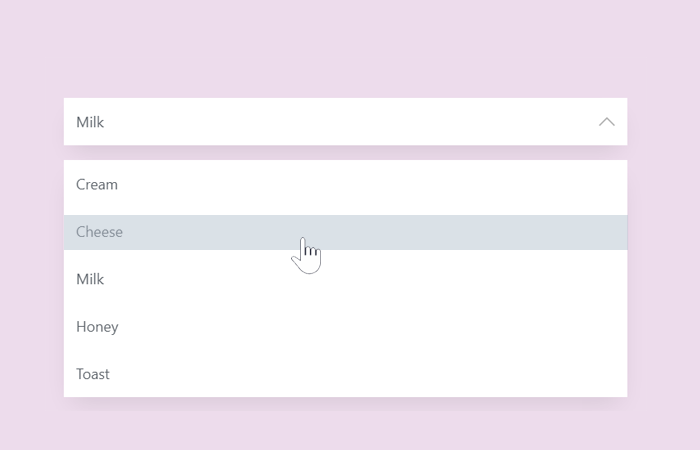
So, in this tutorial, you will come to know how to build a custom select dropdown. Before getting started, I’ll suggest you check the demo page to see the final output of this select dropdown.
As you have seen on the demo page, the output is quite similar to the native HTML select dropdown. The difference is that it can be highly customized with CSS according to your project theme. Although it is built with a custom markup structure, the selected value store in a radio input to use in JavaScript. So, there is nothing to worry about selected values to work in JS functions.
HTML Structure for Custom Select Dropdown
In the HTML, we’ll create a div element with the class name “select-box” and another child div to display the selected value. Inside it, we’ll create radio input with a unique id and select box input text. After these elements, we’ll build a ul list for dropdown and place labels (for radio inputs) in it. So, the complete HTML for custom select dropdown is as follows:
<div class="select-box">
  <div class="select-box__current" tabindex="1">
    <div class="select-box__value">
      <input class="select-box__input" type="radio" id="0" value="1" name="Ben" checked="checked"/>
      <p class="select-box__input-text">Cream</p>
    </div>
    <div class="select-box__value">
      <input class="select-box__input" type="radio" id="1" value="2" name="Ben" checked="checked"/>
      <p class="select-box__input-text">Cheese</p>
    </div>
    <div class="select-box__value">
      <input class="select-box__input" type="radio" id="2" value="3" name="Ben" checked="checked"/>
      <p class="select-box__input-text">Milk</p>
    </div>
    <div class="select-box__value">
      <input class="select-box__input" type="radio" id="3" value="4" name="Ben" checked="checked"/>
      <p class="select-box__input-text">Honey</p>
    </div>
    <div class="select-box__value">
      <input class="select-box__input" type="radio" id="4" value="5" name="Ben" checked="checked"/>
      <p class="select-box__input-text">Toast</p>
    </div><img class="select-box__icon" src="https://cdn.onlinewebfonts.com/svg/img_295694.svg" alt="Arrow Icon" aria-hidden="true"/>
  </div>
  <ul class="select-box__list">
    <li>
      <label class="select-box__option" for="0" aria-hidden="aria-hidden">Cream</label>
    </li>
    <li>
      <label class="select-box__option" for="1" aria-hidden="aria-hidden">Cheese</label>
    </li>
    <li>
      <label class="select-box__option" for="2" aria-hidden="aria-hidden">Milk</label>
    </li>
    <li>
      <label class="select-box__option" for="3" aria-hidden="aria-hidden">Honey</label>
    </li>
    <li>
      <label class="select-box__option" for="4" aria-hidden="aria-hidden">Toast</label>
    </li>
  </ul>
</div>
If you want to add more options in your select dropdown, just follow the above markup structure to do so.
The CSS Styles
Now its time to convert raw HTML into a stylish custom select dropdown. So, first of all, define the basic style for select box (outer/wrapper) just like below. In order to make it responsive, we used the CSS media queries and defined suitable width value on various screen sizes.
.select-box {
  position: relative;
  display: block;
  width: 100%;
  margin: 0 auto;
  font-family: 'Open Sans', 'Helvetica Neue', 'Segoe UI', 'Calibri', 'Arial', sans-serif;
  font-size: 18px;
  color: #60666d;
}
@media (min-width: 768px) {
  .select-box {
    width: 70%;
  }
}
@media (min-width: 992px) {
  .select-box {
    width: 50%;
  }
}
@media (min-width: 1200px) {
  .select-box {
    width: 30%;
  }
}
Now, set styles for the selected items. If you want to customize it, you can add more CSS properties to these selectors.
.select-box__current {
  position: relative;
  box-shadow: 0 15px 30px -10px rgba(0, 0, 0, 0.1);
  cursor: pointer;
  outline: none;
}
.select-box__current:focus + .select-box__list {
  opacity: 1;
  -webkit-animation-name: none;
          animation-name: none;
}
.select-box__current:focus + .select-box__list .select-box__option {
  cursor: pointer;
}
.select-box__current:focus .select-box__icon {
  -webkit-transform: translateY(-50%) rotate(180deg);
          transform: translateY(-50%) rotate(180deg);
}
After that, add the styles for the select box down arrow icon. If you want to change its size, simply set the custom value for the width attribute. Similarly, you can also change its position and opacity.
.select-box__icon {
  position: absolute;
  top: 50%;
  right: 15px;
  -webkit-transform: translateY(-50%);
          transform: translateY(-50%);
  width: 20px;
  opacity: 0.3;
  -webkit-transition: 0.2s ease;
  transition: 0.2s ease;
}
Likewise, define CSS styles for select box input and value.
.select-box__value {
  display: -webkit-box;
  display: flex;
}
.select-box__input {
  display: none;
}
.select-box__input:checked + .select-box__input-text {
  display: block;
}
.select-box__input-text {
  display: none;
  width: 100%;
  margin: 0;
  padding: 15px;
  background-color: #fff;
}
Finally, add the following CSS snippet for select box options list styles. If you want to customize this dropdown list, you can change its background color, text color, box-shadow, and padding attribute by setting the custom values. The other attributes are necessary to functionalize the dropdown list, so don’t update them.
.select-box__list {
  position: absolute;
  width: 100%;
  padding: 0;
  list-style: none;
  opacity: 0;
  -webkit-animation-name: HideList;
          animation-name: HideList;
  -webkit-animation-duration: 0.5s;
          animation-duration: 0.5s;
  -webkit-animation-delay: 0.5s;
          animation-delay: 0.5s;
  -webkit-animation-fill-mode: forwards;
          animation-fill-mode: forwards;
  -webkit-animation-timing-function: step-start;
          animation-timing-function: step-start;
  box-shadow: 0 15px 30px -10px rgba(0, 0, 0, 0.1);
}
.select-box__option {
  display: block;
  padding: 15px;
  background-color: #fff;
}
.select-box__option:hover, .select-box__option:focus {
  color: #fff;
  background-color: #546c84;
}

@-webkit-keyframes HideList {
  from {
    -webkit-transform: scaleY(1);
            transform: scaleY(1);
  }
  to {
    -webkit-transform: scaleY(0);
            transform: scaleY(0);
  }
}

@keyframes HideList {
  from {
    -webkit-transform: scaleY(1);
            transform: scaleY(1);
  }
  to {
    -webkit-transform: scaleY(0);
            transform: scaleY(0);
  }
}
That’s all! I hope you like this CSS only custom select dropdown. If you have any questions or suggestions let me know by comments.