In this article, I’ll explain that how to build a CSS3 based animated navigation. On the other hand, I’ll show you four different colorful navigation with slideout hover effect.
Building awesome navigation for any website is most important. Because it’s the first thing the user take a look when they land on your website.
You can create the main menu of your site in many different away. There are many types of navigation bar we can create for a website which include simple, responsive, fullwidth and so on…..
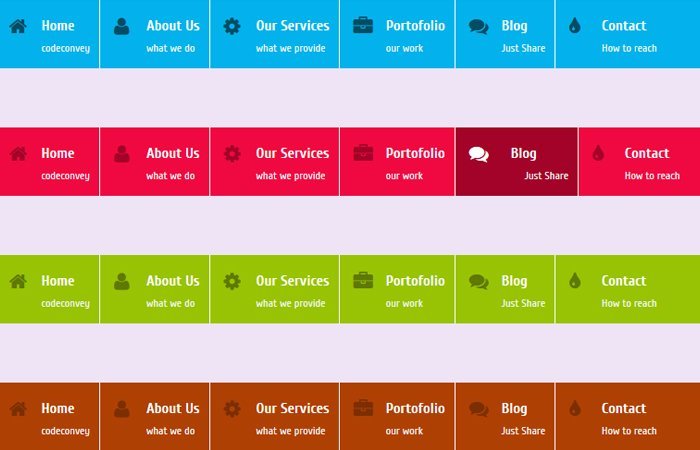
Each menu item on navigation will have the ability to add an icon and description of the menu item. This way you can tell the user more about the menu item.
For example, A menu item “About Us” also have few lines of description “What we do”
Such navigation preferable use for the dashboard area of a site where users can access some specific features of the site.
The navigation with CSS3 slide hovers effect has been kind of interesting to work and enhanced the beauty of the website.
If your site navigation looks good and designs pretty well, Mean it will improve the usability of the site.
Here we will share you one unique way to create such navigation with slide out animation on hover effect by using pure css3.
We will not only show you a unique slide-out transition but also show you how you can create icon style CSS3 Navigation Menus.
In the demo, You will find four different color scheme. You can pick anyone which is best for your website. Although, you can easily change the color of navigation by editing fa ew lines of CSS code in the stylesheet.
These hover effect work on all major browser and very lightweight because we don’t use any kind of jQuery or JavaScript.
It behaves just like any jQuery effects but they used just HTML5 & CSS3. The SlideOut effect used the CSS3 transition property and we set it’s valued all 0.5s ease-in-out to achieve the slide-out effect.
Let’s Start Building CSS3 Navigation with Slideout Effect
Each of navigation color style contains in the section which class can be ccblue, cured, green, cssbron
It depend on what color you want to use for the website. For Each set of navigation bar, We have created a div element class mainmenu.
Inside DIV we have placed the ul and then li.
<section class="ccblue"> <div class="mainmenu"> <ul> <li><i class="icon-home icon-large"></i> <main>Home</main><span>codeconvey</span></li> <li><i class="icon-user icon-large"></i> <main>About Us</main><span>what we do</span></li> <li><i class="icon-gear icon-large"></i> <main>Our Services</main><span>what we provide</span></li> <li><i class="icon-briefcase icon-large"></i> <main>Portofolio</main><span>our work</span></li> <li><i class="icon-comments icon-large"></i> <main>Blog</main><span>Just Share</span></li> <li><i class="icon-tint icon-large"></i> <main>Contact</main><span>How to reach</span></li> </ul> </div> </section>
The Style
In our stylesheet, We have defined .mainmenu and all other elements which are inside the div. Like we define the style for ul, li, mainmenu class and span tag.
These all styles are basic like setting margin, padding, and color etc. Let’s take a look at how we did that.
.mainmenu { color: #FFFFFF; font-family: 'Cuprum',Georgia,"Times New Roman",Times,Serif; font-size: 16px; height: 57px;}
.mainmenu ul {margin: 0; padding: 0; }
.mainmenu li i { position: absolute; margin-left: -35px; margin-top: 6px;}
.mainmenu li { float: left; display: block; padding: 10px 10px 10px 50px; border-right: 1px solid #ffffff; cursor: pointer; }
.mainmenu li:last-child{ border-right:none;}
.mainmenu li main {font-weight: 700; margin-top: -18px; }
.mainmenu li span { position: relative; float: left; font-size: 12px; color: #f5f7f8; }
Now we will add slide effect on Icon, menu text and menu description so we will add transition element with it’s valued all 0.8s ease-in-out
.mainmenu li, .mainmenu li i, .mainmenu li main, .mainmenu li span {
    -moz-transition: all 0.8s ease-in-out;
    -o-transition: all 0.8s ease-in-out;
    transition: all 0.8s ease-in-out;
    -webkit-transition: all 0.8s ease-in-out;
}
Similar to the above, We will apply the transition effect to all navigation elements (Menu Text/Description/Icon) on hover.
.mainmenu li:hover main {
	margin-left: 10px;
   -moz-transition: all 0.5s ease-in-out;
    -o-transition: all 0.5s ease-in-out;
    transition: all 0.5s ease-in-out;
    -webkit-transition: all 0.5s ease-in-out;
}
.mainmenu li:hover span {
	margin-left: 25px;
    -moz-transition: all 0.5s ease-in-out;
    -o-transition: all 0.5s ease-in-out;
    transition: all 0.5s ease-in-out;
    -webkit-transition: all 0.5s ease-in-out;
}
At the end, We will use the CSS for styling the navigation in different colors. We have separated the CSS of each color so you can edit it easily or can add your own.
Here is the example of blue color navigation CSS.
.ccblue .mainmenu { background: none repeat scroll 0 0 #03B2EC;}
.ccblue .mainmenu li:hover { background: #044c64; }
.ccblue .mainmenu li:hover i {color: #ffffff;}
.ccblue .mainmenu li i { color: #044c64; }
.ccblue .mainmenu li:hover i {color: #ffffff;}
That’s It! You can play with the CSS3 code to customize this animated navigation as you want. You can easily change the color of navigation because we have defined a separate class for each color.