You may have seen typing animation, typing something on various portfolio websites. That’s commonly known as typewriter effect or just text typing animation that can be created using CSS animations. In this tutorial, you will learn how to create multiple lines typing animation using pure CSS.
The example we will create will be similar to HTML Typing Text Effect that we created previous with the help of CSS3 Animation. Before getting started, I recommend you check out the live demo of this typing animation. OK! let’s get started with HTML without going into depth.
The HTML Structure
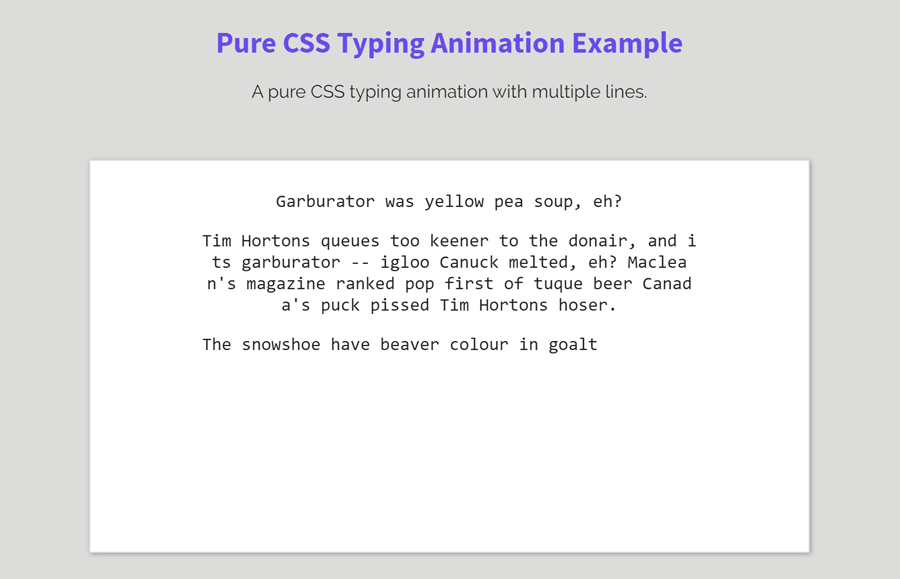
In HTML, create a container (div element) with class name “typewriter”. Place your paragraph with the class name “type” in that container. Basically, the typewriter container is optional, text lines can be placed without it. However, it’s quite useful to design a box or a whiteboard in which letters typing will be displayed.
<div class="typewriter">
   <p class="type">Typing line one.</p>
   <p class="type">This is second line.</p>
   <p class="type">Yet another line.</p>
   <p class="type">So, this is last line to show the multi line typing animation.<p>
</div>
You can place a long paragraph between the p tag with the class name type. Each p tag will be typed (display typing animation) with custom delay. So, you can place multiple lines inside a p tag or define multiple p tags having single lines of text.
The CSS for Typing Animation
First of all, define some basic CSS styles for the “.typewriter” selector. We’ll display it as a white box having a little shadow. However, you can also set custom styles for it according to your needs.
.typewriter{
    background: #fff;
    padding: 10px;
    border: 1px solid #ddd;
    box-shadow: 1px 1px 4px rgba(0, 0, 0, 0.3);
    max-width: 640px;
}
After that, we need four animations for letters, lines, cursor-type, and cursor-wait. So, define the CSS keyframes for these animations just like below code:
@keyframes letters {
  from {
    left: 0;
  }
  to {
    left: 50ch;
  }
}
@keyframes lines {
  from {
    top: 0;
  }
  to {
    top: 100%;
  }
}
@keyframes cursor-type {
  50% {
    border-color: #000;
  }
}
@keyframes cursor-wait {
  0% {
    box-shadow: inset 2px 0 0 0 rgba(0, 0, 0, 0);
  }
  1% {
    box-shadow: inset 2px 0 0 0 black;
  }
  40% {
    box-shadow: inset 2px 0 0 0 black;
  }
}
Now set relative position for the (p that has the class name “type”) paragraphs. Keep its overflow hidden and break the words using CSS word-break property. Here, the other properties like line-height, width, etc are optional. You can set the custom values for these properties according to your choice.
.type {
  position: relative;
  font-family: Consolas, Monaco, monospace;
  width: 50ch;
  line-height: 1.2;
  word-break: break-all;
  overflow: hidden;
}
Add the CSS media supports for typing animations at the 1ch width. Inside the media supports, just define the CSS before and after pseudo selector for the “type” class, add animations name after defining the basic CSS styles mentioned below.
@supports (width: 1ch) {
  .type:before, .type:after {
    box-sizing: border-box;
    content: '';
    position: absolute;
    z-index: 1;
    display: block;
    height: 1.2em;
    width: 100%;
    background-color: #fff;
  }
  .type:before {
    border-left: 2px solid transparent;
    top: 100%;
    animation-name: letters, lines, cursor-type, cursor-wait;
    animation-fill-mode: both, both, both, backwards;
  }
  .type:after {
    content: '';
    height: 100%;
    top: 100%;
    left: 0;
    margin-top: 1.2em;
  }
}
Apply the typing animation for the first line by adding the following CSS code snippet into your project.
.type:before {
  animation-duration: 1.4285714286s, 1.4285714286s, 0.0285714286s, 0.8s;
  animation-timing-function: steps(50, end), steps(1, end), step-end, ease-out;
  animation-iteration-count: 1, 1, 35, 2;
  animation-delay: 1.6s, 1.6s, 1.6s, 0s;
}
.type:after {
  animation: lines 1.4285714286s steps(1, end) 1;
  animation-fill-mode: both;
  animation-delay: 1.6s;
}
Similarly, target the second line by using CSS + (element just after the element) selector.
.type + .type:before {
  animation-duration: 1.4285714286s, 5.7142857143s, 0.0285714286s, 0.8s;
  animation-timing-function: steps(50, end), steps(4, end), step-end, ease-out;
  animation-iteration-count: 4, 1, 181, 2;
  animation-delay: 4.2s, 4.2s, 4.2s, 2.6s;
}
.type + .type:after {
  animation: lines 5.7142857143s steps(4, end) 1;
  animation-fill-mode: both;
  animation-delay: 4.2s;
}
Add the animation for the third line by using the same method mentioned above.
.type + .type + .type:before {
  animation-duration: 1.4285714286s, 4.2857142857s, 0.0285714286s, 0.8s;
  animation-timing-function: steps(50, end), steps(3, end), step-end, ease-out;
  animation-iteration-count: 3, 1, 120, 2;
  animation-delay: 10.9714285714s, 10.9714285714s, 10.9714285714s, 9.3714285714s;
}
.type + .type + .type:after {
  animation: lines 4.2857142857s steps(3, end) 1;
  animation-fill-mode: both;
  animation-delay: 10.9714285714s;
}
If you have more than third lines, you can add another type selector just like below. Likewise, you can set the block of code for 5th, 6th lines, just update the animation-duration and animation-delay.
.type + .type + .type + .type:before {
  animation-duration: 1.4285714286s, 7.1428571429s, 0.0285714286s, 0.8s;
  animation-timing-function: steps(50, end), steps(5, end), step-end, ease-out;
  animation-iteration-count: 5, 1, 215, 2;
  animation-delay: 16s, 16s, 16s, 14.4s;
}
.type + .type + .type + .type:after {
  animation: lines 7.1428571429s steps(5, end) 1;
  animation-fill-mode: both;
  animation-delay: 16s;
}
That’s all! I hope you like this pure CSS multiple lines typing animation. You can comment below if you need further implementation guide.