In this tutorial, we’ll learn how to build a responsive CSS vertical timeline from scratch. First, we’ll create the primary structure of minimum markup and the strength of CSS pseudo-elements.
Then, we’ll use some CSS to feature a few transitional results as we scroll down the page.
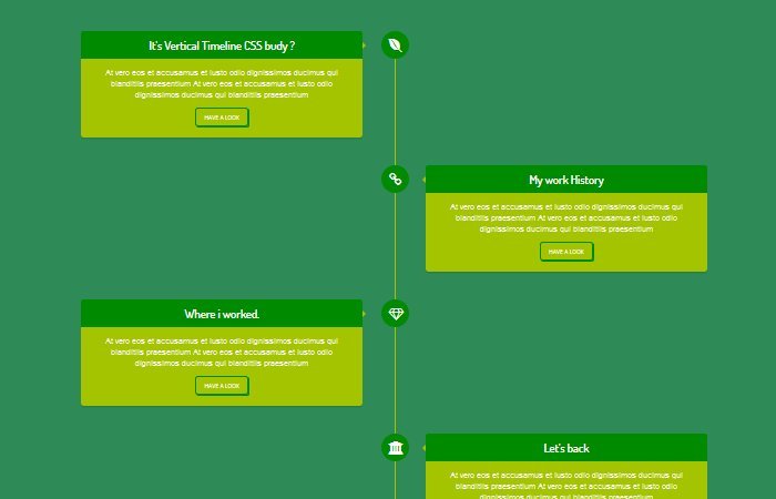
All of us are pretty familiar with Timelines: All instant messaging Applications use them. A contemporary trend in web design is to use a comparable shape, however, to show a manner in preference to a sequence of activities.
That is why timeline-like systems are frequently used for the “how it works” web page.
Build a Vertical Timeline with CSS
The markup we’ll use is quite sincere, we have first div class name .cctimeline that holds all the timeline lists. This list consists of different elements like text, icon, and button. Let’s see how we build it.
<div class="cctimeline-item">
    <div class="cctimeline-icon">
        <i class="fa fa-envira" aria-hidden="true"></i>
    </div>
    <div class="cctimeline-content">
        <h2>How are you budy ?</h2>
        <p>
            At vero eos et accusamus et iusto odio dignissimos ducimus qui blanditiis praesentium At vero eos et accusamus et iusto odio dignissimos ducimus qui blanditiis praesentium
        </p>
        <a href="#" class="btn">Have a Look</a>
    </div>
</div>
You can see that .cctimeline-item is the main div for each timeline and we place some child divs for icon and content.
Here to remember that, if you want to position your timeline to be right then you just need to use class right with timeline-content but if we want it to be left then you don’t need to do anything.
Here is the code for the right timeline.
<div class="cctimeline-item">
    <div class="cctimeline-icon">
        <i class="fa fa-link" aria-hidden="true"></i>
    </div>
    <div class="cctimeline-content right">
        <h2>My work History</h2>
        <p>
           At vero eos et accusamus et iusto odio dignissimos ducimus qui blanditiis praesentium At vero eos et accusamus et iusto odio dignissimos ducimus qui blanditiis praesentium
        </p>
        <a href="#" class="btn">Have a Look</a>
    </div>
</div>
The Styling
In the main container class, we will just make it display table and set the width to 100%.
#cctimeline:after {
  content: "";
  clear: both;
  display: table;
  width: 100%;
}
Before we style the timeline, we first need to use :after and :before element for each timeline item list. Also, we do some margin-bottom with position relative.
#cctimeline .cctimeline-item:after,
#cctimeline .cctimeline-item:before {
  content: '';
  display: block;
  width: 100%;
  clear: both;
}
#cctimeline .cctimeline-item {
  margin-bottom: 50px;
  position: relative;
}
We used a :before selector in an ideal role to create the vertical line. Snapshots/icons are in absolute position too, this way it became fantastic easy to create the responsive structure sincerely using adding a margin-left to the textual content.
#cctimeline {
  width: 100%;
  margin: 30px auto;
  position: relative;
  padding: 0 10px;
  -webkit-transition: all 0.4s ease;
  -moz-transition: all 0.4s ease;
  -ms-transition: all 0.4s ease;
  transition: all 0.4s ease;
}
#cctimeline:before {
  content: "";
  width: 3px;
  height: 100%;
  background: #a4c400;
  left: 50%;
  top: 0;
  position: absolute;
}
Let’s take a look at the CSS for the styling icon and content area of the timeline.
#cctimeline .cctimeline-item .cctimeline-icon {
  background: #008a00;
  width: 50px;
  height: 50px;
  position: absolute;
  top: 0;
  left: 50%;
  overflow: hidden;
  margin-left: -23px;
  -webkit-border-radius: 50%;
  -moz-border-radius: 50%;
  -ms-border-radius: 50%;
  border-radius: 50%;
}
#cctimeline .cctimeline-item i.fa {
 color:#fff;
 font-size:24px;
 padding:13px;
}
#cctimeline .cctimeline-item .cctimeline-content {
  width: 45%;
  background: #a4c400;
  padding: 20px;
  -webkit-box-shadow: 0 3px 0 rgba(0, 0, 0, 0.1);
  -moz-box-shadow: 0 3px 0 rgba(0, 0, 0, 0.1);
  -ms-box-shadow: 0 3px 0 rgba(0, 0, 0, 0.1);
  box-shadow: 0 3px 0 rgba(0, 0, 0, 0.1);
  -webkit-border-radius: 5px;
  -moz-border-radius: 5px;
  -ms-border-radius: 5px;
  border-radius: 5px;
  -webkit-transition: all 0.3s ease;
  -moz-transition: all 0.3s ease;
  -ms-transition: all 0.3s ease;
  transition: all 0.3s ease;
}
#cctimeline .cctimeline-item .cctimeline-content:before {
  content: '';
  position: absolute;
  left: 45%;
  top: 20px;
  width: 0;
  height: 0;
  border-top: 7px solid transparent;
  border-bottom: 7px solid transparent;
  border-left: 7px solid #a4c400;
}
Now we are going to make it right. Here we simply add float right to timeline item and also used :before
#cctimeline .cctimeline-item .cctimeline-content.right {
  float: right;
}
#cctimeline .cctimeline-item .cctimeline-content.right:before {
  content: '';
  right: 45%;
  left: inherit;
  border-left: 0;
  border-right: 7px solid #a4c400;
}
I am hoping you enjoyed the academic, and also you’ll use this CSS Timeline as the premise for constructing something interesting.
You can download the source code for a fully working example. If you have any questions, permit me to understand the feedback below!