Creating a sunset animation using CSS and HTML is a great way to add a dynamic and visually interesting element to your website or web application. The animation can be achieved by using CSS keyframe animations and transitions, along with HTML elements such as divs and spans to create the different parts of the animation.
To create a sunset animation, you will need to create a background that simulates the colors of a sunset, and then use CSS animations to change the background color and position of the sun over time.
Additionally, you may want to use CSS transitions to create the effect of clouds moving across the sky or other elements that help to create the illusion of a sunset.
Overall, creating a sunset animation using CSS and HTML is a relatively simple process that can be accomplished with a basic understanding of HTML and CSS.
How to Create CSS Sunset Animation
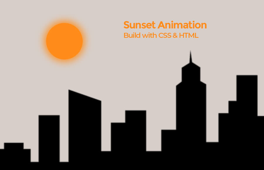
We will create 3 div elements, each with a different class. The first div element with the class “sun” represents the sun in the animation. This div will be used to create the appearance of the sun setting or rising.
The second div element with the class “building”, contains an image element with the source “bg.png”. This div represents the building or any other element that you want to have in the background of your animation.
The last div element with the class “moon” represents the moon in the animation, it will be used to create the appearance of the moon rising or setting.
Together, these elements will make up the basic structure of your sunset animation. In the next step, you will use CSS to position and style these elements on the page, to create the animation of the sunset.
<div class="sun"></div>
<div class="building">
       <img src="bg.png">
</div>
<div class="moon"></div>
Styling & Animation
The first line of CSS applies styles to the body element. It sets the background color to a light blue, removes the margin and overflow, and adds an animation called “sky” that lasts for 5.5 seconds, starting 2 seconds after the page loads. The animation changes the background color of the page to simulate the colors of a sunset, from light blue to yellow, orange, and eventually purple.
body{
background-color: #ccccff;
margin: 0;
overflow: hidden;
animation: sky 5.5s 2s forwards;
line-height: 0;
}
The next set of CSS styles the .sun class element. The .sun class is assigned a height, width, background color, and border-radius of 50% to make it a circle. The position of the element is set to absolute and left: 50% to center the element. The box-shadow adds a soft yellow shadow around the sun. An animation called sunset is applied to the element and it takes 12s and runs forwards.
.sun{
height: 100px;
width: 100px;
background-color: #ff8c1a;
border-radius: 50%;
position: absolute;
left: 50%;
box-shadow: 0px 0px 20px 5px #ff8c1a;
animation: sunset 12s forwards;
}
The next set of CSS styles the .moon class element. The .moon class is assigned a background color, width, height, and border-radius to make it a circle. A box-shadow is added to the element to give it a 3D look. The position of the element is set to absolute, left: 10%, top: 30% to position it on the top left corner of the screen. The opacity is set to 0 to make it invisible and an animation called night is applied to the element which takes 0.8s and runs 7s after the page loads. The animation makes the element visible by increasing its opacity to 1.
.moon{
background-color: #68228b;
width: 100px;
height: 100px;
border-radius: 50%;
box-shadow: -20px 10px white;
position: absolute;
left: 10%;
top: 30%;
opacity: 0;
animation: night 0.8s 7s forwards;
}
The last CSS is for .building class element, it is used to position the image at the bottom of the screen and adjust the width to 100%. The image tag styles the image to fill the width of the parent element and adjust the height automatically.
.building {
position: absolute;
bottom: 0;
width: 100%;
}
img{
width: 100%;
height: auto;
}
Finally, we will create the animation using the keyframes for sky, sunset and night.
@keyframes sky{
50%{
background-color: #ffd700;
}
65%{
background-color: #ffb90f;
}
85%{
background-color: #b39800;
}
100%{
background-color: #68228b;
}

}
@keyframes sunset{
100%{
transform: translateY(750px);
}
}

@keyframes night{
100%{
opacity: 1;
}
}
Conclusion
In conclusion, by using the combination of HTML and CSS, creating a sunset animation can be done easily. The HTML code creates the structure of the animation with different elements, such as the sun, moon and building.
While the CSS code styles and animates these elements to create the illusion of a sunset. The CSS keyframe animations, transitions and other properties like transform and opacity are used to create the animation.