In this tutorial, I am going to create a CSS fixed header with auto height scrolling body content so that the content should be automatically adjusted instead of fixed.
You may know that It is quite easy to create a fixed header using CSS but the issue comes when we need the content area in auto height.
Its simple fixed header but you can also apply some nice animation to make it resizing animated header on scroll to stand out your website navigation and logo part.
We will make the header element stay at the top of the page whether you have more or less content, it does matter. I am not going to add any animation. Also, the header will always visible whether the user scrolls down or not.
I will place some simple content on the header in the position of the logo but you would try out sticky navigation bar on scroll which builds with jQuery and also have a nice animation.
Let’s get started!
We have created a demo with the following files but the demo.css is only for making our demo and you don’t need to add while implementing on your web page.
- Index.html
- Style.css
- demo.css
Now let’s get into the code and start making our header sticky!
Let’s Build Fixed Header Markup
In our index.html file, we have the following code for header. We have a class header-top which will handle the sticky function through CSS.
We did wrap the header logo area with class header-warp . I have added the simple heading text instead of the image but you can replace it if you want.
<header class="header-top dropshadow">
  <div class="header-wrap">
    <div class="header-content align-bottom">
      <h1>Fixed Header <span class="nobr">Design Pattern:</span></h1>
      <h2>Height Specified</h2>
    </div>
    <!-- end .header-content -->
  </div>
  <!-- end .header-wrap -->
</header>
Make Scrolling Body
Now we need to make a content area which will be auto height and work with body scrolling.
<div id="top" class="page-wrap">
  <section class="main">
     content goes here...
    </section>
</div>
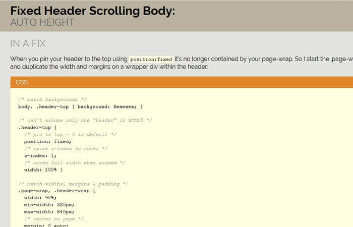
Make Fixed Header with CSS
I have written all the CS in the style.css but here Ii will mention some important class which helps us to make this job done successfully.
First thing, We make overflow-y:scroll and overflow-x: hidden for the HTML element. Set the 100% height for the body so we don’t need to define the fixed height. You can know more about CSS overflow property at W3Schools.
html {
  overflow-y: scroll;
  overflow-x: hidden;
  height: 100%;
  margin: 0;
  padding: 0;
}

body {
  height: 100%;
  margin: 0;
  padding: 0;
}
We will use position: fixed to make the header stay at the top. To raise the header, We use the z-index: 1. The width: 100% is use to covers the full width when zooming the page.
.header-top {
  position: fixed;
  /* raise z-index to cover */
  z-index: 1;

  /* 100% - .header-wrap can be a percentage -
     also covers full width when zoomed */
  width: 100%;
}
To make the header fill the space from left to right and vice versa, I use the position: absolute; with left and right value 10px;
.header-content {
    position: absolute;
    left: 10px;
    right: 10px;
    padding: 10px 2em;
    background: #bab2a0;

}
Styling Scrolling Body
To make the page responsive and work well on mobile devices, we’ll take the help of min-width and max-width. You can give some margin or padding as per your choice.
.page-wrap, .header-wrap, .wrap {
  width: 100%;
  min-width: 320px;
  max-width: 1170px;
  margin: 0 auto;
  padding: 0 10px;
}
We need to add padding-top according to the height of header so the content should not be hidden behind the header.
.page-wrap {
  padding-top: 85px;
}
There are few more style add in the style.css and some are only for demo purpose which you may not need to add. For example figure, h1, h2 and img etc.
Now, let me know (by comment below) if your able to make fixed header & scrolling body by using CSS.