When we talk about creativity in web designing, the very first thing that comes to mind is CSS animation. No doubt, animated elements represent the creative design of a web page. These animations can be fired on different events like scrolling, click, or hover of an element. Draw a rounded border around a circular item is one of such animations that we’re going to create in this CSS animation tutorial.
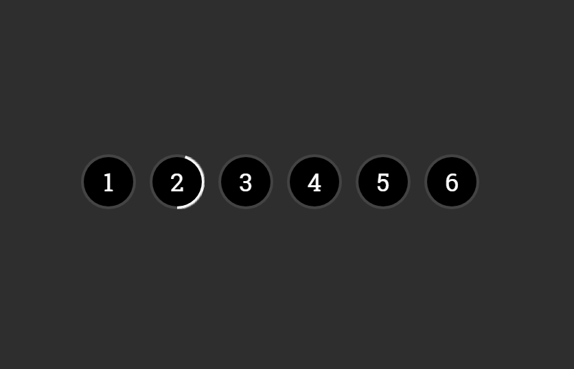
As you have seen on the above image, we’ll create some circular pagination items with numbering. When you hover an element, an animated rounded border will be drawn around the circle. Besides these pagination items, you can apply this animation to any circular item.
The coding for this animation is a little bit tricky than usual CSS keyframes. We need to create some elements programmatically in order to get this animation working. So, we’ll use a jQuery function to create and append some elements to the circular item.
HTML Structure
In HTML, create an unordered list and place anchor links (with a class name "draw-border") in list items.
<ul class="list">
  <li><a class="draw-border" href="#">1</a></li>
  <li><a class="draw-border" href="#">2</a></li>
  <li><a class="draw-border" href="#">3</a></li>
  <li><a class="draw-border" href="#">4</a></li>
  <li><a class="draw-border" href="#">5</a></li>
  <li><a class="draw-border" href="#">6</a></li>
</ul>
CSS Styles to Draw Rounded Border Animation
In CSS, keep the absolute position for the unordered list and setup 50% value for both top and left. Use the CSS transform property to set this list in the middle of the page (optional). Likewise, define the "none" value for CSS list-style-type in ordered to remove the default list bullets. The values for margin and padding can be set according to your needs.
ul.list {
  position: absolute;
  top: 50%;
  left: 50%;
  transform: translate(-50%, -50%);
  margin: 0;
  padding: 0;
  list-style-type: none;
}
Display list items as inline-block and specify the margin value.
ul.list li {
  display: inline-block;
  margin: 0 3px 9px;
}
Now, define some CSS styles for the draw-border class. This is the actual selector that will handle the rounded border animation. Keep its position relative and specify width and height values. Here, the essential property is the overflow that should be hidden. The other CSS properties like font-family, font-size, etc can be defined as your requirements.
ul.list li a.draw-border {
  position: relative;
  display: block;
  width: 40px;
  height: 40px;
  overflow: hidden;
  color: #fff;
  font-family: 'Roboto Slab', serif;
  font-size: 18px;
  text-align: center;
  text-decoration: none;
  line-height: 40px;
}
ul.list li a.draw-border .icon {
  position: relative;
  z-index: 2;
}
After that, define CSS rules for the circle class. We’ll use this class in the span element that will be inserted using jQuery to circular items. Similarly, specify styles for its child span and em elements as described below:
ul.list li a.draw-border .circle:after {
  content: '';
  position: absolute;
  top: 2px;
  left: 2px;
  width: 36px;
  height: 36px;
  border-radius: 100%;
  background: #000;
}
ul.list li a.draw-border .circle span {
  position: absolute;
  width: 50%;
  height: 100%;
  overflow: hidden;
}
ul.list li a.draw-border .circle span em {
  position: absolute;
  border-radius: 999px;
  width: 100%;
  height: 100%;
  background: #fff;
  transition: transform 0.25s linear;
}
Now its time to animate the border, add the following CSS styles for circular border animation.
ul.list li a.draw-border .circle span:first-child {
  left: 0%;
}
ul.list li a.draw-border .circle span:first-child em {
  left: 100%;
  border-top-left-radius: 0;
  border-bottom-left-radius: 0;
  transform-origin: 0% 50%;
}
ul.list li a.draw-border .circle span:last-child {
  left: 50%;
}
ul.list li a.draw-border .circle span:last-child em {
  left: -100%;
  border-top-right-radius: 0;
  border-bottom-right-radius: 0;
  transform-origin: 100% 50%;
  transition-delay: .25s;
}
ul.list li a.draw-border:hover .circle span:first-child em {
  transform: rotate(-180deg);
  transition: transform 0.5s ease-out;
  transition-delay: .25s;
}
ul.list li a.draw-border:hover .circle span:last-child em {
  transform: rotate(-180deg);
  transition: transform .25s linear;
}
The JavaScript
The border drawing JavaScript function depends on the jQuery library. So, load the jQuery and add the following script into your project to get the border animation working.
<!-- jQuery -->
<script src='https://cdnjs.cloudflare.com/ajax/libs/jquery/2.1.3/jquery.min.js'></script>
<script>
// create elements needed for the effect
$('.draw-border').each(function () {
	$(this).html('<span class="icon">' + $(this).html() + '</span><span class="circle"><span><em></em></span><span><em></em></span></span>');
});
</script>
That’s all! I hope you have successfully implemented this border animation. If you have any questions or suggestions let me know by comment below.