CSS Dark Mode: Easy Setup Guide

Implementing a dark mode on your website can significantly improve the user experience, especially for those who spend a lot of time on screens. Dark mode reduces eye strain in low-light conditions and can save battery life on mobile devices. This blog post will guide you through creating a simple dark mode toggle using CSS.

Step1: HTML Structure and Functionality

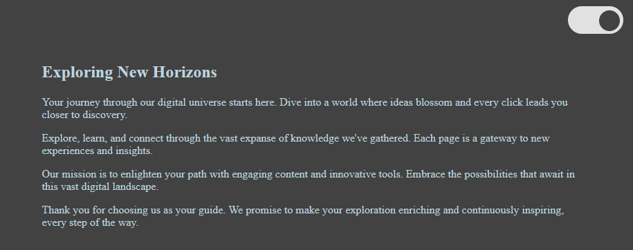
This HTML code contains a checkbox used as a toggle switch for activating dark mode, wrapped in a layout that includes an article with motivational content about discovery and learning in a digital environment. The switch, when toggled, likely triggers a visual theme change on the webpage, enhancing user experience by allowing for a light or dark display.

<input type="checkbox" id="switcher">
<div class="body">
<article>
<h1>Exploring New Horizons</h1>
<p>Your journey through our digital universe starts here. Dive into a world where ideas blossom and every click leads you closer to discovery.</p>
<p>Explore, learn, and connect through the vast expanse of knowledge we've gathered. Each page is a gateway to new experiences and insights.</p>
<p>Our mission is to enlighten your path with engaging content and innovative tools. Embrace the possibilities that await in this vast digital landscape.</p>
<p>Thank you for choosing us as your guide. We promise to make your exploration enriching and continuously inspiring, every step of the way.</p>
</article>
</div>

Step2: CSS Dark Mode Toggle Implementation

This CSS code configures a toggle switch (#switcher) to enable dark mode for a webpage. It uses CSS variables and transitions to change background and text colors dynamically when the toggle is activated, shifting the theme from light to dark, and vice versa.

body {
min-height: 100vh;
margin: 0;
}

article {
padding: 5em;
}

.body {
display: flex;
flex-direction: column;
width: 100%;
height: 100%;
min-height: 100vh;
background: white;
background-color: var(--bg-color, #fff);
color: var(--color, #000);
transition: 250ms;
}

#switcher {
position: absolute;
-webkit-appearance: none;
-moz-appearance: none;
appearance: none;
top: 1rem;
right: 1rem;
width: 4em;
height: 2em;
background-color: var(--color, #000);
border-radius: 2em;
font-size: 20px;
}
#switcher::after {
position: absolute;
top: 0.25em;
left: 0.25em;
width: 1.5em;
height: 1.5em;
content: "";
background-color: var(--bg-color, #fff);
border-radius: 2em;
transform: translateX(var(--translate, 0));
transition: 250ms;
}
#switcher:checked {
--translate: 2em;
--bg-color: #424242;
--color: #ffffffd6;
}
#switcher:checked ~ * {
--bg-color: #424242;
--color: #bcd4df;
}

CSS Dark Mode: Easy Setup Guide Demo


Adding a dark mode toggle to your website doesn’t have to be complicated. With just a few lines of HTML, CSS, and JavaScript, you can offer users a choice that enhances their viewing experience.

You Might Be Interested In:

Ashfaq Ahmed is a freelance WordPress developer and owner of codeconvey.com. I developed modern and highly interactive websites. I always focus on improving my development and design skills.

Leave a Comment