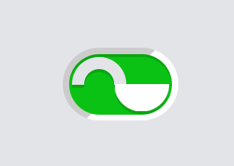
This code defines a detailed, customizable toggle switch styled to resemble a padlock, complete with a 3D handle and keyhole, utilizing CSS variables for easy theme customization and transitions for smooth state changes. The design adapts to both light and dark themes using a media query to adjust colors based on the user’s preference.
* {
border: 0;
box-sizing: border-box;
margin: 0;
padding: 0;
}

:root {
--hue: 223;
--bg: hsl(var(--hue),10%,90%);
--fg: hsl(var(--hue),10%,10%);
--primary: hsl(var(--hue),90%,50%);
--trans-dur: 0.3s;
--trans-timing: cubic-bezier(0.65,0,0.35,1);
font-size: calc(56px + (120 - 56) * (100vw - 280px) / (3840 - 280));
}

body,
input {
font: 1em/1.5 sans-serif;
}

body {
background-color: var(--bg) !important;
color: var(--fg);
display: flex;
height: 100vh;
transition: background-color var(--trans-dur), color var(--trans-dur);
}

.switch {
display: flex;
align-items: center;
margin: auto;
}
.switch, .switch__input {
-webkit-tap-highlight-color: transparent;
}
.switch__handle, .switch__input, .switch__wrapper {
display: block;
}
.switch__handle {
filter: drop-shadow(0 0.0625em rgba(0, 0, 0, 0.15));
pointer-events: none;
top: 0.1875em;
left: 0.1875em;
width: 1.125em;
height: 1.125em;
transform-style: preserve-3d;
perspective: 19.5em;
}
[dir=rtl] .switch__handle {
right: 0.1875em;
left: auto;
}
.switch__handle, .switch__handle-top, .switch__handle-bottom, .switch__handle-side {
position: absolute;
}
.switch__handle-top, .switch__handle-bottom {
border-radius: 50%;
top: 0;
left: 0;
width: 100%;
height: 100%;
}
.switch__handle-top {
box-shadow: 0 0 0 0.25em hsl(var(--hue), 10%, 90%) inset;
clip-path: polygon(0 0, 100% 0, 100% calc(50% + 1px), 0 calc(50% + 1px));
}
.switch__handle-bottom, .switch__handle-side {
background-color: white;
transition: transform var(--trans-dur) var(--trans-timing);
}
.switch__handle-bottom {
clip-path: polygon(0 50%, 100% 50%, 100% 100%, 0 100%);
transform: rotateY(0) translateZ(-0.125em);
transform-origin: calc(100% - 0.125em) 0;
}
[dir=rtl] .switch__handle-bottom {
transform-origin: 0.125em 0;
}
.switch__handle-bottom ~ .switch__handle-bottom {
transform: rotateY(0) translateZ(0.125em);
}
.switch__handle-side {
display: block;
top: 50%;
left: 0.875em;
width: 0.25em;
height: 50%;
transform: rotateY(-90deg) translateZ(0.4375em);
}
[dir=rtl] .switch__handle-side {
right: 0.875em;
left: auto;
transform: rotateY(90deg) translateZ(0.4375em);
}
.switch__input {
background-color: white;
background-image: linear-gradient(-45deg, rgba(0, 0, 0, 0) 49%, rgba(0, 0, 0, 0.2) 50%);
border-radius: 0.75em;
cursor: pointer;
position: relative;
width: 2.375em;
height: 1.5em;
-webkit-appearance: none;
appearance: none;
}
.switch__input, .switch__input:before {
transition: background-color var(--trans-dur);
}
.switch__input:before {
background-color: hsl(var(--hue), 10%, 80%);
border-radius: 0.625em;
box-shadow: 0 0.0625em 0 rgba(0, 0, 0, 0.15) inset;
content: "";
display: block;
position: absolute;
top: 0.125em;
left: 0.125em;
width: 2.125em;
height: 1.25em;
transition-timing-function: var(--trans-timing);
}
.switch__input:checked + .switch__handle .switch__handle-bottom {
transform: rotateY(180deg) translateZ(-0.125em);
}
[dir=rtl] .switch__input:checked + .switch__handle .switch__handle-bottom {
transform: rotateY(-180deg) translateZ(-0.125em);
}
.switch__input:checked + .switch__handle .switch__handle-bottom ~ .switch__handle-bottom {
transform: rotateY(180deg) translateZ(0.125em);
}
[dir=rtl] .switch__input:checked + .switch__handle .switch__handle-bottom ~ .switch__handle-bottom {
transform: rotateY(-180deg) translateZ(0.125em);
}
.switch__input:checked + .switch__handle .switch__handle-bottom:last-child {
backface-visibility: hidden;
}
.switch__input:checked + .switch__handle .switch__handle-side {
transform: rotateY(90deg) translateZ(0.4375em);
}
[dir=rtl] .switch__input:checked + .switch__handle .switch__handle-side {
transform: rotateY(-90deg) translateZ(0.4375em);
}
.switch__input:checked:before {
background-color: #0ac213;
}
.switch__keyhole {
top: 0.625em;
width: 0.1875em;
height: 0.375em;
transition: visibility calc(var(--trans-dur) / 2) steps(1, end);
}
.switch__keyhole, .switch__keyhole:before, .switch__keyhole:after {
position: absolute;
left: 50%;
transform: translateX(-50%);
}
.switch__keyhole:before, .switch__keyhole:after {
background-color: hsl(var(--hue), 10%, 50%);
content: "";
display: block;
}
.switch__keyhole:before {
border-radius: 50%;
width: 0.1875em;
height: 0.1875em;
}
.switch__keyhole:after {
border-radius: 0 0 0.125em 0.125em;
top: auto;
bottom: 0;
width: 0.1em;
height: 0.25em;
}
.switch__input:checked + .switch__handle .switch__keyhole {
visibility: hidden;
}
.switch__label {
overflow: hidden;
margin-inline-start: 0.625em;
position: absolute;
width: 1px;
height: 1px;
}
.switch__wrapper {
position: relative;
}

/* Dark theme */
@media (prefers-color-scheme: dark) {
:root {
--bg: hsl(var(--hue),10%,10%);
--fg: hsl(var(--hue),10%,90%);
}

.switch__input {
background-color: hsl(var(--hue), 10%, 30%);
}
.switch__input:before {
background-color: hsl(var(--hue), 10%, 40%);
}
}
Creating CSS-Based Padlock Toggle Switch Demo
Here we have created a functional and visually appealing padlock toggle switch using CSS. This toggle can enhance the user interface of your web projects by providing a clear and interactive way to represent locked and unlocked states.