Sharing your photos online is a great way to connect with others and showcase your creativity. But static image lists can feel bland. This is where Bootstrap’s image gallery classes come in! With Bootstrap’s grid system and pre-styled components, you can easily build beautiful and responsive image galleries that adapt to any screen size.
In this post, we’ll guide you through the steps to create a basic Bootstrap image gallery, complete with captions, to enhance your website’s visual appeal.
Step 1: Responsive Bootstrap Image Gallery with Captions
This code creates a responsive image gallery using Bootstrap’s grid system and thumbnails. Each image is linked and captioned, providing a visually appealing way to showcase content.
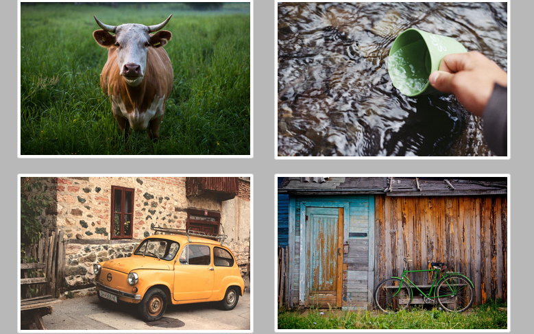
<link rel="stylesheet" href="https://maxcdn.bootstrapcdn.com/bootstrap/3.3.6/css/bootstrap.min.css" integrity="sha384-1q8mTJOASx8j1Au+a5WDVnPi2lkFfwwEAa8hDDdjZlpLegxhjVME1fgjWPGmkzs7" crossorigin="anonymous">
<script src="https://ajax.googleapis.com/ajax/libs/jquery/1.12.4/jquery.min.js"></script>
<script src="https://use.fontawesome.com/8c01f7817d.js"></script>

<!-- wrapper -->
<div class="body">
<div class="container">

<!-- header -->

<header class="main-header">
<i class="fa fa-camera-retro fa-4x logo"></i>
<h1 class="title">Bootstrap and CSS<span>Transitions</span> Gallery<h1>
</header>

<!-- images row one -->

<div class="row">
<a href="https://static.pexels.com/photos/111159/pexels-photo-111159-large.jpeg">
<div class="col-xs-12 col-sm-6 col-md-3">
<div class="thumbnail">
<img src="https://static.pexels.com/photos/111159/pexels-photo-111159-large.jpeg" alt="Green coffee cup and saucer filled with a latte">
<div class="caption">
<h3>Coffee is awesome.</h3>
<p>I really really enjoy a nice cup of joe.</p>
</div>
</div>
</div>
</a>
<a href="https://snap-photos.s3.amazonaws.com/img-thumbs/960w/MIFDXUR2VY.jpg">
<div class="col-xs-12 col-sm-6 col-md-3">
<div class="thumbnail">
<img src="https://snap-photos.s3.amazonaws.com/img-thumbs/960w/MIFDXUR2VY.jpg" alt="Various colored umbrellas drifting into the afternoon sky">
<div class="caption umbrellas">
<h3>Runaway umbrellas.</h3>
<p>Umbrellas keep us dry from rain.</p>
</div>
</div>
</div>
</a>
<a href="https://snap-photos.s3.amazonaws.com/img-thumbs/960w/6UHHE19YG7.jpg">
<div class="col-xs-12 col-sm-6 col-md-3">
<div class="thumbnail">
<img src="https://snap-photos.s3.amazonaws.com/img-thumbs/960w/6UHHE19YG7.jpg" alt="Cup of coffee sitting next to Macbook on desk">
<div class="caption code">
<h3>Code and coffee.</h3>
<p>I'm drinking coffee as I code this.</p>
</div>
</div>
</div>
</a>
<a href="https://snap-photos.s3.amazonaws.com/img-thumbs/960w/KGSTJH2CB7.jpg">
<div class="col-xs-12 col-sm-6 col-md-3">
<div class="thumbnail">
<img src="https://snap-photos.s3.amazonaws.com/img-thumbs/960w/KGSTJH2CB7.jpg" alt="Satellite view of Earth">
<div class="caption canvas">
<h3>NASA.</h3>
<p>Thanks for the photo.</p>
</div>
</div>
</div>
</a>
</div>

<!-- images row two -->

<div class="row">
<a href="https://snap-photos.s3.amazonaws.com/img-thumbs/960w/I042LQ5O8H.jpg">
<div class="col-xs-12 col-sm-6 col-md-3">
<div class="thumbnail">
<img src="https://snap-photos.s3.amazonaws.com/img-thumbs/960w/I042LQ5O8H.jpg" alt="Cow standing in field">
<div class="caption cow">
<h3>Aw yeah.</h3>
<p>This cow is a boss.</p>
</div>
</div>
</div>
</a>
<a href="https://snap-photos.s3.amazonaws.com/img-thumbs/960w/37O88WH3DD.jpg">
<div class="col-xs-12 col-sm-6 col-md-3">
<div class="thumbnail">
<img src="https://snap-photos.s3.amazonaws.com/img-thumbs/960w/37O88WH3DD.jpg" alt="Person using a cup to collect water from river">
<div class="caption beer">
<h3>This looks delicious.</h3>
<p>Really delicious.</p>
</div>
</div>
</div>
</a>
<a href="https://snap-photos.s3.amazonaws.com/img-thumbs/960w/TQ44FVSM3Y.jpg">
<div class="col-xs-12 col-sm-6 col-md-3">
<div class="thumbnail">
<img src="https://snap-photos.s3.amazonaws.com/img-thumbs/960w/TQ44FVSM3Y.jpg" alt="Small Italian coupe">
<div class="caption dog">
<h3>European cars.</h3>
<p>Are much smaller than ours.</p>
</div>
</div>
</div>
</a>
<a href="https://snap-photos.s3.amazonaws.com/img-thumbs/960w/643FE96E84.jpg">
<div class="col-xs-12 col-sm-6 col-md-3">
<div class="thumbnail">
<img src="https://snap-photos.s3.amazonaws.com/img-thumbs/960w/643FE96E84.jpg" alt="Green bicycle resting on old shed">
<div class="caption bike">
<h3>Vintage bikes.</h3>
<p>Are awesome.</p>
</div>
</div>
</div>
</div>
</a>
</div>
</div>
Step 2: Styling for the Image Gallery
This code refines the visual style of the image gallery, incorporating hover effects, custom borders, and media query adjustments for different screen sizes.
.body{
background: #b8b8b8;
}
.main-header {
text-align: center;
margin: 1.5em 0 5em;
padding: 1em;
text-indent: 0;
letter-spacing: 0;
transition-property: text-indent, letter-spacing,;
transition-duration: 0.7s;
transform: scale(1,1);
}
.main-header:hover {
text-indent: .2rem;
letter-spacing: .3rem;
transform: scale(1.3,1.3);
}
.title {
line-height: .2rem;
}
span {
font-weight: 900;
}
.caption {
opacity: 0;
transition-property: opacity, transform;
transition-duration: .8s;
}
.caption:hover {
opacity: 1;
transform: scale(1.2, 1.2);
}
.thumbnail {
position: relative;
}
.thumbnail img {
transition: transform .8s;
transform-origin: 0,0;
}
.thumbnail:hover img {
transform: scale(1.2, 1.2);
overflow: hidden;
}
.caption {
position: absolute;
top: 0;
right: 0;
bottom: 0;
left: 0;
display: flex;
flex-direction: column;
justify-content: center;
align-items: center;
background: rgba(0,0,0, .65);
border: 5px solid #00D180;
}
.umbrellas{
border: 5px solid #FFB037;
}
.code{
border: 5px solid #2E2C2D;
}
.canvas {
border: 5px solid #AD6A3E;
}
.cow {
border: 5px solid #31490B;
}
.beer {
border: 5px solid #792002;
}
.dog{
border: 5px solid #4E68C1;
}
.bike {
border: 5px solid #4DB74F;
}
.caption h3,
.caption p {
color: #fff;
}
#popup {
background: rgba(0, 0, 0, .7);
width: 100%;
height: 100%;
position: absolute;
top: 0;
left:0;
display: none;
}
#popup img {
margin-left: 30%;
margin-top: 5%;
width: 40%;
border: 5px solid #FFF8DC;
border-radius: 5%;
}
#popup p {
text-align: center;
font-size: 1.5rem;
line-height: 3rem;
color: #fff;
}
/* Media Query */
@media (max-width: 768px) {
.main-header {
margin: initial;
}
.main-header:hover {
text-indent: .1rem;
letter-spacing: .1rem;
transform: scale(1.1,1.1);
}
.title {
line-height: initial;
}
.thumbnail:hover img {
transform: scale(1, 1);
}
.caption:hover{
transform: scale(1,1);
}
}
@media (min-width: 769px) and (max-width: 1040px){
.main-header:hover {
text-indent: .1rem;
letter-spacing: .1rem;
transform: scale(1.05,1.05);
}
}
Step 3: Implementing a Popup for Enlarged Image Viewing
This code creates a popup to display enlarged images and captions when a thumbnail is clicked.
class="wp-block-preformatted prettyprint linenums lang-html" dir="ltr">var $popup = $('<div id="popup"></div>');
var $image = $("<img>");
var $caption = $("<p> </p>");
//Append image and caption to popup before we append popup to body
$popup.append($image);
$popup.append($caption);
//Append popup div to html
$("body").append($popup);
// Capture click event on link
$("div a").click(function(event) {
event.preventDefault();
var href = $(this).attr("href");
//Set src as href from link clicked
$image.attr("src", href);
$popup.show();
});
//Get alt text to set caption
var captionText = $("div.thumbnail").find("img").attr("alt");
$caption.text(captionText);
//Hide popup when clicked
$popup.click(function() {
$popup.hide();
});
Creating Bootstrap Thumbnail Gallery with Hover Effects, Popups and Style Demo
With Bootstrap’s foundation and these simple steps, you can create beautiful and responsive image galleries to effectively showcase your photos or products.