Learn how to create circle image hover effects with the help of CSS. With the help of border-radius property, we can easily create circular shapes on any element.
So we will apply that property over the image to make it in circular shapes and then apply effects by using the transition CSS property.
Our goal to set the image as a background and when someone mouse over the thumbnail, it will show animated text over the picture.
We will use a similar technique as we did with creating a simple hover effect with captions text but here is the difference is the image will be in rounded shape instead of rectangular.
HTML for Image Circle
I did try to keep the markup as simple as possible. With the help of the unordered list, we can easily create a clean structure. We have a main class ch-grid and then child elements hold the basic info which includes the heading, text, and link.
<ul class="ch-grid">
<li>
<div class="ch-item ch-img-1">
<div class="ch-info">
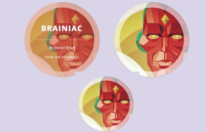
<h3>Brainiac</h3>
<p>by Daniel Nyari <a href="http://drbl.in/eODP">View on Dribbble</a></p>
</div>
</div>
</li>
<li>
<div class="ch-item ch-img-2">
<div class="ch-info">
<h3>Vision</h3>
<p>by Daniel Nyari <a href="http://drbl.in/eNXW">View on Dribbble</a></p>
</div>
</div>
</li>
<li>
<div class="ch-item ch-img-3">
<div class="ch-info">
<h3>Cylon</h3>
<p>by Daniel Nyari <a href="http://drbl.in/eNXY">View on Dribbble</a></p>
</div>
</div>
</li>
</ul>CSS for Image Hover Effects
Now, we’ll code CSS styles for circle image hover effects. The important part is styling the element to make them work. The first thing we need to do basic styling to properly align the unorder list elements.
.ch-grid {
	margin: 20px 0 0 0;
	padding: 0;
	list-style: none;
	display: block;
	text-align: center;
	width: 100%;
}
.ch-grid:after,
.ch-item:before {
	content: '';
    display: table;
}
.ch-grid:after {
	clear: both;
}
.ch-grid li {
	width: 220px;
	height: 220px;
	display: inline-block;
	margin: 20px;
}
After that, we will apply the width and height to 100%. Furthermore, we will use the border-radius property to make the image in a rounded shape.
Also, the transition property helps us to achieve the animation goal. Each image define has a background with a unique class.
.ch-item {
  width: 100%;
  height: 100%;
  border-radius: 50%;
  position: relative;
  cursor: default;
  box-shadow: inset 0 0 0 0 rgba(200, 95, 66, 0.4), inset 0 0 0 16px rgba(255, 255, 255, 0.6), 0 1px 2px rgba(0, 0, 0, 0.1);
  -webkit-transition: all 0.4s ease-in-out;
  -moz-transition: all 0.4s ease-in-out;
  -o-transition: all 0.4s ease-in-out;
  -ms-transition: all 0.4s ease-in-out;
  transition: all 0.4s ease-in-out;
}
.ch-img-1 {
  background-image: url(https://tympanus.net/Tutorials/CircleHoverEffects/images/5.jpg);
}
.ch-img-2 {
  background-image: url(https://tympanus.net/Tutorials/CircleHoverEffects/images/5.jpg);
}
.ch-img-3 {
  background-image: url(https://tympanus.net/Tutorials/CircleHoverEffects/images/5.jpg);
}
In the last part, we need to take care of text which will show when hovering the image. Of course, it should look nice and clean so we will apply a transition to all elements which hold the text.
.ch-info {
  position: absolute;
  width: 100%;
  height: 100%;
  border-radius: 50%;
  opacity: 0;
  -webkit-transition: all 0.4s ease-in-out;
  -moz-transition: all 0.4s ease-in-out;
  -o-transition: all 0.4s ease-in-out;
  -ms-transition: all 0.4s ease-in-out;
  transition: all 0.4s ease-in-out;
  -webkit-transform: scale(0);
  -moz-transform: scale(0);
  -o-transform: scale(0);
  -ms-transform: scale(0);
  transform: scale(0);
  -webkit-backface-visibility: hidden;
}
.ch-info h3 {
  color: #fff;
  text-transform: uppercase;
  position: relative;
  letter-spacing: 2px;
  font-size: 22px;
  margin: 0 30px;
  padding: 65px 0 0 0;
  height: 110px;
  font-family: 'Open Sans', Arial, sans-serif;
  text-shadow: 0 0 1px #fff, 0 1px 2px rgba(0, 0, 0, 0.3);
}
.ch-info p {
  color: #fff;
  padding: 10px 5px;
  font-style: italic;
  margin: 0 30px;
  font-size: 12px;
  border-top: 1px solid rgba(255, 255, 255, 0.5);
}
.ch-info p a {
  display: block;
  color: #fff;
  color: rgba(255, 255, 255, 0.7);
  font-style: normal;
  font-weight: 700;
  text-transform: uppercase;
  font-size: 9px;
  letter-spacing: 1px;
  padding-top: 4px;
  font-family: 'Open Sans', Arial, sans-serif;
}
.ch-info p a:hover {
  color: #fff222;
  color: rgba(255, 242, 34, 0.8);
}
.ch-item:hover {
  box-shadow: inset 0 0 0 110px rgba(200, 95, 66, 0.4), inset 0 0 0 16px rgba(255, 255, 255, 0.8), 0 1px 2px rgba(0, 0, 0, 0.1);
}
.ch-item:hover .ch-info {
  opacity: 1;
  -webkit-transform: scale(1);
  -moz-transform: scale(1);
  -o-transform: scale(1);
  -ms-transform: scale(1);
  transform: scale(1);
}
That’s It. Our effects are ready to implement on production site.