Bootstrap 4 makes creating responsive and visually appealing layouts a breeze. This layout is perfect for displaying collections of items like products, portfolios, or blog posts. It ensures your content is organized, easy to scan, and adapts to different screen sizes.In this post, we’ll walk you through how to set up a list grid view using Bootstrap’s grid system and list group components.
Step1: Bootstrap Grid Layout With HTML
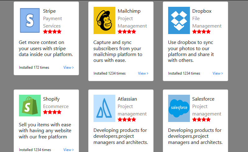
This code displays a grid of cards showcasing different applications. Each card has an image, title, description, star rating, install count, and a view more option. Here is code example
<div class="container mt-5"> <div class="row"> <div class="col-md-4"> <div class="card p-3"> <div class="d-flex flex-row mb-3"><img src="https://i.imgur.com/ccMhxvC.png" width="70"> <div class="d-flex flex-column ml-2"><span>Stripe</span><span class="text-black-50">Payment Services</span><span class="ratings"><i class="fa fa-star"></i><i class="fa fa-star"></i><i class="fa fa-star"></i><i class="fa fa-star"></i></span></div> </div> <h6>Get more context on your users with stripe data inside our platform.</h6> <div class="d-flex justify-content-between install mt-3"><span>Installed 172 times</span><span class="text-primary">View <i class="fa fa-angle-right"></i></span></div> </div> </div> <div class="col-md-4"> <div class="card p-3"> <div class="d-flex flex-row mb-3"><img src="https://i.imgur.com/IpKQiNu.png" width="70"> <div class="d-flex flex-column ml-2"><span>Mailchimp</span><span class="text-black-50">Project Management</span><span class="ratings"><i class="fa fa-star"></i><i class="fa fa-star"></i><i class="fa fa-star"></i><i class="fa fa-star"></i></span></div> </div> <h6>Capture and sync subscribers from your mailchimp platform to ours with ease.</h6> <div class="d-flex justify-content-between install mt-3"><span>Installed 1234 times</span><span class="text-primary">View <i class="fa fa-angle-right"></i></span></div> </div> </div> <div class="col-md-4"> <div class="card p-3"> <div class="d-flex flex-row mb-3"><img src="https://i.imgur.com/42SqVZd.png" width="70"> <div class="d-flex flex-column ml-2"><span>Dropbox</span><span class="text-black-50">File Management</span><span class="ratings"><i class="fa fa-star"></i><i class="fa fa-star"></i><i class="fa fa-star"></i><i class="fa fa-star"></i></span></div> </div> <h6>Use dropbox to sync your photos to our platform and share it with others.</h6> <div class="d-flex justify-content-between install mt-3"><span>Installed 1234 times</span><span class="text-primary">View <i class="fa fa-angle-right"></i></span></div> </div> </div> <div class="col-md-4"> <div class="card p-3"> <div class="d-flex flex-row mb-3"><img src="https://i.imgur.com/lXEUCY8.png" width="70"> <div class="d-flex flex-column ml-2"><span>Shopify</span><span class="text-black-50">Ecommerce</span><span class="ratings"><i class="fa fa-star"></i><i class="fa fa-star"></i><i class="fa fa-star"></i><i class="fa fa-star"></i></span></div> </div> <h6>Sell you items with ease with having any website with our free platform</h6> <div class="d-flex justify-content-between install mt-3"><span>Installed 1234 times</span><span class="text-primary">View <i class="fa fa-angle-right"></i></span></div> </div> </div> <div class="col-md-4"> <div class="card p-3"> <div class="d-flex flex-row mb-3"><img src="https://i.imgur.com/S2In5pz.png" width="70"> <div class="d-flex flex-column ml-2"><span>Atlassian</span><span class="text-black-50">Project management</span><span class="ratings"><i class="fa fa-star"></i><i class="fa fa-star"></i><i class="fa fa-star"></i><i class="fa fa-star"></i></span></div> </div> <h6>Developing products for developers,project managers and architects.</h6> <div class="d-flex justify-content-between install mt-3"><span>Installed 345 times</span><span class="text-primary">View <i class="fa fa-angle-right"></i></span></div> </div> </div> <div class="col-md-4"> <div class="card p-3"> <div class="d-flex flex-row mb-3"><img src="https://i.imgur.com/S5oK3Oe.png" width="70"> <div class="d-flex flex-column ml-2"><span>Salesforce</span><span class="text-black-50">Project management</span><span class="ratings"><i class="fa fa-star"></i><i class="fa fa-star"></i><i class="fa fa-star"></i><i class="fa fa-star"></i></span></div> </div> <h6>Developing products for developers,project managers and architects.</h6> <div class="d-flex justify-content-between install mt-3"><span>Installed 345 times</span><span class="text-primary">View <i class="fa fa-angle-right"></i></span></div> </div> </div> </div> </div>
Step2: Background, Ratings, and Layout Margins in CSS
The CSS code sets the background color of the body to grey, styles rating stars in red, adjusts the font size of installation information, and adds top margin to columns with the class “col-md-4.”
body {
background: grey;

}

.ratings i {
color: red;
}

.install span {
font-size: 12px;
}

.col-md-4 {
margin-top: 27px;
}
Step3: Including CDNs
https://stackpath.bootstrapcdn.com/bootstrap/4.4.1/css/bootstrap.min.css
https://cdnjs.cloudflare.com/ajax/libs/font-awesome/4.7.0/css/font-awesome.min.css
https://cdnjs.cloudflare.com/ajax/libs/jquery/3.2.1/jquery.min.js
https://stackpath.bootstrapcdn.com/bootstrap/4.4.1/js/bootstrap.bundle.min.js
Building a List Grid View with Bootstrap 4: A Step-by-Step Guide Demo
By following these steps and exploring Bootstrap’s documentation, you can create responsive and visually appealing list grid views for your web projects. The grid system and list group components offer a flexible foundation for building clean and user-friendly interfaces.