In the digital realm, making your website stand out involves integrating elements that captivate and hold the attention of your visitors. Among such innovative features is the “gravity button,” a unique component that simulates the effect of gravity, reacting dynamically to user interactions on your webpage. In this blog post, we will walk you through a detailed guide on how to construct your own gravity button, enhancing the interactivity and visual allure of your site in a few easy steps.
Step1: Button with Animated Fireworks Launch
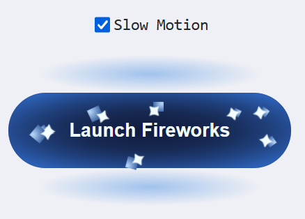
This code snippet creates an interactive “Launch Fireworks” button that, when clicked, triggers an animation of fireworks using CSS particles. The particles are styled and animated to simulate fireworks exploding, with the option to view the animation in slow motion through a checkbox.
<input id="slow" type="checkbox"/>
<label for="slow">Slow Motion</label>
<button>Launch Fireworks<span class="wrap" aria-hidden="true">
<span class="particle" style="--a: -45deg; --x: 53%; --y: 15%; --d: 4em; --f: .7; --t: .15"></span>
<span class="particle" style="--a: 150deg; --x: 40%; --y: 70%; --d: 7.5em; --f: .8; --t: .08"></span>
<span class="particle" style="--a: 10deg; --x: 90%; --y: 65%; --d: 7em; --f: .6; --t: .25"></span>
<span class="particle" style="--a: -120deg; --x: 15%; --y: 10%; --d: 4em"></span>
<span class="particle" style="--a: -175deg; --x: 10%; --y: 25%; --d: 5.25em; --f: .6; --t: .32"></span>
<span class="particle" style="--a: -18deg; --x: 80%; --y: 25%; --d: 4.75em; --f: .5; --t: .4"></span>
<span class="particle" style="--a: -160deg; --x: 30%; --y: 5%; --d: 9em; --f: .9; --t: .5"></span>
<span class="particle" style="--a: 175deg; --x: 9%; --y: 30%; --d: 6em; --f: .95; --t: .6"></span>
<span class="particle" style="--a: -10deg; --x: 89%; --y: 25%; --d: 4.5em; --f: .55; --t: .67"></span>
<span class="particle" style="--a: -140deg; --x: 40%; --y: 10%; --d: 5em; --f: .85; --t: .75"></span>
<span class="particle" style="--a: 90deg; --x: 45%; --y: 65%; --d: 4em; --f: .5; --t: .83"></span>
<span class="particle" style="--a: 30deg; --x: 70%; --y: 80%; --d: 6.5em; --f: .75; --t: .92"></span>
</span></button>
Step2: CSS Fireworks Animation with Speed Control
This code creates a visually appealing button with animated firework particles that launch outward upon clicking. It also includes a checkbox to enable a slow-motion effect for the animation.
@charset "UTF-8";
@property --k {
syntax: "<number>";
initial-value: -1;
inherits: true;
}
html, body {
display: grid;
}

html {
height: 100%;
}

body {
place-content: center;
overflow-x: hidden;
}

button {
--m: 1;
grid-area: 2/1/span 1/span 2;
position: relative;
margin: 1em;
border: solid 2em transparent;
padding: 1.5em 3.25em;
border-radius: 5em;
box-shadow: inset 0 0 1px #23429e;
background: radial-gradient(#111a39, 67.5%, #3476da) padding-box, radial-gradient(#a0c2ed, 35%, #a0c2ed00 70%) 50% 0/80% 50% repeat-y;
color: #f2fdfe;
font: 700 1.5em/1 montserrat, sans-serif;
}
#slow:checked ~ button {
--m: 5 ;
}

@keyframes k {
0%, 33.3% {
--k: 1 ;
}
}
.particle {
--f: 1;
--pos-k: max(0, var(--k));
--neg-k: max(0, -1*var(--k));
--low-c: min(1, 4*(1 - var(--pos-k)));
--abs-d: max(var(--neg-k) - .5, .5 - var(--neg-k));
--mov-f: var(--pos-k);
display: grid;
position: absolute;
left: var(--x);
top: var(--y);
rotate: var(--a);
animation: k calc(var(--m)*1s) linear calc(var(--m)*var(--t, 0)*1s) infinite;
}
@supports (scale: sqrt(4)) {
.particle {
--mov-f: sqrt(var(--pos-k)) ;
}
}
.particle::before, .particle::after {
grid-area: 1/1;
width: 0.75em;
aspect-ratio: 1;
}
.particle::before {
--sa: calc(min(1, 1 - 2*min(.5, var(--mov-f)))*45deg);
border-radius: calc(1.25*min(.8, var(--mov-f))*50%) 50% 50%;
transform-origin: 0 0;
translate: calc(var(--mov-f)*var(--d));
rotate: -45deg;
scale: var(--f);
transform: skew(var(--sa), var(--sa));
opacity: var(--low-c);
filter: Saturate(var(--low-c));
background: radial-gradient(at 85% 85%, #bad9fa, #3e66a4 75%);
content: "";
}
.particle::after {
translate: -50% -50%;
scale: calc(var(--f)*(1 - 2*var(--abs-d)));
text-align: center;
filter: blur(0.5px);
content: "✦";
}

[type=checkbox] {
justify-self: end;
margin: 5px;
width: 1em;
aspect-ratio: 1;
}
[type=checkbox], [type=checkbox] + label {
align-self: center;
font: 1.25em orbitron, monospace;
cursor: pointer;
}
Animated Button With Gravity Effect Using Pure CSS Demo
Creating a gravity button using pure CSS is a simple way to add interactivity and visual appeal to your website. By following these steps, you can implement this engaging feature, making your website not only more attractive but also more memorable for your users.