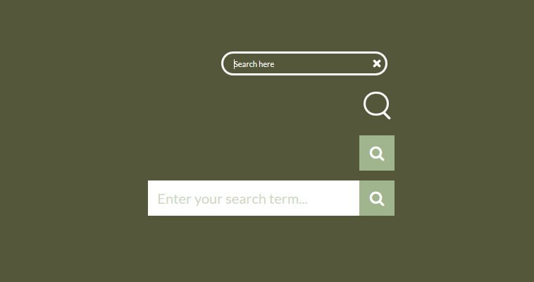
Learn how to create a mobile-friendly expanding search bar with the help of jQuery & CSS3 transitions. It is a click-to-expand input search that has fluid width. It is a new and popular way of the latest web design trends. Initially, the search form is hidden from view, and only a search icon or a button is visible.
When a user clicks on the magnifying glass button, A smoothly animated search field opens for the user to type their relative query for the search result. It has a fluid width and works well on all kinds of mobile devices. It is designed by using CSS transitions property and a bit of jQuery requires to handle its functionality.
We are going to demonstrate two different types of OnClick-to-Expand search input text fields. The first one requires a little jQuery and it will show when someone clicks on an input type search button.
The second one is an animated search bar that develops with pure CSS. It gives a nice smooth ease-in-out transition when click or leave. A standard CSS search form is boring nowadays. Our expanding input field will neatly well fit next to the main menu with having a smart icon tag. It not only looks good but also enhances the beauty of your website.
HTML for Expanding Search Bar
As we said above, we have prepared two versions, First, one used jQuery and another one is simple pure CSS. You will find both in demo and download, but here we will explain only the jQuery method.
Let’s just simply wrap an input search form with a div class & ID .Exp-serach We have an input type search field that has a onkeyup="buttonUp" function that will be later defined in JavaScript.
Next, A simple input type submits button and magnifying glass icon defined inside a span tag.
<div id="Exp-serach" class="Exp-serach">
    <form>
        <input class="ExpInput " onkeyup="buttonUp();"
        placeholder="Enter your search term..." onblur="monkey();"
        type="search" value="" name="search" id="search">
        <input class="Expbtn" type="submit"  value="">
        <span class="ExpIcon"><i class="fa fa-search"></i></span>
    </form>
</div>
As you can see HTML is very standard, nothing special. Now let’s move to next and see how the CSS will work.
CSS Styles for Search Bar
The first thing we need to make sure that the search icon should be visible and the rest should not be visible. But there is also another thing to be noticed, What happens if we increase the size of the search bar?
How can we make this possible? Just simply use of overflow: hidden and extend the width of the .Exp-serach wrapper.
.Exp-serach {
    position: relative;
    margin-top: 20px;
    width: 0%;
    min-width: 50px;
    height: 50px;
    float: right;
    overflow: hidden;

    -webkit-transition: width 0.3s;
    -moz-transition: width 0.3s;
    transition: width 0.3s;
    -webkit-backface-visibility: hidden;
}
i) Positioning Search Input
The next thing we need to position this search input. We added an absolute position and the right/top should be set to zero because of the input visible on the right side. The width should be according to your requirements. I simply set it to 50% of my header column width
Furthermore, We setting the proper height, background color font size, and padding to make sure everything looks good just like the demo.
.ExpInput {
    background: #fff none repeat scroll 0 0;
    border: medium none;
    color: #A0B58D;
    font-family: inherit;
    font-size: 20px;
    height: 50px;
    margin: 0;
    outline: medium none;
    padding: 0 2%;
    position: absolute;
    right: 0;
    top: 0;
    width: 50%;
    z-index: 10;
}
input[type="search"].ExpInput {
    -webkit-appearance: none;
    -webkit-border-radius: 0px;
}
ii) Removing Search Bar Default Styles
Additionally, we need to remove the default styles of the input search bar for WebKit browsers. Let’s see how we will define the color of the placeholder text.
.ExpInput::-webkit-input-placeholder {
    color: #efb480;
}

.ExpInput:-moz-placeholder {
    color: #A0B58D;
}

.ExpInput::-moz-placeholder {
    color: #A0B58D;
}

.ExpInput:-ms-input-placeholder {
    color: #A0B58D;
}
The next step is about looking at the search icon and submit button. As we know that both are at the same place so we will define the same style and position.
.ExpIcon,
.Expbtn  {
    width: 50px;
    height: 50px;
    display: block;
    position: absolute;
    right: 0;
    top: 0;
    padding: 0;
    margin: 0;
    line-height: 50px;
    text-align: center;
    cursor: pointer;
}
We need to make the icon button to be clickable. when the search bar opens the input submits button should be clickable. To get this done, we need to set the z-index to -1 in the beginning and make it transparent.
.Expbtn {
    background: #fff; /* IE needs this */
    -ms-filter: "progid:DXImageTransform.Microsoft.Alpha(Opacity=0)"; /* IE 8 */
    filter: alpha(opacity=0); /* IE 5-7 */
    opacity: 0;
    color: transparent;
    color:red;
    border: none;
    outline: none;
    z-index: -1;
}

.ExpIcon {
    color: #fff;
    background: #A0B58D;
    z-index: 90;
    font-size: 22px;
    font-family: 'icomoon';
    speak: none;
    font-style: normal;
    font-weight: normal;
    font-variant: normal;
    text-transform: none;
    -webkit-font-smoothing: antialiased;
}

.ExpIcon:before {
    content: "";
}

.Exp-serach.Exp-serach-open,
.no-js .Exp-serach {
    width: 100%;
}

.Exp-serach.Exp-serach-open .ExpIcon,
.no-js .Exp-serach .ExpIcon {
    background: #A0B58D;
    color: #fff;
    z-index: 11;
}

.Exp-serach.Exp-serach-open .Expbtn,
.no-js .Exp-serach .Expbtn {
/*    z-index: 90;*/
}
The JavaScript
Now finally we need to take care of JavaScript. This JavaScript code requires a jQuery library for expanding the search bar.
$(document).ready(function(){
function buttonUp(){
     var valux = $('.ExpInput').val();
        valux = $.trim(valux).length;
        if(valux !== 0){
            $('.Expbtn').css('z-index','99');
        } else{
            $('.ExpInput').val('');
            $('.Expbtn').css('z-index','-999');
        }
}
});

$(document).ready(function(){
    var submitIcon = $('.ExpIcon');
    var submitInput = $('.ExpInput');
    var searchBox = $('.Exp-serach');
    var isOpen = false;

    $(document).mouseup(function(){
        if(isOpen == true){
        submitInput.val('');
        $('.Expbtn').css('z-index','-999');
        submitIcon.click();
        }
    });

    submitIcon.mouseup(function(){
        return false;
    });

    searchBox.mouseup(function(){
        return false;
    });

    submitIcon.click(function(){
        if(isOpen == false){
            searchBox.addClass('Exp-serach-open');
            isOpen = true;
        } else {
            searchBox.removeClass('Exp-serach-open');
            isOpen = false;
        }
});

});
I hope you enjoyed this tutorial and found it very useful! Download and see the demo for both versions. Please leave comments and let us know about this.