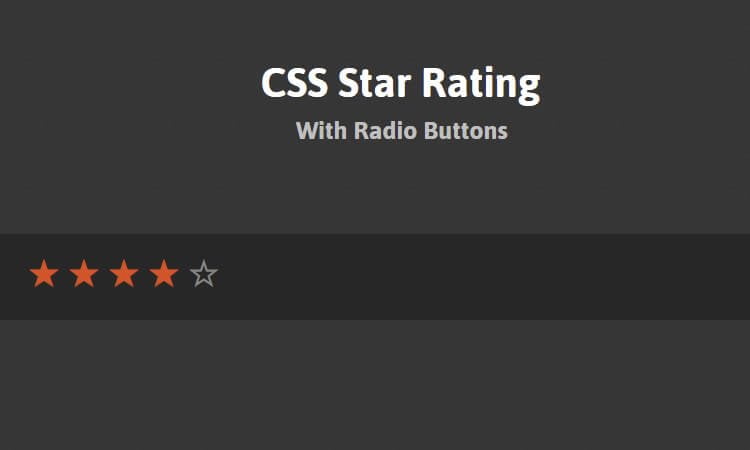
In this tutorial, I’ll make a CSS star rating system using HTML radio buttons and also will show a pure Unicode entity HTML rating.
The CSS Star Rating is one particular classic UX patterns that every web designer has tinkered with at one time or another. I had formed an idea to get the UX part of it done using pure CSS.
There are tons of jQuery plugins and necessary JavaScript code that will help you create rating stars. The reason why because it’s all written in JavaScript is that whenever a dependence on such a rating system first arose CSS lacked the capability to do things like this.
As I said above, this star rating component built-in with purely CSS, so it doesn’t mean that it will not work on click. It will still work on-click and update the value to match.
It supports hovering over the star, and it will change the color of stars when you hover. When you click the stars it will keep that value or update the rating.
That is a very straightforward and quick tutorial about making rating radio buttons. We are planning to use HTML form tag, radio input type buttons and used different colored stars plus some simple CSS logic to create the ratings.
How to Make Star Rating Using Radio Buttons
The simplest way of making star rating, We can use Unicode object for stars (☆) right in it. You should have UTF-8 charset that should not be a big deal but if some reason you don’t have UTF-8 Charset, you can be used.☆ You can use as many stars as you want. Let’s see HTML markup.
<div class="rating">
	<span>☆</span><span>☆</span><span>☆</span><span>☆</span><span>☆</span>
</div>
There is absolutely no way to choose another child component. However, there’s a real way to choose succeeding child elements, through the next or general sibling combinators.
If we change the order of the characters actually, then we can use the overall sibling combinator to choose all the actors that appear prior to the hovered star aesthetically, but following the hovered star in the HTML.
CSS Styles for Star Rating
.rating {
  unicode-bidi: bidi-override;
  direction: rtl;
  text-align: center;
}
.rating > span:hover:before,
.rating > span:hover ~ span:before {
   content: "\2605";
   position: absolute;
   left: 0;
   color: gold;
}
Next, we need to change the star into a “solid” star on hover (Finding those sorts of characters). An easy way, Just need to add the pseudo-element \2605 of a solid star (★) over it on hover. That’s the whole star rating pattern. Here’s is complete CSS code to make it work:
.rating {
  unicode-bidi: bidi-override;
  direction: rtl;
  text-align: center;
}
.rating > span:hover:before,
.rating > span:hover ~ span:before {
   content: "\2605";
   position: absolute;
   left: 0;
   color: gold;
}
.rating > span {
  display: inline-block;
  position: relative;
  width: 1.1em;
}
.rating > span:hover,
.rating > span:hover ~ span {
  color: transparent;
}
Source code taken from CSS Tricks
Using Radio Buttons
Using Radio buttons is another method of creating the rating. This method we need to define HTML form element and then each star will be radio button. We also need to set the label for each star.
When we click on that label, It will make a radio button to get checked. We are using these labels as the stars so click on a star would result in the selecting radio button.
<form>
  <fieldset>
    <span class="star-cb-group">
      <input type="radio" id="rating-5" name="rating" value="5" />
      <label for="rating-5">5</label>
      <input type="radio" id="rating-4" name="rating" value="4" checked="checked" />
      <label for="rating-4">4</label>
      <input type="radio" id="rating-3" name="rating" value="3" />
      <label for="rating-3">3</label>
      <input type="radio" id="rating-2" name="rating" value="2" />
      <label for="rating-2">2</label>
      <input type="radio" id="rating-1" name="rating" value="1" />
      <label for="rating-1">1</label>
      <input type="radio" id="rating-0" name="rating" value="0" class="star-cb-clear" />
      <label for="rating-0">0</label>
    </span>
  </fieldset>
</form>
And the CSS code where we hide radio buttons while keeping labels
.star-cb-group {
  /* remove inline-block whitespace */
  font-size: 0;
  /* flip the order so we can use the + and ~ combinators */
  unicode-bidi: bidi-override;
  direction: rtl;
  /* the hidden clearer */
}
.star-cb-group * {
  font-size: 1rem;
}
.star-cb-group > input {
  display: none;
}
.star-cb-group > input + label {
  /* only enough room for the star */
  display: inline-block;
  overflow: hidden;
  text-indent: 9999px;
  width: 1em;
  white-space: nowrap;
  cursor: pointer;
}
.star-cb-group > input + label:before {
  display: inline-block;
  text-indent: -9999px;
  content: "☆";
  color: #888;
}
.star-cb-group > input:checked ~ label:before, .star-cb-group > input + label:hover ~ label:before, .star-cb-group > input + label:hover:before {
  content: "★";
  color: #e52;
  text-shadow: 0 0 1px #333;
}
.star-cb-group > .star-cb-clear + label {
  text-indent: -9999px;
  width: .5em;
  margin-left: -.5em;
}
.star-cb-group > .star-cb-clear + label:before {
  width: .5em;
}
.star-cb-group:hover > input + label:before {
  content: "☆";
  color: #888;
  text-shadow: none;
}
.star-cb-group:hover > input + label:hover ~ label:before, .star-cb-group:hover > input + label:hover:before {
  content: "★";
  color: #e52;
  text-shadow: 0 0 1px #333;
}
That’s a wrap! It works with modern browsers. For the Older browser version, e.g., IE7 & IE8 you will to provide fallback or use Javascript solution.
I hope you like this and find it useful for your projects. You can view a demo and download the source of this CSS based star rating system using radio buttons. If you have any questions feedback or comments, please feel free to post below.