Today we have a tutorial about building a responsive lightbox for the YouTube video. I am sure, You have experience with making a lightbox for photos but how about adding a video?
Adding lightbox on any website is a good idea because it saves web page space and allows users to quickly access some important information. Whenever you will implement any functionality, Its important the code should be lightweight and provide a clean interface.
It is almost similar as we do with photos but need some more coding and also need to implement JavaScript.
The JavaScript will help us to control the video ID, auto play and few more functionality. As you know the CSS and HTML is always require to make an web element.
I will use the media queries to make the light box mobile friendly and make sure, it work well on small device like mobile and tablet.
Furthermore , It is a lightweight solution which is easy to implement.
Basic HTML for Responsive Video Lightbox
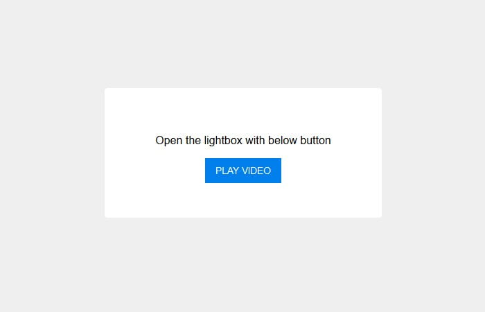
First of all, we have to define the container which holds some text information and a button which will perform the click function.
<div id="container">
  <center>
    <p>Open the lightbox with below button</p>
    <button id="playme" onclick="revealVideo('video','youtube')">Play Video</button>
  </center>
</div>
Next, we have the source code for the lightbox or overlay. What we have done is to define the ID video and an on click function.
We also have two more inner containers for lightbox and content.
<div id="video" class="lightbox" onclick="hideVideo('video','youtube')">
  <div class="lightbox-container">
    <div class="lightbox-content">

      <button onclick="hideVideo('video','youtube')" class="lightbox-close">
        Close | ✕
      </button>
      <div class="video-container">
        <iframe id="youtube" width="960" height="540" src="https://www.youtube.com/embed/WsptdUFthWI?showinfo=0" frameborder="0" allowfullscreen></iframe>
      </div>

    </div>
  </div>
</div>
We need to place the close button which will allow closing the video instead of the content container. And, lastly, we have to put iframe YouTube video code instead of the video container.
The CSS Styles
If we take a look the CSS, we have found that the lightbox requires fixed position with z-index:1; You also notice that we have used the RGBA color scheme to keep the transparent background beside the video.
.lightbox {
  background-color: rgba(0, 0, 0, 0.8);
  overflow: scroll;
  position: fixed;
  display: none;
  z-index: 1;
  bottom: 0;
  right: 0;
  left: 0;
  top: 0;
}
Here are few more lines of CSS code where you can see the container of lightbox has the position relative instead of fixed.
.lightbox-container {
  position: relative;
  max-width: 960px;
  margin: 7% auto;
  display: block;
  padding: 0 3%;
  height: auto;
  z-index: 10;
}
To make the video responsive, we need to take the help of traditional media queries.
@media screen and (max-width: 768px) {
  .lightbox-container {
    margin-top: 10%;
  }
}
@media screen and (max-width: 414px) {
  .lightbox-container {
    margin-top: 13%;
  }
}
The JavaScript
You can find the remaining CSS code in the above demo example. Now have a look at the JavaScript Code.
// Function to reveal lightbox and adding YouTube autoplay
function revealVideo(div,video_id) {
  var video = document.getElementById(video_id).src;
  document.getElementById(video_id).src = video+'&autoplay=1'; // adding autoplay to the URL
  document.getElementById(div).style.display = 'block';
}

// Hiding the lightbox and removing YouTube autoplay
function hideVideo(div,video_id) {
  var video = document.getElementById(video_id).src;
  var cleaned = video.replace('&autoplay=1',''); // removing autoplay form url
  document.getElementById(video_id).src = cleaned;
  document.getElementById(div).style.display = 'none';
}
The JavaScript use the two functions. The first one is to reveal responsive video lightbox and to add YouTube autoplay.
The second function allows to hide the lightbox and removing the YouTube autoplay.
That’s, and it’s easy, don’t you think? You just have to get the code and implement into your website to make it work.
If you have an issue, you can try to add main jQuery file.