The CSS animation quite trending now days and front-end developers love to use to make their design unique. This tutorial is all about creating a wave text effect using CSS3 animation.
You can apply this effect on any text on your website. You can easily implement on paragraph or heading text. The animation give a nice looking dancing effect which look like a waves.
For the purpose of creating wave animation is with the help of CSS3 animation and key-frames.
Create HTML Structure
Let’s start with HTML and define a div class name “waveTextAnimated“. Within the div we will put five span tags and each one hold one word from the text. In case your text longer then you need to define more span tags according to your text.
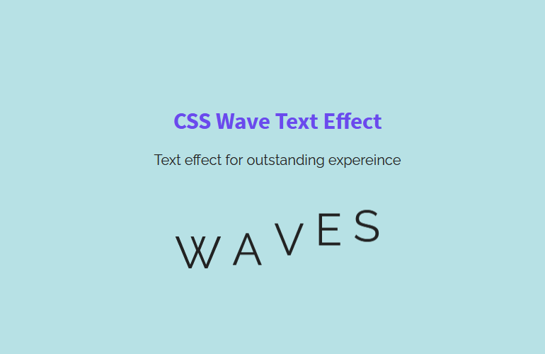
<div class="waveTextAnimated">
  <span>W</span>
  <span>A</span>
  <span>V</span>
  <span>E</span>
  <span>S</span>
</div>
Apply CSS On Wave Effect Text
Before apply the animation, we must need to do some alignment so the text look nice. So we will simply apply the font-size and text-align. Of-course, you can adjust it according to your need.
.waveTextAnimated {
    margin-top: 0.6em;
    font-size: 50px;
    text-align: center;
}
Next, we need to apply some general style to span tag. With the help of display property we will able to inline the each word. Moreover, we will also apply the animation and define its property wave-text. This wave-text will be next handle with the help of keyframes.
.waveTextAnimated span {
  display: inline-block;
  -webkit-animation: wave-text 1s ease-in-out infinite;
          animation: wave-text 1s ease-in-out infinite;
}
The important part of CSS start from here. As we have five words in our text so we will define five selectors that will help us to select the element of span siblings.
Each one further apply the animation-delay with different values in seconds so the text will wave.
.waveTextAnimated span:nth-of-type(1) {
  -webkit-animation-delay: 0s;
          animation-delay: 0s;
}
.waveTextAnimated span:nth-of-type(2) {
  -webkit-animation-delay: 0.1s;
          animation-delay: 0.1s;
}
.waveTextAnimated span:nth-of-type(3) {
  -webkit-animation-delay: 0.2s;
          animation-delay: 0.2s;
}
.waveTextAnimated span:nth-of-type(4) {
  -webkit-animation-delay: 0.3s;
          animation-delay: 0.3s;
}
.waveTextAnimated span:nth-of-type(5) {
  -webkit-animation-delay: 0.4s;
          animation-delay: 0.4s;
}
Finally we will create the wave-text animation by using the keyframes. We will transform the text on the Y-axis so we will set the translateY and set the value.
@-webkit-keyframes wave-text {
  00% {
    transform: translateY(0em);
  }
  60% {
    transform: translateY(-0.6em);
  }
  100% {
    transform: translateY(0em);
  }
}

@keyframes wave-text {
  00% {
    transform: translateY(0em);
  }
  60% {
    transform: translateY(-0.6em);
  }
  100% {
    transform: translateY(0em);
  }
}
That’s it and you are done. You can easily adjust the animation according to your need. Even you can slow down or fast the waves by changing the animation-delay: 0.1s;
Conclusion
This tutorial is an easy way to create a wave text effect using CSS3 animation. We have seen the effect in action on our demo website. You can easily implement on your own website.