Nowadays, every web developer wants to explore trendy design for each component of the webpage. Either it is regard to button styles or hovers effects in CSS or something like that. So, I’m here to show you some ways to design modern social media icons with a beautiful hover effect using CSS.
In the modern web design concept, placing social media icons is the most necessary part of a webpage. These buttons can be used to link the social profiles of your website.
By doing so, your users/customers can easily communicate with you. In short, that’s a good way to keep in touch with your existing users.
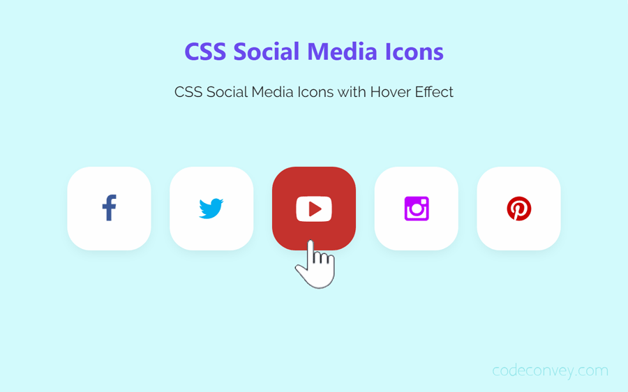
We’ll use Font Awesome CSS library for icons and some CSS attributes to transform social (HTML anchor) links into buttons that you saw in the above image. You are absolutely free to add some extra functionalities in these social links according to your needs.
How to Design Social Media Icons with CSS
Ok! now, let’s start designing the process without going into depth. First of all, make sure that you have included “Font Awesome” iconic fonts in your web project.
You can add this CSS library by adding the following CDN link into head tag of your HTML document. If you have already, then simply skip this step.
<!-- Font Awsome CSS for icons -->
<link rel='stylesheet' href='https://maxcdn.bootstrapcdn.com/font-awesome/4.3.0/css/font-awesome.min.css'>
Thereafter, create all necessary social links in HTML, wrap them all in the parent div element and define its class name "social-btns".
Also, add a class name "btn" to each link and a unique class (according to social media name) that we’ll use to define specific color in CSS for that button.
Each anchor has a Font Awesome icon placed in i tag. You can browse 400+ icons if you want to use a custom one.
The HTML
The following is the complete HTML structure for social media links/buttons.
  <div class="social-btns">
    <a class="btn facebook" href="#"><i class="fa fa-facebook"></i></a>
    <a class="btn twitter" href="#"><i class="fa fa-twitter"></i></a>
    <a class="btn youtube" href="#"><i class="fa fa-youtube-play"></i></a>
    <a class="btn instagram" href="#"><i class="fa fa-instagram"></i></a>
    <a class="btn pinterest" href="#"><i class="fa fa-pinterest"></i></a>
  </div>
Add your social media profile link in place "#" according to each social icon. If you want to open these links in a new tab, simply add target attribute with value “_blank” to each link.
The CSS
Now it’s time to style these links, the following is the complete CSS code that will produce beautiful social media buttons with icons and hover effects.
.social-btns .btn,
.social-btns .btn:before,
.social-btns .btn .fa {
  transition: all 0.35s;
  transition-timing-function: cubic-bezier(0.31, -0.105, 0.43, 1.59);
}
.social-btns .btn:before {
  top: 90%;
  left: -110%;
}
.social-btns .btn .fa {
  -webkit-transform: scale(0.8);
  transform: scale(0.8);
}
.social-btns .btn.facebook:before {
  background-color: #3b5998;
}
.social-btns .btn.facebook .fa {
  color: #3b5998;
}
.social-btns .btn.twitter:before {
  background-color: #00aff0;
}
.social-btns .btn.twitter .fa {
  color: #00aff0;
}
.social-btns .btn.youtube:before {
  background-color: #c4302b;
}
.social-btns .btn.youtube .fa {
  color: #c4302b;
}
.social-btns .btn.instagram:before {
  background-color: #bf00ff;
}
.social-btns .btn.instagram .fa {
  color: #bf00ff;
}
.social-btns .btn.pinterest:before {
  background-color: #cc0000;
}
.social-btns .btn.pinterest .fa {
  color: #cc0000;
}
.social-btns .btn:focus:before,
.social-btns .btn:hover:before {
  top: -10%;
  left: -10%;
}
.social-btns .btn:focus .fa,
.social-btns .btn:hover .fa {
  color: #fff;
  -webkit-transform: scale(1);
  transform: scale(1);
}
.social-btns {
  height: 90px;
  margin: 20px auto;
  font-size: 0;
  text-align: center;
  position: absolute;
  top: 0;
  bottom: 0;
  left: 0;
  right: 0;
}
.social-btns .btn {
  display: inline-block;
  background-color: #fff;
  width: 90px;
  height: 90px;
  line-height: 90px;
  margin: 0 10px;
  text-align: center;
  position: relative;
  overflow: hidden;
  border-radius: 28%;
  box-shadow: 0 5px 15px -5px rgba(0, 0, 0, 0.1);
  opacity: 0.99;
}
.social-btns .btn:before {
  content: "";
  width: 120%;
  height: 120%;
  position: absolute;
  -webkit-transform: rotate(45deg);
  transform: rotate(45deg);
}
.social-btns .btn .fa {
  font-size: 38px;
  vertical-align: middle;
}
CSS Customization Guide
If you wan to control :hover and :focus behavior, you can pass some additional values in the above CSS. Similarly, you can set a custom size, icons and transition speed for hover, etc.
To change buttons size, pass the custom value (in px) by editing the following CSS code.
.social-btns .btn {
  width: 40px;
  height: 40px;
  line-height: 40px;
}
If you wan to set custom transition speed, update the following.
transition: all 0.35s;