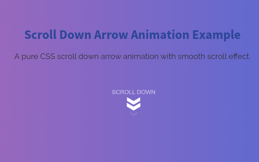
The scroll down arrow is most commonly used in the hero section of website templates that indicates or points to the specific content. It is used as a quick call to action button where users can easily scroll down by clicking on it to the interactive section of the webpage. In this tutorial, we are going to create a scroll down arrow animation using CSS.
We are going to create this small project without any dependency even we’ll not use any icon library or image. Well! the final output will amaze you, which you can check on the demo page. The idea is very simple, we’ll use the CSS pseudo-classes, before and after pseudo-selectors for div elements for arrow icon and animate this using keyframes.
After creating the arrow down animation, we’ll functionalize the smooth scrolling effect using the hash anchor technique. So, let’s get started with HTML structure to create the arrow-down animation.
Scroll Down Arrow HTML Structure
In HTML, create a div element with a class name "arrow_container" and place a hash link that points to the content element. Inside the anchor tag, place three divs elements with the class name "chevron" and create a span element with class name "text".
<div class="arrow_container">
    <a href="#toscroll">
  <div class="chevron"></div>
  <div class="chevron"></div>
  <div class="chevron"></div>
  <span class="text">Scroll down</span>
    </a>
</div>
You can place the above HTML code inside the hero section of your webpage where you want to display the scroll-down arrow animation. After that, add "toscroll" id to your specific content area where you point to scroll-down arrow.
<div id="toscroll">

<!-- Your Content Goes Here -->

</div>
CSS Styles for Arrow Down Animation
After creating HTML, now it’s time to style the arrow down icon and animate it with CSS. So, select the "arrow_container" class and define its relative position. This class will hold the arrow icon and its animation. We need its fixed width so that the arrow icon can be fit into it. Therefore, define the 24px width and height for this container. The margin property is optional, you can use this according to your needs.
.arrow_container {
  position: relative;
  width: 24px;
  height: 24px;
  margin: 0px auto;
}
Styling Arrow
In HTML, we defined three div elements with the class name "chevron". Now, we’ll turn these elements into arrows using CSS width and height property along with a background. So, select the "chevron" class and define its absolute position. Similarly, define width and height 28px and 8px respectively. You can increase these values if you want to make the arrow icon large.
Use the CSS transform property with scale3d(0.5, 0.5, 0.5) value for 3d transformation. At last, define the animation property and specify "move" animation whose keyframes we’ll define in the next steps.
.chevron {
  position: absolute;
  width: 28px;
  height: 8px;
  opacity: 0;
  transform: scale3d(0.5, 0.5, 0.5);
  animation: move 3s ease-out infinite;
}
Now, target the chevron class with before and after pseudo selector and define the absolute position. Use the 100% width along with the 51% height and set a background color. You can set any background color that you want the color for the arrow icon.
Here the important thing to do is shape the arrow icon. To do so, we are going to use skew transformation for both before and after the chevron class. The before pseudo-class is the left side of the arrow whereas the after pseudo-class is the right side of the arrow.
.chevron:before,
.chevron:after {
  content: ' ';
  position: absolute;
  top: 0;
  height: 100%;
  width: 51%;
  background: #fff;
}

.chevron:before {
  left: 0;
  transform: skew(0deg, 30deg);
}

.chevron:after {
  right: 0;
  width: 50%;
  transform: skew(0deg, -30deg);
}
Target the chevron first-child and nth-child(2) class and define the move animation as follows.
.chevron:first-child {
  animation: move 3s ease-out 1s infinite;
}

.chevron:nth-child(2) {
  animation: move 3s ease-out 2s infinite;
}
The "text" class is the wrapper element for the text that shows along with the arrow icon. Select this class and define margin, font-size, color, text-transform, white-space, opacity, and animation property as described below:
.text {
  display: block;
  margin-top: 75px;
  margin-left: -30px;
  font-family: "Helvetica Neue", "Helvetica", Arial, sans-serif;
  font-size: 12px;
  color: #fff;
  text-transform: uppercase;
  white-space: nowrap;
  opacity: .25;
  animation: pulse 2s linear alternate infinite;
}
Apply Keyframes
In the last step, define the CSS keyframes for the "pulse" and "move" animation. The pulse animation is just a change of opacity from 0 to 1. Whereas, in move animation we need to define both opacity and transformation rules. So, the keyframes rules for these animations are as follows:
@keyframes pulse {
to {
    opacity: 1;
  }
}
@keyframes move {
  25% {
    opacity: 1;

  }
  33% {
    opacity: 1;
    transform: translateY(30px);
  }
  67% {
    opacity: 1;
    transform: translateY(40px);
  }
  100% {
    opacity: 0;
    transform: translateY(55px) scale3d(0.5, 0.5, 0.5);
  }
}
In order to make the smooth scroll effect between the hashed anchor sections, use the smooth value for the scroll-behavior property.
html {
  scroll-behavior: smooth;
}
That’s all! hopefully, you have successfully created CSS scroll down arrow animation. If you have any questions or suggestions, let me know by comment below.