A few months back, we created a testimonial slider based on pure CSS. We’re back again with a similar tutorial but with a quite different style of a testimonial slider. In this tutorial, we’ll create a responsive testimonial slider using HTML radio inputs and CSS3.
Unlike the previous testimonial slider, this slider comes with a modern UI design concept. Each quotation slide comes with different background colors, author pictures, and quote symbols. Anyhow, the core coding concept is the same to display the customers/users’ quotes and sliding functionality. You can easily integrate this slider into JS-Free small website projects.
You can also use this project as a content slider or image slider with a little bit of change. Before getting started with coding, let’s have a look at the demo page to check this testimonial slider.
HTML Structure for Testimonial Slider
First of all, create a container and place HTML radio input for the navigation of the slides. Similarly, create labels for inputs and create content slides as follows:
<div class="container">
<input type="radio" name="nav" id="first" checked/>
<input type="radio" name="nav" id="second" />
<input type="radio" name="nav" id="third" />
<label for="first" class="first"></label>
<label for="second" class="second"></label>
<label for="third" class="third"></label>
<div class="one slide">
<blockquote>
<span class="leftq quotes">“</span> He promptly completed the task at hand and communicates really well till the project reaches the finishing line. I was pleased with his creative design and will definitely be hiring him again. <span class="rightq quotes">„ </span>
</blockquote>
<img src="img/dp-1.jpg" width="170" height="130" />
<h2>Steve Kruger</h2>
<h6>UI/UX Designer at Woof Design Studio</h6>
</div>
<div class="two slide">
<blockquote>
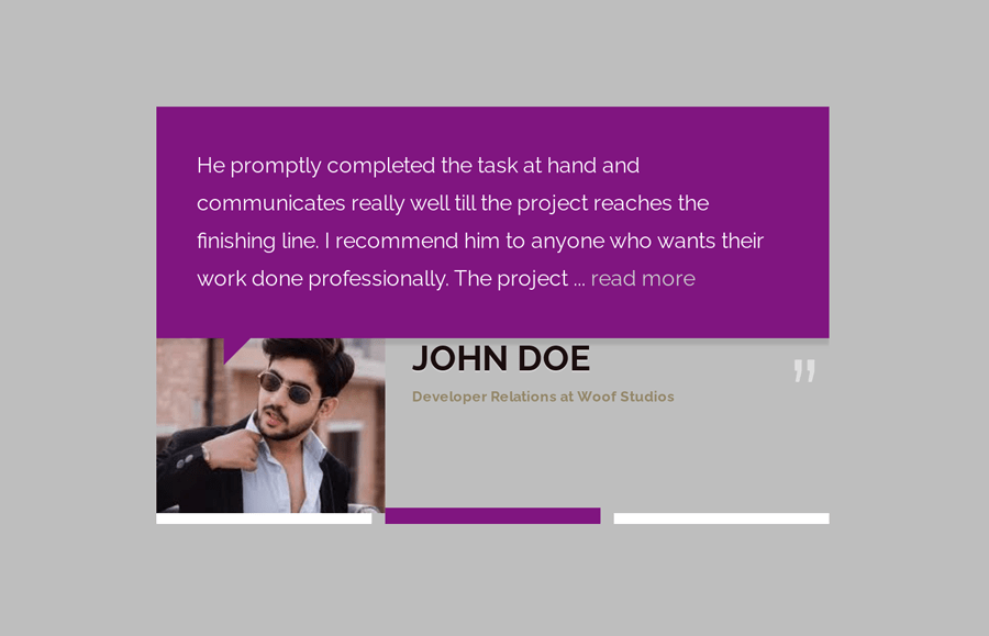
<span class="leftq quotes">“</span> He promptly completed the task at hand and communicates really well till the project reaches the finishing line. I recommend him to anyone who wants their work done professionally. The project ... <a href="#"> read more</a><span class="rightq quotes">„ </span>
</blockquote>
<img src="img/dp-2.jpg" width="170" height="130" />
<h2>John Doe</h2>
<h6>Developer Relations at Woof Studios</h6>
</div>
<div class="three slide">
<blockquote>
<span class="quotes leftq"> “</span> He promptly completed the task at hand and communicates really well till the project reaches the finishing line. I was pleased with his creative design and will definitely be hiring him again. <span class="rightq quotes">„ </span>
</blockquote>
<img src="img/dp-3.jpg" width="170" height="130" />
<h2>Steve Stevenson</h2>
<h6>CEO Woof Web Design Studios</h6>
</div>
</div>
The CSS Styles
We need the fixed width for the container element to slide the quotes area of the testimonial. So, define the 500px width and set the minimum height as 315px. Specify the "0 auto" value for the margin in order to align it to the center. Here the important properties are position and overflow that should be relative and hidden respectively.
.container{
  width:500px;
  min-height:315px;
  margin:0 auto;
  position:relative;
  padding-bottom:30px;
  overflow:hidden;
}
Define the same width for the blockquote and specify the margin, padding, and background color. Likewise, define the position relative and transition property,
blockquote{
  margin:0;
  padding:30px;
  width:500px;
  background-color: #DB532B;
  color:white;
  box-shadow: 0 5px 2px rgba(0,0,0,0.1);
  position:relative;
  transition: background-color 0.6s linear;
}

blockquote:after {
  content: " ";
  height: 0;
  width: 0;
  position: absolute;
  top: 100%;
  border: solid transparent;
  border-top-color: #DA532B;
  border-left-color:#DA532B;
  border-width: 10px;
  left: 10%;
}
The default styles of the radio input should be hidden from the users. So, define the opacity 0 or define the "none" value for the display property to hide the radio buttons.
input[type="radio"] {
 display: none;
 opacity: 0;
}
Now, define the styles for the label that will be used to navigate the testimonial slides. Display it as a block element and define width as 32% and keep its position absolute.
label{
  display:block;
  width:32%;
  border: 4px solid white;
  position:absolute;
  bottom:5px;
  cursor: pointer;
  transition: border-color 0.3s linear;
}
Keep the labels in a sequence according to the total width of the slider. Like, the first label is 32% wide and it’s left position is 0. Similarly, define the left value for the second and third labels as 34% and 68% respectively. If you want to add more slides in the testimonial slider, count the total slides and divide them by 100 to get the width and left position value.
label.second{
  left:34%;
}
label.third{
  left:68%;
}
Testimonial Slide & Quotes Styles
The “slide” class is the common class for all the slides. You need to keep all the slides behind the scene in order to show a specific slide at a time. So, keep the absolute position for the slide class and define its left value as -100% to keep it behind the testimonial container. Likewise, set the 0 value for the opacity and define CSS transition duration in order to make a fade-in effect when the slide display.
.slide{
  position:absolute;
  left:-100%;
  opacity:0;
  transition: all 0.6s ease-in;
}
After that, define the styles for the quotes. The "quotes" class is the wrapper of the quotation symbols. Keep its absolute position, define font-size, and color value. You can set the custom values for the font-size and color in order to customize the quotation sign.
.quotes{
  position:absolute;
  color:rgba(255,255,255,0.5);
  font-size:5em;
}
.leftq{
  top:-25px;
  left:5px;
}
.rightq{
  bottom:-10px;
  right:5px;
}
Float the avatar image to left and leave some space from the right by defining 20px value for the margin-right property. We already defined the height and width inside each HTML of each image. So, here you just need to define the object-fit value to adjust the image according to the defined resolution.
.container img{
  float:left;
  margin-right: 20px;
    object-fit: cover;
}
Define the different background colors for the slides. If you want to keep only one background color (that defined in the “blockquote”), then you can skip this step.
#second:checked ~ .two blockquote {
  background-color:purple;
}
.two blockquote:after{
  border: solid transparent;
  border-top-color: purple;
  border-left-color:purple;
  border-width: 10px;
}
#third:checked ~ .three blockquote{
  background-color:#54885F;
}
.three blockquote:after{
  border: solid transparent;
  border-top-color: #54885F;
  border-left-color: #54885F;
  border-width: 10px;
}
In order to make the testimonial slider responsive, keep the 100% full width of the container and blockquote on a small media screen.
@media only screen and (max-width: 480px){
  .container,
   blockquote{
    width: 100%;
  }
}
Finally, define the slide functionality by using CSS checked pseudo-class and ~ (just after the element), selector. Similarly, set the left position 0 and opacity 1 for each slide to display it when a specific label selected.
#first:checked ~ label.first {
  border-width:6px;
  border-color:#DB532B;
}
#second:checked ~ label.second {
  border-width:6px; border-color:purple;
}
#third:checked ~ label.third {
  border:6px solid #54885F;
}

#first:checked ~ div.one {
  left:0;
  opacity:1;
}
#second:checked ~ div.two {
  left:0;
  opacity:1;
}
#third:checked ~ div.three {
  left:0;
  opacity:1;
}
That’s all! Hopefully, you have successfully created a responsive testimonial slider using HTML and CSS. If you have any questions or suggestions, let me know by comment below.