The online mobile browser emulator plays a major role while testing your website responsiveness. If you don’t have any smartphone, but you want to check your site, then you can use online responsive tool to test the site.
There is no doubt that the percentage of all users that comes from different smartphones and mobile devices is Growing. It won’t be so far that mobile users will overtake Laptop and desktop users.
Why a Site Need to be Responsive
Why a site need to be Responsive? The answer is simply that people don’t have much time to go to the laptop, so they use their mobile phones to get the required information on the internet.
The number of users increases day by day who access websites from their smartphones. Also, Google loves responsive websites.
It is also a ranking signal in google for a site which works well on all kind of small to large devices. A great looking and fully responsive site attract more site visitor so it’s important that your site looks on all devices.
To check how your site looks on a different type of gadgets, you should require to test it on different devices but that’s of course not possible with physical devices.
Because you can buy a lot of different devices and of course don’t want to pay a lot of money to buy them, so the solution to this problem can be solve using online tools.
How Browser Simulator Help for Responsiveness
The responsive testing simulator helps you check the responsiveness of your site across different mobile platforms such as iPhone, iPad, BlackBerry without having devices in your hand.
The browser simulator can help you to point out issues and problems with the website. It allows you to take corrections to make the site visually appealing.
If you are looking to design a responsive website, you can use choose a CSS framework to build a website and make it responsive and work on all kinds of devices.
The website testing tools for responsiveness not only limited to test your site on different devices but also allow you to test it any resolutions.
Like now days Laptop take place over desktop computer so laptop recommended resolution is 1366px x 768px.
Best Responsive Testing Tools Online:
You may need to test your website into that resolution because the trend of the website has changed. Now, most websites look different on large screens. Some website hides their few features on 1024px resolution and shows them on the 1366px landscape.
The responsive checker tools work in a very simple way. You just have to put your website URL in the given search bar then press Enter.
It will load your site and show you a result. Now you can not only see your site look and it’s an issue but also can use Firebug Extension to sort out issues.
If you are using Google Chrome, then you don’t need an extension because it has a built-in Tool.
Let’s have a look list of some great online best responsive testing tools which are absolutely free!
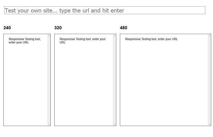
1- Mattkersley
By using Mattkersley, you just have to put URL into the address bar at the top of the page and then hit enter. It will show you a result. It tests site on 240, 320, 480, 768 and 1024 resolution.
It has little fewer features because not allowing more resolutions.
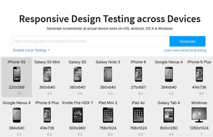
2- Browserstack
Browserstack is a great looking tool and provides a wide-range of a mobile device. It also allows you to test a site on a different model of different company tablets.
One awesome feature it has, it generates screenshots at actual device sizes on iOS, Android, OS X & Windows. But the main issue with this, it didn’t allow used Firebug and other CSS bug tool.
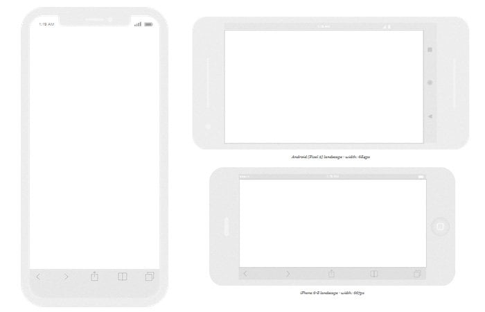
3- Responsinator
Responsinator is one of my favorite tools. When I do work for my client, I always use it because it is simple and easy to use.
It doesn’t have too many devices but has all the major devices which allow me to take an idea of how the site will look at the different range of screens sizes.
It shows the result in portrait and as well as shows the website looks in the landscape. If you are working on your local computer server such as WAMP, you can still test your site responsiveness into this tool without any issue.
4- Responsive Test Tool
Sometimes I prefer to use Responsivetest because it has unlimited screen resolution which I didn’t find anyone else.
You can put your site URL into the address bar and press enter. You can drag the right gray line to see how your site design looks at what screen size.

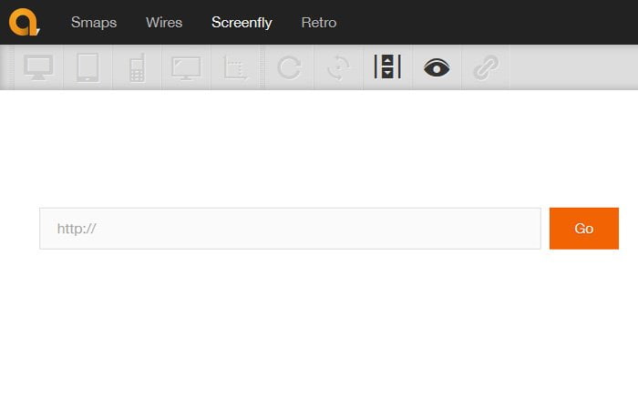
5- Screenfly a Responsive Check Tool
Screenfly is another very nice simulator that has too many options. It allows the testing site into many devices. It covers almost all devices such as different laptops, mobile phones, and pads, etc.
6- Website Responsive Test Tool
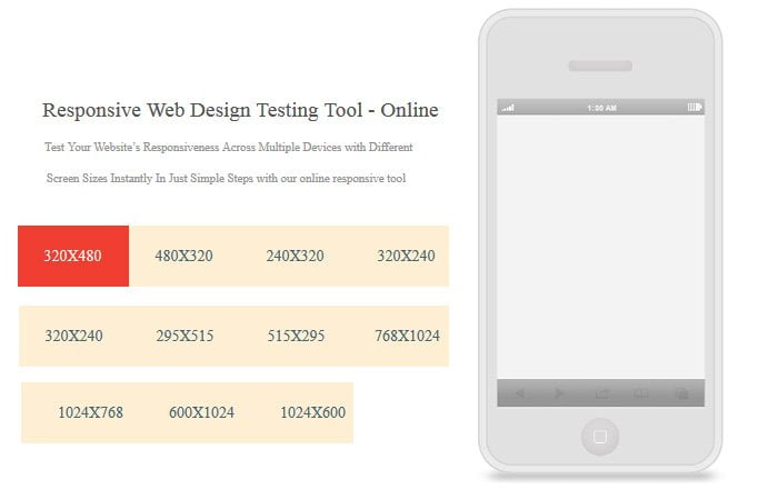
This responsive web design testing tool allows you to check your site layout across multiple devices. It provides you different screen sizes instantly.
Once you put your site URL and hit enter, It will your site on mobile and then you can click different size tabs to check it’s the layout.
I just try to cover some good responsive web design tools which are free to use. If you think another tool should be on my list than don’t mind to share with me in below comment section.
If you want to make your website responsive, you can use CSS media queries to do so. Don’t forget to check out the best ways to use CSS media queries.