Do you want to create a message card in HTML that would be displayed after successful registration? Yes! you are in the right place. In this tutorial, I’ll show how you can do this with a few simple steps of HTML and CSS coding.
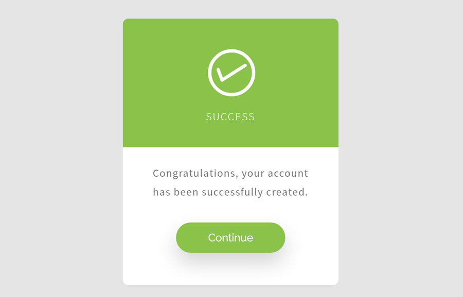
Before getting started, I’ll suggest you browse the demo page to check the final output of this “success message” card. OK! as you have seen on the demo page, the design of this message card is quite modern. It consists of the main three parts, these are check icon, success message, and a continue button. Each part of this message card can be highly customized according to your needs.
This message card design can be used in any signup form to inform the users about the successful registration process. You can place a link behind its continue button to redirect the users to any page when users click it.
HTML Structure for Registration Successful Message
In HTML, create a div element with an id attribute "card" and place two div inside it with id "upper-side" and "lower-side" respectively. Inside the upper side of the card, place the SVG checkmark icon (copy & paste the SVG code). Similarly, define the success message inside the lower side of the card. The following is the complete HTML structure for the “success message” card.
<div id='card' class="animated fadeIn">
  <div id='upper-side'>
    <?xml version="1.0" encoding="utf-8"?>
      <!-- Generator: Adobe Illustrator 17.1.0, SVG Export Plug-In . SVG Version: 6.00 Build 0)  -->
      <!DOCTYPE svg PUBLIC "-//W3C//DTD SVG 1.1//EN" "http://www.w3.org/Graphics/SVG/1.1/DTD/svg11.dtd">
      <svg version="1.1" id="checkmark" xmlns="http://www.w3.org/2000/svg" xmlns:xlink="http://www.w3.org/1999/xlink" x="0px" y="0px" xml:space="preserve">
        <path d="M131.583,92.152l-0.026-0.041c-0.713-1.118-2.197-1.447-3.316-0.734l-31.782,20.257l-4.74-12.65
	c-0.483-1.29-1.882-1.958-3.124-1.493l-0.045,0.017c-1.242,0.465-1.857,1.888-1.374,3.178l5.763,15.382
	c0.131,0.351,0.334,0.65,0.579,0.898c0.028,0.029,0.06,0.052,0.089,0.08c0.08,0.073,0.159,0.147,0.246,0.209
	c0.071,0.051,0.147,0.091,0.222,0.133c0.058,0.033,0.115,0.069,0.175,0.097c0.081,0.037,0.165,0.063,0.249,0.091
	c0.065,0.022,0.128,0.047,0.195,0.063c0.079,0.019,0.159,0.026,0.239,0.037c0.074,0.01,0.147,0.024,0.221,0.027
	c0.097,0.004,0.194-0.006,0.292-0.014c0.055-0.005,0.109-0.003,0.163-0.012c0.323-0.048,0.641-0.16,0.933-0.346l34.305-21.865
	C131.967,94.755,132.296,93.271,131.583,92.152z" />
        <circle fill="none" stroke="#ffffff" stroke-width="5" stroke-miterlimit="10" cx="109.486" cy="104.353" r="32.53" />
      </svg>
      <h3 id='status'>
      Success
    </h3>
  </div>
  <div id='lower-side'>
    <p id='message'>
      Congratulations, your account has been successfully created.
    </p>
    <a href="#" id="contBtn">Continue</a>
  </div>
</div>
If you don’t want to use the SVG icon, you can also replace it with the Font Awesome check icon. To do so, just define the upper side of the card as follows:
<div id='upper-side'>
   <i class="fa fa-check"></i>
   <h3 id='status'> Success </h3>
</div>
The CSS Styles
In CSS, the very first thing is the card design. Keep its relative position, define the width, margin, and display it as a block. The other properties like font family and text-align are optional, you can set their values according to your needs.
#card {
  position: relative;
  width: 320px;
  display: block;
  margin: 40px auto;
  text-align: center;
  font-family: 'Source Sans Pro', sans-serif;
}
After that, define the CSS styles for the upper side of the card. This area of the card contains the check (success) icon. Define a background color, padding, color, and border-radius property for this selector. You can set a custom background color for the upper area according to your webpage theme.
#upper-side {
  padding: 2em;
  background-color: #8BC34A;
  display: block;
  color: #fff;
  border-top-right-radius: 8px;
  border-top-left-radius: 8px;
}
Now, set some styles for the checkmark (that is SVG id). Here, you just need to define the font-weight, fill color, and margin property.
#checkmark {
  font-weight: lighter;
  fill: #fff;
  margin: -3.5em auto auto 20px;
}
Similarly, define font styles for success status. Keep lighter font-weight, transform text to uppercase, and keep some space between the letters. Likewise, set font-size, and margin according to your needs.
#status {
  font-weight: lighter;
  text-transform: uppercase;
  letter-spacing: 2px;
  font-size: 1em;
  margin-top: -.2em;
  margin-bottom: 0;
}
Write some CSS rules for the lower side of the card described as following:
#lower-side {
  padding: 2em 2em 5em 2em;
  background: #fff;
  display: block;
  border-bottom-right-radius: 8px;
  border-bottom-left-radius: 8px;
}
Now, its time to set a few properties for the message text. Set color and letter spacing for the #message selector. You can also define some additional attributes in order to customize message text.
 #message {
  margin-top: -.5em;
  color: #757575;
  letter-spacing: 1px;
}
Finally, write CSS styles for the “continue” button as described below:
#contBtn {
  position: relative;
  top: 1.5em;
  text-decoration: none;
  background: #8bc34a;
  color: #fff;
  margin: auto;
  padding: .8em 3em;
  -webkit-box-shadow: 0px 15px 30px rgba(50, 50, 50, 0.21);
  -moz-box-shadow: 0px 15px 30px rgba(50, 50, 50, 0.21);
  box-shadow: 0px 15px 30px rgba(50, 50, 50, 0.21);
  border-radius: 25px;
  -webkit-transition: all .4s ease;
		-moz-transition: all .4s ease;
		-o-transition: all .4s ease;
		transition: all .4s ease;
}
#contBtn:hover {
  -webkit-box-shadow: 0px 15px 30px rgba(50, 50, 50, 0.41);
  -moz-box-shadow: 0px 15px 30px rgba(50, 50, 50, 0.41);
  box-shadow: 0px 15px 30px rgba(50, 50, 50, 0.41);
  -webkit-transition: all .4s ease;
		-moz-transition: all .4s ease;
		-o-transition: all .4s ease;
		transition: all .4s ease;
}
That’s all! I hope you have successfully implemented this message card into your signup form. If you have still confusion or any question, let me know by comment below.
Is the card inputted inside the form?
Hi Bulleme!
You can place this card on a seprate page (usually on form submit page).