In a website interface, a stepper is a useful component to visualize steps of a process. It can be used in the signup form or timeline of major events. Generally, a stepper can be in a horizontal or vertical layout depending on the process interface. In this tutorial, we are going to design a simple vertical stepper using pure CSS.
Usually, the stepper component requires a little JavaScript function to switch between the next and previous steps. Anyhow, here we’ll only design a vertical stepper and define a class name for active/current steps that you can add/remove for the next/previous steps.
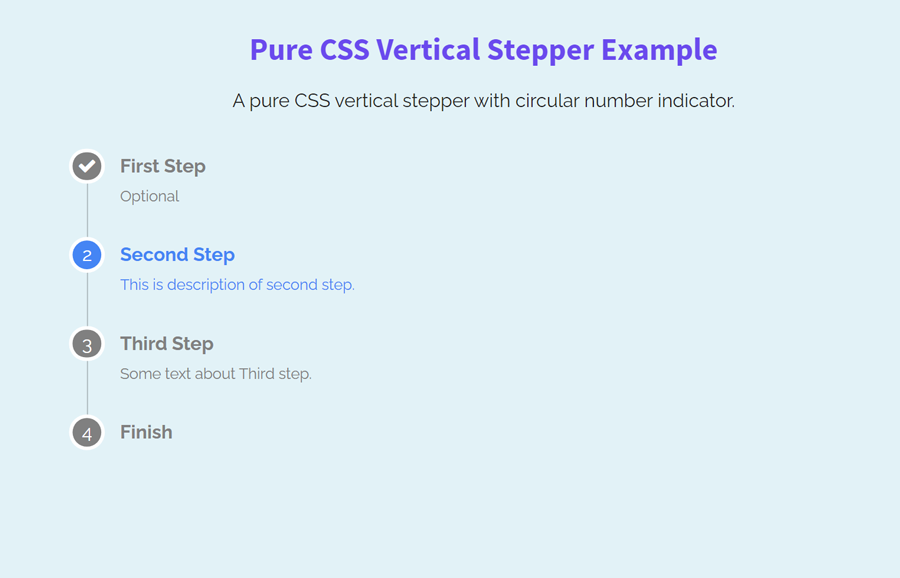
As you have seen in the above preview, there are four steps in the vertical layout. Each step has title and caption text along with a circular number indicator. You can add multiple steps according to your needs without writing extra CSS code. So, let’s get started with HTML to create a vertical stepper.
The HTML Structure
The HTML for a step indicator contains three elements, a div element with a "circle" class, and two other div elements for title and caption. Each step has a similar HTML structure. So, you can copy/paste the code to create the next step. The following is the HTML for four steps (as shown on the demo page):
<div class="step">
   <div>
      <div class="circle"><i class="fa fa-check"></i></div>
   </div>
   <div>
      <div class="title">First Step</div>
      <div class="caption">Optional</div>
   </div>
</div>
<div class="step step-active">
   <div>
      <div class="circle">2</div>
   </div>
   <div>
      <div class="title">Second Step</div>
      <div class="caption">This is description of second step.</div>
   </div>
</div>
<div class="step">
   <div>
      <div class="circle">3</div>
   </div>
   <div>
      <div class="title">Third Step</div>
      <div class="caption">Some text about Third step. </div>
   </div>
</div>
<div class="step">
   <div>
      <div class="circle">4</div>
   </div>
   <div>
      <div class="title">Finish</div>
   </div>
</div>
In the above HTML, the "step-active" class is used to indicate the current step. This class name can be used dynamically to show the active step.
CSS Styles for Vertical Stepper
In CSS, target the "step" class that is the container of a step. Keep its relative position and define 1em minimum height. Likewise, define the text color according to your needs.
.step {
  position: relative;
  min-height: 1em;
  color: gray;
}
Similarly, select the "title" and "caption" class in order to style the step title and description. Use the CSS line-height property and set its value 1.5em and make the font style bold using the font-weight property. Define the 0.8em value for the font size to keep the caption text smaller than the title.
.title {
  line-height: 1.5em;
  font-weight: bold;
}
.caption {
  font-size: 0.8em;
}
After that, target the next step using CSS (element just after the element) + selector and define margin-top in order to leave some space between the steps.
.step + .step {
  margin-top: 1.5em
}
Select the div element of the first step and define its static position along with the 0 height.
.step > div:first-child {
  position: static;
  height: 0;
}
After that, keep some left margin for steps except the first step.
.step > div:not(:first-child) {
  margin-left: 1.5em;
  padding-left: 1em;
}
The "circle" class contains the number of steps. Keep its relative position, define the width, height, color, and other CSS properties as mentioned below:
/* Circle */
.circle {
  background: gray;
  position: relative;
  width: 1.5em;
  height: 1.5em;
  line-height: 1.5em;
  border-radius: 100%;
  color: #fff;
  text-align: center;
  box-shadow: 0 0 0 3px #fff;
}
In order to draw a vertical line between the step’s indicator, we’ll use the after pseudo selector with the "circle" class. So, define the following CSS styles for the vertical line:
/* Vertical Line */
.circle:after {
  content: ' ';
  position: absolute;
  display: block;
  top: 1px;
  right: 50%;
  bottom: 1px;
  left: 50%;
  height: 100%;
  width: 1px;
  transform: scale(1, 2);
  transform-origin: 50% -100%;
  background-color: rgba(0, 0, 0, 0.25);
  z-index: -1;
}
We don’t need to show the vertical line for the last step’s indicator. So, hide the line (using display none property) for the last step.
.step:last-child .circle:after {
  display: none
}
Finally, define the style for the "step-active" class and done.
.step.step-active {
  color: #4285f4
}
.step.step-active .circle {
  background-color: #4285f4;
}
That’s all! I hope you have successfully created a vertical stepper using pure CSS. If you have any questions or suggestions, let me know by comment below.
awesome tips
I am struggling to see how the z-index will not hinder the display of the line
Hi Sumo!
You can set the z-index property for the “.step” class that’s the main container of all steps. Also, make sure you are using the position property (relative/absolute/fixed) to make the z-index work.
.step{
   position: relative;
   z-index: 999;
}
Note: z-index will not work for static property.