Today, I’m going to create a simple card slider with pure CSS. A card slider delivers a lot of information in a limited space of a webpage. It may contain text, images or videos. This type of content slider also helps users to easily navigate the important contents of a webpage.
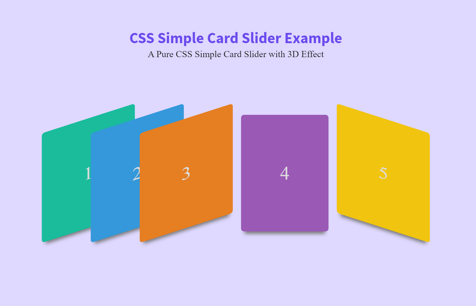
The coding concept (and HTML structure) is really simple for it. However, the output design of this card slider (shown on the above image) is eye-catchy. Before going further, I’ll recommend you to check out the demo page. If you’ve already visited the demo page then it’s great!
OK!, now let’s get started with HTML to create card slider.
HTML to Create Pure CSS Card Slider
As I said above, the HTML (for card slider) is absolutely straightforward. Simply, you need to use input (with type radio) and label elements. We’ll style label tag as a card using CSS. The input tag will allow us to switch between these (labels) cards.
 <div class="card-slider">
  <input type="radio" id="1" name="sld"/>
  <label for="1">1</label>
  <input type="radio" id="2" name="sld"/>
  <label for="2">2</label>
  <input type="radio" id="3" name="sld" checked/>
  <label for="3">3</label>
  <input type="radio" id="4" name="sld"/>
  <label for="4">4</label>
  <input type="radio" id="5" name="sld"/>
  <label for="5">5</label>
</div>
You can wrap all these elements (input and labels) into a parent div for further customization. Inside the label tag, you can put any HTML elements like images, text, and HTML5 videos, etc.
If you want to add more than 5 cards into one slider, just add another input with id 6 and creates its label respectively. You can use any unique id rather than numbers for cards.
Styles for Card Slider
Now, it’s time to finalize the card slider using CSS styles. So, the very first thing is to design the card style (of label element). We’ll create a 150×200 card with other CSS properties (like a shadow, position, margin, etc). Also, for the eye-catchy effect, we’ll use CSS skew transformation.
label {
  position: realtive;
  margin: 0 -35px;
  display: inline-block;
  width: 150px;
  height: 200px;
  line-height: 200px;
  color: #ddd;
  font-size: 2em;
  border-radius: 5px;
  box-shadow: 0 10px 6px -6px #777;
  -webkit-transform: skew(-20deg) rotate(-20deg);
          transform: skew(-20deg) rotate(-20deg);
  -webkit-transition: .3s;
  transition: .3s;
}
If you want to use a different background color for each card, you can set using CSS nth-of-type selector.
label:nth-of-type(1) {
  background: #1abc9c;
}

label:nth-of-type(2) {
  background: #3498db;
}

label:nth-of-type(3) {
  background: #e67e22;
}

label:nth-of-type(4) {
  background: #9b59b6;
}

label:nth-of-type(5) {
  background: #f1c40f;
}
Now we’ll hide the input element and add the card switch functionality (using CSS: checked pseudo selector). You can set a unique class/id for slider inputs to hide it uniquely.
input[type="radio"] {
  display: none;
}

input[type="radio"]:checked ~ label {
  -webkit-transform: skew(20deg) rotate(20deg);
          transform: skew(20deg) rotate(20deg);
}

input[type="radio"]:checked + label {
  margin: 0 50px;
  -webkit-transform: none;
          transform: none;
}
That’s all! your card slider is ready. Additionally, if you want to adjust the overall slider, you can set styles for the “card-slider” div element. Besides this, you can add any CSS style (in below selector) to customize the outer of the slider.
.card-slider{
  margin: 60px auto;
  text-align: center;
}
I hope, you find this tutorial helpful to create CSS based card slider. If you have any questions or suggestions related to card/content slider, let me know by comment below.