Menu navigation is the main part of a website to navigate webpage content. It allows users to browse the most important pages easily. There are many types of menus like dropdown menu, sidebar menu, and off-canvas menu, etc. In this tutorial, we are going to build a responsive off canvas menu using pure CSS.
Basically, menu navigation depends upon the website’s contents. A web designer chooses a mega menu for heavy content websites. Similarly, multilevel menus are used to organize categories with subcategories. Likewise, off canvas menu is the best choice to create a general-purpose sidebar navigation system.
Generally, off canvas menu requires JavaScript function to slide out and push the main content. But, it’s quite possible using HTML radio input and CSS to toggle the sidebar menu. The final output and working are quite the same, you can check it live on the demo page. Without going into depth, let’s get started with HTML coding to create off canvas menu.
HTML for CSS Off Canvas Menu
In HTML, we need four main elements to build an off canvas navigation system. The first one is main wrapper that will wrap all other elements. The other elements are radio input, a div tag for the main content and nav element that contains navigation links. The complete HTML structure for off canvas menu is as follows:
<div class='wrapper'>
<input data-function='swipe' id='swipe' type='checkbox'>
<label data-function='swipe' for='swipe'></label>
<div class='content'>
<!-- Place your site contents here -->
</div>
<div class='sidebar'>
<nav class='menu'>
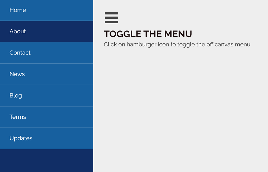
<li><a href='#'>Home</a></li>
<li class='active'><a href='#'>About</a></li>
<li><a href='#'>Contact</a></li>
<li><a href='#'>News</a></li>
<li><a href='#'>Blog</a></li>
<li><a href='#'>Terms</a></li>
<li><a href='#'>Updates</a></li>
</nav>
</div>
</div>
If you want to push the main area of the webpage when the sidebar menu opens, place your content inside the <div class='content'> container. Similarly, you can increase/decrease the number of links inside the nav tag according to your needs.
The CSS Styles
Now its time to style and functionalize the off canvas menu using CSS. So, here we’ll use CSS flex property for menu wrapper and set 100% its minimum height.
.wrapper {
  display: flex;
  min-height: 100%;
}
After that, define the styles for sidebar menu drawer and links. Keep it behind the scene using CSS transform property, we’ll reveal it on button click. So, the following is the CSS code snippet for the menu sidebar. If you want to customize it, you can set the custom background color and change other properties. If you want to set the custom width for drawer, just keep the same value for width and transformation (in minus).
.sidebar {
  transform: translate3d(-260px, 0px, 0px);
  position: absolute;
  width: 260px;
  background: #112e66;
  color: #eee;
  left: 0;
  height: 100%;
  transition: all .3s;
}

.menu li {
  padding: 10px;
  list-style: none;
  width: 0%;
  background: #17609f;
  border-bottom: 1px solid rgba(255, 255, 255, 0.2);
}
.menu li.active {
  background: #112e66;
}
.menu li a {
  color: #fff;
  display: block;
  text-decoration: none;
  padding: 5px 0px 5px 0;
  margin: 0 20px;
}
.menu li:hover{
    background: #0f4a7e;;
}
Now, define some styles for main contents that will be pushed while the menu opened. Here, you can change the padding and background property to customize it.
.content {
  flex: 1;
  padding: 80px 30px;
  background: #eee;
  transform: translate3d(0, 0, 0);
  transition: transform .3s;
}
Add the following CSS code snippet for swipe toggle function. If you want to change the size of the hamburger icon, just update the font value (that is font: 42px/42px fontawesome;).
input[data-function*='swipe'] {
  position: absolute;
  opacity: 0;
}

label[data-function*='swipe'] {
  position: absolute;
  top: 30px;
  left: 30px;
  z-index: 1;
  display: block;
  width: 42px;
  height: 42px;
  font: 42px/42px fontawesome;
  text-align: center;
  color: #444;
  cursor: pointer;
  transform: translate3d(0, 0, 0);
  transition: transform .3s;
}

input[data-function*='swipe']:checked ~ label[data-function*='swipe'] {
  transform: translate3d(260px, 0, 0);
}
Finally, the following CSS code pushes the main content when the menu is opened. If you want to increase/decrease menu toggle speed, update the transition value (transition: transform .3s;) from the above code.
input[data-function*='swipe']:checked ~ .content {
  transform: translate3d(245px, 0px, 0px);
}

input[data-function*='swipe']:checked ~ .sidebar {
  transform: translate3d(0px, 0px, 0px);
}
input[data-function*='swipe']:checked ~ .sidebar .menu li {
  width: 100%;
}
That’s all! I hope you like this pure CSS off canvas menu and successfully implemented into your web project. If you have any questions or suggestions feel free to comment below.