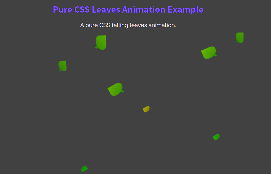
Sometimes, we need an animated background for a specific container or for the whole page. The simple solution is that we can use an animated image but the worst thing is that it slows down the page loading. Fortunately, CSS animations are the best solution to make simpler animations. So, in this tutorial, we are going to create falling leaves animation effects using pure CSS.
You can use this animation effect as a background of a container or body of the webpage. As you can see on the demo page, the leaves are falling down with random animation-delay that looks natural. In this leaves falling animation, the leaves are also designed with HTML and CSS. So, there is no image for a leaf and each leaf can be customized with CSS.
Likewise, you can also control the leaves falling speed and animation transition effects. In short, you can easily customize this project according to your needs. So, let’s get started with HTML to create the leaves falling effect.
Create HTML for Leaves
First of all, create a div element with an id “leaves” and place the 15 blank "<i></i>" elements inside it. We’ll style these "i" elements as leaves using CSS.
<div id="leaves">
  <i></i>
  <i></i>
  <i></i>
  <i></i>
  <i></i>
  <i></i>
  <i></i>
  <i></i>
  <i></i>
  <i></i>
  <i></i>
  <i></i>
  <i></i>
  <i></i>
  <i></i>
</div>
You can also place some other elements (like text or images etc.) inside the leaves container.
The CSS Styles
In CSS, first of all, target the "#leaves" id and set its relative position. This div element will contain all the leaves (designed with <i> tag). Define a 100% width and align the text to the right.
#leaves {
    position:relative;
    top:-50px;
    width:100%;
    text-align: right;
}
In order to shape a leaf, we’ll target the "i" element of the leaves container. Generally, you can set the custom size for the leaves by defining width and height values. Similarly, you can set the custom background color and box-shadow, etc. After specifying basic styles for a leaf, use the CSS skew transformation along with the border radius in order to make it a realistic leaf.
#leaves i {
    display: inline-block;
    width: 200px;
    height: 150px;
    background: linear-gradient(to bottom right, #309900, #005600);
    transform: skew(20deg);
    border-radius: 5% 40% 70%;
    box-shadow: inset 0px 0px 1px #222;
    border: 1px solid #333;
    z-index: 1;
    -webkit-animation: falling 5s 0s infinite;
}
Clone the leaves using CSS before and after pseudo-classes. Specify the leaf styles just like the above snippet, just define the different widths and heights to make a smaller leaf. You can also change other CSS properties to make a huge difference between leaves.
#leaves i:before {
  position: absolute;
  content: '';
  top: 117px;
  right: 9px;
  height: 27px;
  width: 32px;
  transform: rotate(49deg);
  border-radius: 0% 15% 15% 0%;
  border-top: 1px solid #222;
  border-bottom: 1px solid #222;
  border-left: 0px solid #222;
  border-right: 1px solid #222;
  background: linear-gradient(to right, rgba(0,100,0,1), #005600);
  z-index: 1;
}

#leaves i:after {
  content: '';
  height: 125px;
  width: 10px;
  background: linear-gradient(to right, rgba(0,0,0,.15), rgba(0,0,0,0));
  display: block;
  transform: rotate(125deg);
  position: absolute;
  left: 85px;
  border-radius:50%;
}
In order to customize each leaf, you can select a leaf using CSS nth-of-type selector and set the different sizes, colors, etc.
#leaves i:nth-of-type(n)    { height:23px; width:30px; }
#leaves i:nth-of-type(n):before { width:7px; height:5px; top:17px; right:1px; }
#leaves i:nth-of-type(n):after { width:2px; height:17px; left: 12px; top:0px; }

#leaves i:nth-of-type(2n+1)    { height:11px; width:16px; }
#leaves i:nth-of-type(2n+1):before { width:4px; height:3px; top:7px; right:0px; }
#leaves i:nth-of-type(2n+1):after { width:2px; height:6px; left: 5px; top:1px; }

#leaves i:nth-of-type(3n+2)  { height:17px; width:23px; }
#leaves i:nth-of-type(3n+2):before  { height:4px; width:4px; top:12px; right:1px; }
#leaves i:nth-of-type(3n+2):after  { height:10px; width:2px; top:1px; left:8px; }
Similarly, you can also set a different background color for a leaf. To do so, target the "i" tag as described above and define a gradient background color.
#leaves i:nth-of-type(n)    { background: linear-gradient(to bottom right, #309900, #005600); }
#leaves i:nth-of-type(2n+2)  { background: linear-gradient(to bottom right, #5e9900, #2b5600); }
#leaves i:nth-of-type(4n+1)  { background: linear-gradient(to bottom right, #990, #564500); }

#leaves i:nth-of-type(n)    { opacity: .7;}
#leaves i:nth-of-type(3n+1)  { opacity: .5;}
#leaves i:nth-of-type(3n+2)  { opacity: .3;}

#leaves i:nth-of-type(n)    {transform: rotate(180deg);}


#leaves i:nth-of-type(n) { -webkit-animation-timing-function:ease-in-out;}
Leaves Falling CSS Animation
After styling the leaves, now it’s time to animate them using CSS animation. In order to make a natural falling effect, we’ll create three falling animations and apply them to various leaves. So, create an animation with the name “falling”, “falling2”, “falling3” and define their keyframes as described below:
@-webkit-keyframes falling {

    0% {
        -webkit-transform:
            translate3d(300,0,0)
            rotate(0deg);
    }

    100% {
        -webkit-transform:
            translate3d(-350px,700px,0)
            rotate(90deg);
        opacity: 0;
    }
}

@-webkit-keyframes falling3 {
     0% {
        -webkit-transform:
            translate3d(0,0,0)
            rotate(-20deg);
    }

    100% {
        -webkit-transform:
            translate3d(-230px,640px,0)
            rotate(-70deg);
        opacity: 0;
    }
}

@-webkit-keyframes falling2 {
     0% {
        -webkit-transform:
            translate3d(0,0,0)
            rotate(90deg);
    }

    100% {
        -webkit-transform:
            translate3d(-400px,680px,0)
            rotate(0deg);
        opacity: 0;
    }
}
The "falling" animation has been defined in "i" element. Apply the "falling1" and "falling3" animation to some leaves with 5 seconds infinite animation.
#leaves i:nth-of-type(2n) { -webkit-animation: falling2 5s 0s infinite; }
#leaves i:nth-of-type(3n) { -webkit-animation: falling3 5s 0s infinite; }
Set a different duration for animation-delay in order to produce a realistic falling effect.
#leaves i:nth-of-type(n)   { -webkit-animation-delay: 1.9s;}
#leaves i:nth-of-type(2n)  { -webkit-animation-delay: 3.9s;}
#leaves i:nth-of-type(3n)  { -webkit-animation-delay: 2.3s;}
#leaves i:nth-of-type(4n)  { -webkit-animation-delay: 4.4s;}
#leaves i:nth-of-type(5n)  { -webkit-animation-delay: 5s;  }
#leaves i:nth-of-type(6n)  { -webkit-animation-delay: 3.5s;}
#leaves i:nth-of-type(7n)  { -webkit-animation-delay: 2.8s;}
#leaves i:nth-of-type(8n)  { -webkit-animation-delay: 1.5s;}
#leaves i:nth-of-type(9n)  { -webkit-animation-delay: 3.3s;}
#leaves i:nth-of-type(10n) { -webkit-animation-delay: 2.5s;}
#leaves i:nth-of-type(11n) { -webkit-animation-delay: 1.2s;}
#leaves i:nth-of-type(12n) { -webkit-animation-delay: 4.1s;}
#leaves i:nth-of-type(13n) { -webkit-animation-delay: 1s;  }
#leaves i:nth-of-type(14n) { -webkit-animation-delay: 4.7s;}
#leaves i:nth-of-type(15n) { -webkit-animation-delay: 3s;  }
You have done! hopefully, you found this tutorial helpful to create pure CSS falling leaves animation effects. If you have any questions or suggestions, let me know by comment below.