In this tutorial, we are going to create a zoom effect on hover for product image using pure CSS. Basically, this is a minimal zoom effect that reveals on mouseover. Besides the zoom effect, the caption overlay also displayed on hover.
Before going into depth, I’ll suggest you check out the final output of this project on the demo page. The images that we placed looks like a thumbnail image slider. But keep in mind, this tutorial focused only on the zoom effect. So, you need to write further coding in order to get your desired results.
The coding techniques used in this project are really simple. We used CSS transform scale property to zoom an image on hover. Well! Let’s get started with HTML to create an image zoom effect.
HTML Structure for Product Image Zoom Effect
The HTML structure for product image consists of two parts. The first part is the main image that will be zoom on hover. The second part is optional that displays other images of a product. You can skip the second part if you want a minimal zoom effect for one image only.
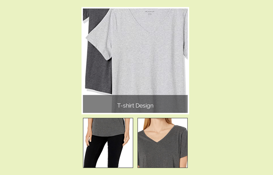
In HTML, you just need to create an image container with a class name "image-container" and place your image inside it. So, the following is the complete HTML code for product image:
<div class="image-container">
   <img src="img/image-3.jpg" />
   <div class="overlay">
      <p>T-shirt Design</p>
      <div></div>
   </div>
</div>
<div class="img-dock">
   <img src="img/image-1.jpg">
   <img src="img/image-2.jpg">
</div>
</div>
</div>
The CSS Styles
In regards to CSS styles, the very first thing is the outer wrapper of the image. Keep its overflow hidden and define the relative position. You can set the custom values for width and height according to your needs. Similarly, the border property is optional, you can set a border that will be displayed outside of the image.
.image-container{
  width: 300px;
  height: 300px;
  overflow: hidden;
  position: relative;
  border: 4px solid #fff;
  margin: 10px auto;
}
After that, define the styles for your product image. Keep its position value as absolute and define top & left values as mentioned below. Additionally, you need to transform your image that will be scaled up (zoom) on hover. Use the CSS transition property for smooth zoom.
.image-container img{
  /*tinkering with image bigger than parent div. Note: bad practice*/
  position: absolute;
  top: -190px;
  left: -110px;
  transform: scale(0.6);
  /*making the scaling smooth*/
  transition: transform 0.5s ease;
}
Now, target container’s image using CSS hover pseudo-selector and transform the scale value of the image. You can also change the cursor by defining cursor value as “zoom-in”, but that’s optional.
.image-container:hover img{
  transform: scale(0.80);
  cursor: zoom-in;
}
The CSS coding for zoom product image on hover has been done. Now its time to define CSS styles for image caption overlay. In order to reveal caption text on hover, we’ll keep the height value as 0. So, create the overlay styles as follows:
.overlay{
  position: absolute;
  bottom: 0;
  background: rgba(0,0,0,0.5);
  color: white;
  width: 100%;
  text-align: center;
  height: 0;
  transition: height 0.5s ease;
}
Now, define the height value as 50px inside the hover pseudo-class in order to display a caption on hover. You can increase/decrease height value if you wanted to customize the thickness of the caption overlay.
.image-container:hover .overlay{
  height: 50px;
}
Bottom Images Styles
You can also keep some images on the bottom of your main image. To do so, define CSS styles for “img-dock” selector as follows:
.img-dock{
    display: block;
    width: 300px;
    margin: 10px auto;
}
After that, define height and width values for the image. We kept a small size for these images to show as thumbnails. The other properties like border, margin, etc can be defined as your needs.
.img-dock img{
    display: inline-block;
    width: 140px;
    height: 140px;
    object-fit: cover;
    border: 1px solid #333;
    margin: 0 4px;
     transition: .5s;
}
Also, apply the zoom effect for these images by transforming scale value.
.img-dock img:hover{
   transform: scale(1.1);
    transition: .5s;
}
That’s all! I hope you have successfully implemented this simple zoom hover effect. If you need any further help please let me know by comment below.