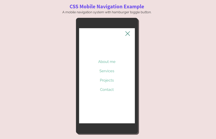
In this tutorial, you’ll come to know the easy way to build a simple mobile navigation menu using HTML and CSS. Basically, this is a responsive menu project that comes with an animated hamburger toggle menu icon. When a user clicks the menu button, it converted into a cross sign. All this done with CSS and a little use of jQuery.
This navigation is ideal for lite web projects, especially for mobile sites. The menu user interface is really simple and mobile-friendly. There is a logo container, hamburger icon inside the menu’s navbar, and main container for the navigation links.
On the other hand, the code for this menu is also simple and easy to implement. You can easily customize each component of the menu by minor changes in CSS values. So, let’s get started with HTML structure.
The HTML Structure
The HTML structure for this navigation system is simple and straightforward. You just need to create four main elements for the menu, a header, logo container, menu button, and navigation links. So, first of all, create an HTML header element and place a tags with the class name "logo" and "menuBtn" respectively inside it. Similarly, create an HTML nav element and place your site links wrapped with an unordered list inside it.
<header>
    <a href="#" class="logo">Brand</a>
    <a href="#" class="menuBtn">
        <span class="lines"></span>
    </a>
    <nav class="mainMenu">
        <ul>
            <li>
                <a href="#">About me</a>
            </li>
            <li>
                <a href="#">Services</a>
            </li>
            <li>
                <a href="#">Projects</a>
            </li>
            <li>
                <a href="#">Contact</a>
            </li>

        </ul>
    </nav>
</header>
Feel free to add more links in the above HTML structure as you need. You can also place your logo image inside the hyperlink that has a class name "logo".
CSS Styles for Mobile Navigation Menu
After creating HTML, now it’s time to style the navigation with CSS. So, target the very first element "header" and set its 50px height. Similarly, define the background color and CSS box-shadow property as described below.
header {
  background-color: #fff;
  background-color: rgba(255, 255, 255, 0);
  box-shadow: 0 1px 0 rgba(0, 0, 0, 0.2);
  height: 50px;
}
Now, specify the styles for the logo container. Define 20px font-size, color and padding value. Here, the important thing is the CSS line-height property that should be equivalent to the header height in order to set the logo in the middle of the navbar.
.logo {
  color: #fff;
  font-size: 20px;
  line-height: 50px;
  padding: 0 0 0 20px;
  text-transform: capitalize;
}
The "menuBtn" class is the wrapper element of the hamburger menu toggle button. This element contains a span element with a class name “lines”. Specify the following CSS styles for the hamburger icon. If you want to increase/decrease the size of the menu toggle button, you can set the custom values for the width and height that is 30px by default. Similarly, you can set the custom background color if you want to customize the color of the hamburger icon lines.
/* menu button */
.menuBtn {
  height: 30px;
  width: 30px;
  position: absolute;
  right: 20px;
  top: 10px;
  z-index: 101;
}
.menuBtn > span {
  background-color: #fff;
  border-radius: 1px;
  height: 2px;
  width: 100%;
  position: absolute;
  left: 50%;
  top: 50%;
  margin: -1px 0 0 -15px;
  -webkit-transition: height 100ms;
  transition: height 100ms;
}
.menuBtn > span:after,
.menuBtn > span:before {
  content: '';
  background-color: #fff;
  border-radius: 1px;
  height: 2px;
  width: 100%;
  position: absolute;
  left: 50%;
  margin-left: -15px;
  -webkit-transition: all 200ms;
  transition: all 200ms;
}
.menuBtn > span:after {
  top: -7px;
}
.menuBtn > span:before {
  bottom: -7px;
}
Create an extra class “act” that we’ll add to the hamburger icon to animate it. In order to turn the hamburger icon lines into the cross sign, we’ll use the CSS rotate transformation. So, define the styles for the "act" class as follows:
.menuBtn.act > span {
  height: 0;
}
.menuBtn.act > span:after,
.menuBtn.act > span:before {
  background-color: #008877;
  top: 1px;
}
.menuBtn.act > span:after {
  -webkit-transform: rotate(45deg);
          transform: rotate(45deg);
}
.menuBtn.act > span:before {
  -webkit-transform: rotate(-45deg);
          transform: rotate(-45deg);
}
Define the CSS for the main menu container, keep its absolute position, and 100% height and width in order to make it a full-screen element. Keep it hidden by defining opacity value as 0. Similarly, define the background color and top left values as mentioned in the following snippet.
.mainMenu {
  background-color: #fff;
  position: absolute;
  left: 0;
  top: 0;
  z-index: 100;
  height: 100%;
  width: 100%;
  display: table;
  text-align: center;
  opacity: 0;
  -webkit-transition: all 500ms cubic-bezier(0.68, -0.55, 0.265, 1.55);
  transition: all 500ms cubic-bezier(0.68, -0.55, 0.265, 1.55);
  -webkit-transform: scale(0);
          transform: scale(0);
}
We need another "act" class for the menu container to reveal when this class added to the menu. So, create a class name “act” and keep the opacity value as 1 in this class. Likewise, define the transform scale as 1 to make a zoom effect.
.mainMenu.act {
  opacity: 1;
  -webkit-transform: scale(1);
          transform: scale(1);
}
.mainMenu.act ul li {
  opacity: 1;
  -webkit-transform: translateX(0);
          transform: translateX(0);
}
Menu Navigation Links
After styling the basic components of the menu, now it’s time to style the navigational links that we placed in the HTML unordered list.
.mainMenu ul {
  display: table-cell;
  vertical-align: middle;
}
.mainMenu li {
  padding: 8px 0;
  -webkit-transition: all 400ms 510ms;
  transition: all 400ms 510ms;
  opacity: 0;
}
To make the menu attractive, we’ll animate the links. So, target the both odd and even list items using CSS nth-child selector and apply the following transformation.
.mainMenu li:nth-child(odd) {
  -webkit-transform: translateX(30%);
          transform: translateX(30%);
}
.mainMenu li:nth-child(even) {
  -webkit-transform: translateX(-30%);
          transform: translateX(-30%);
}
.mainMenu li:last-child {
  -webkit-transform: none;
          transform: none;
}
Target the anchor element of the menu, display it as inline-block, define color, and font-size. You can set the custom value for these CSS properties if you want to customize the menu links.
.mainMenu a {
  color: #19b698;
  display: inline-block;
  font-size: 18px;
}
.mainMenu a.suBtn {
  color: #fff;
}
That’s all! I hope you have successfully implemented this CSS mobile navigation menu into your project. If you have any questions or suggestions related to this menu, feel free to comment below.