In web designing, a loader is a visual element that displays when page content still loading. It gets users’ attention and makes it easier for them to wait for the page to open. It may be an animated icon, circular preloader, or simple “Loading..” or “Please wait…” text. In this tutorial, you’ll come to know how to create such a preloader with loading text animation using HTML and CSS.
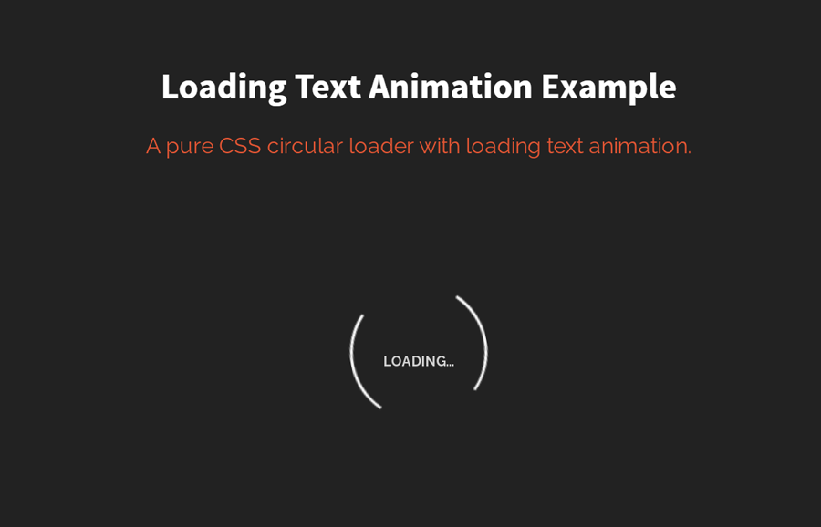
As you have seen on the above image, there is a “Loading..” text inside a two-sided bordered circle. There are two different animations and text effects, circle continuously rotates while loading text smoothly blinking (fade in and out). Well! You can check it on the demo.
HTML Structure
The HTML structure is consists of three div elements one of them dedicated to the circular loader, the second contains the loading text and the third is the wrapper of these two elements. So, create a div element with a class name “loading-container” and place 2 another div (with the following mentioned attributes) inside it.
<div class="loading-container">
   <div class="loading"></div>
   <div id="loading-text">loading...</div>
</div>
If you want to add anything else along with the circular loader, you can create custom HTML elements just after the div element that has a class name "loading-text". By doing so, you’ll also need some additional CSS styles for your elements.
Basic CSS Styles
In CSS, define some basic CSS styles for the loading container. Align this container to the center by defining the left and right margin value as “auto”. Set dark background-color and keep the white text.
.loading-container{
   margin: 40px auto;
   background: #333333;
   color: #fff;
 }
Now, specify the style for the “loading” class. Define border property as mentioned below to make it a circular loader. Likewise, apply the "rotate-loading" animation (that we’ll create next) with the browser vendor prefixes. Define the transform-origin CSS property in order to rotate the circle from the center.
        .loading {
            border: 2px solid transparent;
            border-color: transparent #fff transparent #FFF;
            -moz-animation: rotate-loading 1.5s linear 0s infinite normal;
            -moz-transform-origin: 50% 50%;
            -o-animation: rotate-loading 1.5s linear 0s infinite normal;
            -o-transform-origin: 50% 50%;
            -webkit-animation: rotate-loading 1.5s linear 0s infinite normal;
            -webkit-transform-origin: 50% 50%;
            animation: rotate-loading 1.5s linear 0s infinite normal;
            transform-origin: 50% 50%;
        }

        .loading-container:hover .loading {
            border-color: transparent #E45635 transparent #E45635;
        }
        .loading-container:hover .loading,
        .loading-container .loading {
            -webkit-transition: all 0.5s ease-in-out;
            -moz-transition: all 0.5s ease-in-out;
            -ms-transition: all 0.5s ease-in-out;
            -o-transition: all 0.5s ease-in-out;
            transition: all 0.5s ease-in-out;
        }
After that, define the CSS style for loading text. Here the important thing is the opacity property that should be 0. Keep its absolute position, define the width, set the top value as 0, and align text to the center. Similarly, apply the "loading-text-opacity" animation. The other properties like color, font-size, font-family are optional and can be defined according to your needs.
        #loading-text {
            -moz-animation: loading-text-opacity 2s linear 0s infinite normal;
            -o-animation: loading-text-opacity 2s linear 0s infinite normal;
            -webkit-animation: loading-text-opacity 2s linear 0s infinite normal;
            animation: loading-text-opacity 2s linear 0s infinite normal;
            color: #ffffff;
            font-family: "Helvetica Neue, "Helvetica", ""arial";
            font-size: 10px;
            font-weight: bold;
            margin-top: 45px;
            opacity: 0;
            position: absolute;
            text-align: center;
            text-transform: uppercase;
            top: 0;
            width: 100px;
        }
The CSS coding for the basic layout of the loader has been done. Now its time to animate the loader by defining CSS keyframes for circular loader rotation and loading text fading animation.
CSS Animation Keyframes for Loading Text
Add the following keyframes rule for the circular loader into your project. This CSS code snippet rotates the circle from 0° to 360°.
@keyframes rotate-loading {
            0%  {transform: rotate(0deg);-ms-transform: rotate(0deg); -webkit-transform: rotate(0deg); -o-transform: rotate(0deg); -moz-transform: rotate(0deg);}
            100% {transform: rotate(360deg);-ms-transform: rotate(360deg); -webkit-transform: rotate(360deg); -o-transform: rotate(360deg); -moz-transform: rotate(360deg);}
        }

        @-moz-keyframes rotate-loading {
            0%  {transform: rotate(0deg);-ms-transform: rotate(0deg); -webkit-transform: rotate(0deg); -o-transform: rotate(0deg); -moz-transform: rotate(0deg);}
            100% {transform: rotate(360deg);-ms-transform: rotate(360deg); -webkit-transform: rotate(360deg); -o-transform: rotate(360deg); -moz-transform: rotate(360deg);}
        }

        @-webkit-keyframes rotate-loading {
            0%  {transform: rotate(0deg);-ms-transform: rotate(0deg); -webkit-transform: rotate(0deg); -o-transform: rotate(0deg); -moz-transform: rotate(0deg);}
            100% {transform: rotate(360deg);-ms-transform: rotate(360deg); -webkit-transform: rotate(360deg); -o-transform: rotate(360deg); -moz-transform: rotate(360deg);}
        }

        @-o-keyframes rotate-loading {
            0%  {transform: rotate(0deg);-ms-transform: rotate(0deg); -webkit-transform: rotate(0deg); -o-transform: rotate(0deg); -moz-transform: rotate(0deg);}
            100% {transform: rotate(360deg);-ms-transform: rotate(360deg); -webkit-transform: rotate(360deg); -o-transform: rotate(360deg); -moz-transform: rotate(360deg);}
        }

        @keyframes rotate-loading {
            0%  {transform: rotate(0deg);-ms-transform: rotate(0deg); -webkit-transform: rotate(0deg); -o-transform: rotate(0deg); -moz-transform: rotate(0deg);}
            100% {transform: rotate(360deg);-ms-transform: rotate(360deg); -webkit-transform: rotate(360deg); -o-transform: rotate(360deg); -moz-transform: rotate(360deg);}
        }

        @-moz-keyframes rotate-loading {
            0%  {transform: rotate(0deg);-ms-transform: rotate(0deg); -webkit-transform: rotate(0deg); -o-transform: rotate(0deg); -moz-transform: rotate(0deg);}
            100% {transform: rotate(360deg);-ms-transform: rotate(360deg); -webkit-transform: rotate(360deg); -o-transform: rotate(360deg); -moz-transform: rotate(360deg);}
        }

        @-webkit-keyframes rotate-loading {
            0%  {transform: rotate(0deg);-ms-transform: rotate(0deg); -webkit-transform: rotate(0deg); -o-transform: rotate(0deg); -moz-transform: rotate(0deg);}
            100% {transform: rotate(360deg);-ms-transform: rotate(360deg); -webkit-transform: rotate(360deg); -o-transform: rotate(360deg); -moz-transform: rotate(360deg);}
        }

        @-o-keyframes rotate-loading {
            0%  {transform: rotate(0deg);-ms-transform: rotate(0deg); -webkit-transform: rotate(0deg); -o-transform: rotate(0deg); -moz-transform: rotate(0deg);}
            100% {transform: rotate(360deg);-ms-transform: rotate(360deg); -webkit-transform: rotate(360deg); -o-transform: rotate(360deg); -moz-transform: rotate(360deg);}
        }
Similarly, add the following CSS keyframes for loading text fading animation.
        @keyframes loading-text-opacity {
            0%  {opacity: 0}
            20% {opacity: 0}
            50% {opacity: 1}
            100%{opacity: 0}
        }

        @-moz-keyframes loading-text-opacity {
            0%  {opacity: 0}
            20% {opacity: 0}
            50% {opacity: 1}
            100%{opacity: 0}
        }

        @-webkit-keyframes loading-text-opacity {
            0%  {opacity: 0}
            20% {opacity: 0}
            50% {opacity: 1}
            100%{opacity: 0}
        }

        @-o-keyframes loading-text-opacity {
            0%  {opacity: 0}
            20% {opacity: 0}
            50% {opacity: 1}
            100%{opacity: 0}
        }
Everything has been done! I hope you found this tutorial helpful. If you have any questions or suggestions, let me know by comment below.