Today, we’re going to create an infinite carousel with next/previous buttons and dots navigation using pure CSS. Similarly, we’ll also add image captions and a background image for each slide of the carousel. The final output of this project can be browsed on the demo page.
As you’ve seen on the demo page, the slide began from first after reaching last. That’s all done without using the JavaScript loop, however, it works similarly. Although it’s a pure CSS multifunctional carousel, if you wanted to execute JavaScript callback functions, you can do that with a little bit of hard work.
Anyhow, it’s the best choice to use this image slider as a general-purpose infinite carousel. Each element of this carousel can be customized according to your needs with a minor changing of CSS styles. OK! let’s get started with HTML to integrate infinite carousel.
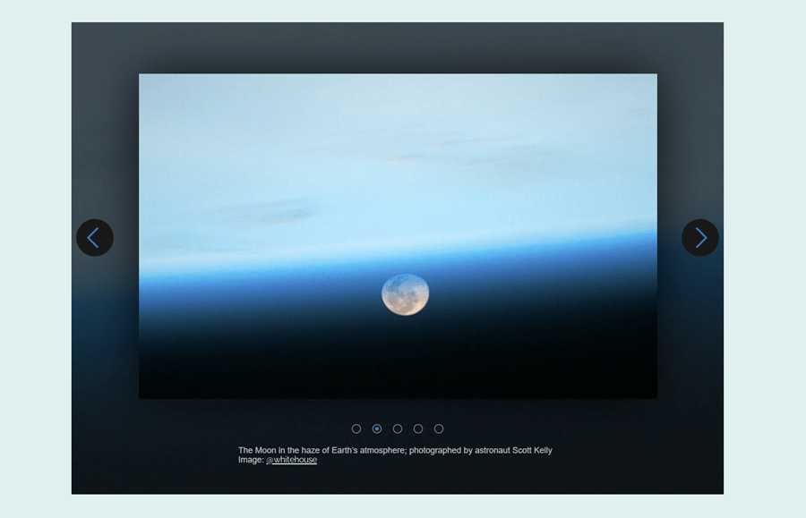
Infinite Carousel CSS with Dots Navigation Preview
The HTML Structure
The HTML structure for an infinite carousel consists of three parts that are slides, arrows (next & previous) buttons, and dots navigation. Before each slide, there is a radio input that used to switch the slide. Similarly, the label tags (associated with inputs) are used for buttons and bullets navigation. The complete HTML for the infinite carousel is as follows:
<section class="carousel">
   <input class="carousel__input" type="radio" id="carousel__slide--1" name="carousel" aria-hidden="true" hidden="" checked="checked">
   <div class="carousel__slide" style="background-image:url(https://s3-us-west-2.amazonaws.com/s.cdpn.io/334248/earth_back_1.jpg)">
      <img src="https://s3-us-west-2.amazonaws.com/s.cdpn.io/334248/earth_front_1.jpg">
      <div class="carousel__caption">
         <p>Csption goes here</p>
      </div>
   </div>
   <input class="carousel__input" type="radio" id="carousel__slide--2" name="carousel" aria-hidden="true" hidden="">
   <div class="carousel__slide" style="background-image:url(https://s3-us-west-2.amazonaws.com/s.cdpn.io/334248/earth_back_2.jpg)">
      <img src="https://s3-us-west-2.amazonaws.com/s.cdpn.io/334248/earth_front_2.jpg">
      <div class="carousel__caption">
         <p>Csption goes here</p>
      </div>
   </div>
   <input class="carousel__input" type="radio" id="carousel__slide--3" name="carousel" aria-hidden="true" hidden="">
   <div class="carousel__slide" style="background-image:url(https://s3-us-west-2.amazonaws.com/s.cdpn.io/334248/earth_back_3.jpg)">
      <img src="https://s3-us-west-2.amazonaws.com/s.cdpn.io/334248/earth_front_3.jpg">
      <div class="carousel__caption">
         <p>Csption goes here</p>
      </div>
   </div>
   <input class="carousel__input" type="radio" id="carousel__slide--4" name="carousel" aria-hidden="true" hidden="">
   <div class="carousel__slide" style="background-image:url(https://s3-us-west-2.amazonaws.com/s.cdpn.io/334248/earth_back_4.jpg)">
      <img src="https://s3-us-west-2.amazonaws.com/s.cdpn.io/334248/earth_front_4.jpg">
      <div class="carousel__caption">
         <p>Csption goes here</p>
      </div>
   </div>
   <input class="carousel__input" type="radio" id="carousel__slide--5" name="carousel" aria-hidden="true" hidden="">
   <div class="carousel__slide" style="background-image:url(https://s3-us-west-2.amazonaws.com/s.cdpn.io/334248/earth_back_5.jpg)">
      <img src="https://s3-us-west-2.amazonaws.com/s.cdpn.io/334248/earth_front_5.jpg">
      <div class="carousel__caption">
         <p>Csption goes here</p>
      </div>
   </div>
   <!-- ARROWS -->
   <label for="carousel__slide--5" class="carousel__arrow carousel__arrow--prev carousel__arrow--1"></label>
   <label for="carousel__slide--5" class="carousel__arrow carousel__arrow--next carousel__arrow--4"></label>
   <label for="carousel__slide--4" class="carousel__arrow carousel__arrow--prev carousel__arrow--5"></label>
   <label for="carousel__slide--4" class="carousel__arrow carousel__arrow--next carousel__arrow--3"></label>
   <label for="carousel__slide--3" class="carousel__arrow carousel__arrow--prev carousel__arrow--4"></label>
   <label for="carousel__slide--3" class="carousel__arrow carousel__arrow--next carousel__arrow--2"></label>
   <label for="carousel__slide--2" class="carousel__arrow carousel__arrow--prev carousel__arrow--3"></label>
   <label for="carousel__slide--2" class="carousel__arrow carousel__arrow--next carousel__arrow--1"></label>
   <label for="carousel__slide--1" class="carousel__arrow carousel__arrow--prev carousel__arrow--2"></label>
   <label for="carousel__slide--1" class="carousel__arrow carousel__arrow--next carousel__arrow--5"></label>
   <!-- BULLETS -->
   <ol class="carousel__bullets">
      <li>
         <label for="carousel__slide--1" class="carousel__bullets--bullet"></label>
      </li>
      <li>
         <label for="carousel__slide--2" class="carousel__bullets--bullet"></label>
      </li>
      <li>
         <label for="carousel__slide--3" class="carousel__bullets--bullet"></label>
      </li>
      <li>
         <label for="carousel__slide--4" class="carousel__bullets--bullet"></label>
      </li>
      <li>
         <label for="carousel__slide--5" class="carousel__bullets--bullet"></label>
      </li>
   </ol>
</section>
The CSS for Infinite Carousel
In CSS, first of all, define styles for the main wrapper of the carousel. Define the width and height values as 100% and 504px respectively. The most important properties for this selector are position and overflow. You need to keep its position to relative and hidden overflow. Likewise, define the image width and height according to the carousel.
.carousel {
	position: relative;
	width: 100%;
	height: 504px;
	margin: 0;
	padding: 0;
	overflow: hidden;
	transform: translateZ(0px); /* stops flickering */
}
.carousel__buffer {
	display: none;
}
.carousel__buffer img {
	margin: 55px auto 18px;
	width: 553px;
	height: 347px;
}
After that, create CSS styles for slides (.carousel__slide selector). Keep the absolute position, opacity to 0, and 100% width and height. Similarly, define the background-size and set the auto overflow.
.carousel__slide {
	position: absolute;
	opacity: 0;
	width: 100%;
	height: 100%;
	-webkit-transition: opacity 1s;
	-moz-transition: opacity 1s;
	-o-transition: opacity 1s;
	transition: opacity 1s;
	background: no-repeat center top;
	background-size: cover;
	overflow: auto;
}
.carousel__slide img {
	display: block;
	position: relative;
	margin: 55px auto 50px;
	width: 553px;
	height: 347px;
	-webkit-box-shadow: 0 0 50px 0 rgba(0,0,0,0.8);
	-moz-box-shadow: 0 0 50px 0 rgba(0,0,0,0.8);
	box-shadow: 0 0 50px 0 rgba(0,0,0,0.8);
}

.carousel__input:checked + .carousel__slide {
	position: static;
	opacity: 1;
}
Now define styles for the next and previous arrows buttons as follows:
.carousel__arrow {
	position: absolute;
	display: none;
	cursor: pointer;
	background: #191919;
	top: 210px;
	left: 50%;
	width: 40px;
	height: 40px;
	border-radius: 50%;
	z-index: 10;
}
.carousel__arrow:before {
	position: absolute;
	content: "";
	padding: 8px; /* Arrow size */
	box-shadow: 1px -1px 0 1px #0072bc inset;
	-webkit-box-shadow: 2px -2px #0072bc inset;
	-moz-box-shadow: 2px -2px #0072bc inset;
	border: solid transparent;
	border-width: 0 0 2rem 2rem;
}
.carousel__arrow--prev {
	margin-left: -343px;
}
.carousel__arrow--prev:before {
	transform: rotate(45deg);
	margin: -4px 0 0 -24px;
}
.carousel__arrow--next {
	margin-left: 303px;
}
.carousel__arrow--next:before {
	transform: rotate(225deg);
	margin: -4px 0 0 15px;
}
Display each arrow button for the checked slide.
#carousel__slide--1:checked ~ .carousel__arrow--1,
#carousel__slide--2:checked ~ .carousel__arrow--2,
#carousel__slide--3:checked ~ .carousel__arrow--3,
#carousel__slide--4:checked ~ .carousel__arrow--4,
#carousel__slide--5:checked ~ .carousel__arrow--5 {
	display: block;
}
Style the bullets/dots navigation just below code snippet. If you want to increase/decrease dots size, you can set the custom values for width and height that are 10px by default.
.carousel__bullets {
	list-style: none;
	margin: 12px auto -6px;
	padding: 0;
	position: absolute;
	top: 408px;
	left: 0;
	right: 0;
	text-align: center;
	z-index: 10;
}
.carousel__bullets li {
	display: inline-block;
}
.carousel__bullets--bullet {
	cursor: pointer;
	display: block;
	width: 10px;
	height: 10px;
	margin: 0 4px 0;
	border-radius: 50%;
	background: rgba(0,0,0,0);
	border: 1px solid #6e7c7f;
}
Set the background color and box-shadow for the active dot.
#carousel__slide--1:checked ~ .carousel__arrow--1 ~ .carousel__bullets li:nth-child(1) .carousel__bullets--bullet,
#carousel__slide--2:checked ~ .carousel__arrow--2 ~ .carousel__bullets li:nth-child(2) .carousel__bullets--bullet,
#carousel__slide--3:checked ~ .carousel__arrow--3 ~ .carousel__bullets li:nth-child(3) .carousel__bullets--bullet,
#carousel__slide--4:checked ~ .carousel__arrow--4 ~ .carousel__bullets li:nth-child(4) .carousel__bullets--bullet,
#carousel__slide--5:checked ~ .carousel__arrow--5 ~ .carousel__bullets li:nth-child(5) .carousel__bullets--bullet {
	background: #0072bc;
	box-shadow: inset 0 0 0 2px #12171b; /* Separates blue dot from border */
}
Now, set some CSS styles for image captions. Define font size and family for caption paragraphs. Likewise, you can also define some styles for hyperlinks in order to make them different from the text.
.carousel__caption {
	width: 340px;
	max-width: 80%;
	margin: 24px auto 0;
}
.carousel__caption p {
	font: 400 9px "Roboto", sans-serif !important;
	color: #c1c1c1 !important;
	text-align: left;
}
.carousel__caption a {
	text-decoration: underline;
	color: #fff;
}
Finally, make the carousel responsive by using CSS media queries. The following CSS code snippet define the carousel styles for mobile/tab screens. You can change any value to get the desired result on a small screen device.
@media screen and (max-width: 690px) {
	.carousel__buffer {
		width: 100%;
		position: relative;
		display: inline-block;
		visibility: hidden;
		z-index: -1;
		padding-bottom: 120px;
	}
	.carousel__buffer img {
		width: 100%;
		height: auto;
		-webkit-box-shadow: none;
		-moz-box-shadow: none;
		box-shadow: none;
		margin-top: 0;
	}
	.carousel {
		height: auto;
		overflow: visible;
	}
	.carousel__slide {
		-webkit-transition: opacity 0s;
		-moz-transition: opacity 0s;
		-o-transition: opacity 0s;
		transition: opacity 0s;
		position: absolute;
		top:0;
		height: auto;
		background: transparent none !important;
	}
	.carousel__slide img {
		width: 100%;
		height: auto;
		-webkit-box-shadow: none;
		-moz-box-shadow: none;
		box-shadow: none;
		margin-top: 0;
	}
	.carousel__arrow {
		top: calc(50% - 70px);
	}
	.carousel__arrow--prev {
		margin-left: -48%;
	}
	.carousel__arrow--next {
		margin-left: calc(48% - 40px);
	}
	.carousel__bullets {
		top: auto;
		bottom: 40px;
	}
}
You have all done! Let us know by comment below if you’ve successfully implemented this pure CSS carousel in your project.