Are you looking for the HTML & CSS source code for an image slideshow? Well! you are in the right place, here you’ll find complete source code for the image slideshow with a step-by-step implementation/customization guide.
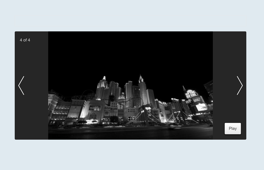
This image slideshow is based on pure CSS that comes with slides numbering, next/previous, and play button. Users can easily switch to the next or previous slideshow item by clicking the arrow button. Similarly, it has an autoplay mode in which images slide with fading animation.
This general-purpose image slideshow can be used for any personal portfolio for the photography website template. Likewise, it can be implemented in the hero section of the webpage.
Prepare HTML Code for Image Slideshow
What do you need to do in HTML to create an image slideshow? Good! let’s see how we do HTML coding. But before this, have a look at the five main components of the slideshow and classes name that we’ll use in the HTML structure:
- Main wrapper (
"slideshow") - Image area/slideshow item (
"slideshow-item") - Next & previous buttons (
"arrow") - Slide numbering (
"progress") - Play button (
"play")
Besides these main components, we’ll also need some supportive elements in order to get the working of the slideshow. So, first of all, create a section with a class name "slideshow" and place span elements (according to the number of slide items) with id target-n. After that, create a hyperlink with “#” href and define its class name "play". This link/button will be used to play/pause the slideshow.
Now, create a div element with a class name "slideshow-item" and place an image, slide number "progress" element, and next/previous links inside it. Repeat the same method for the next slideshow item. Therefore, the complete HTML structure for the image slideshow is as follows:
<div class="property">
   <section class="slideshow" style="height: 420px;">
      <span id="target-1"></span>
      <span id="target-2"></span>
      <span id="target-3"></span>
      <span id="target-4"></span>
      <a href="#" class="play">play</a>
      <div class="slideshow-item item-1">
         <div class="progress">1 of 4</div>
         <img src="https://lorempixel.com/g/600/420" alt="" />
         <a href="#target-4" class="arrow arrow-prev"></a>
         <a href="#target-2" class="arrow arrow-next"></a>
      </div>
      <div class="slideshow-item item-2">
         <div class="progress">2 of 4</div>
         <img src="https://lorempixel.com/g/500/420" alt="" />
         <a href="#target-1" class="arrow arrow-prev"></a>
         <a href="#target-3" class="arrow arrow-next"></a>
      </div>
      <div class="slideshow-item item-3">
         <div class="progress">3 of 4</div>
         <img src="https://lorempixel.com/g/480/420" alt="" />
         <a href="#target-2" class="arrow arrow-prev"></a>
         <a href="#target-4" class="arrow arrow-next"></a>
      </div>
      <div class="slideshow-item item-4">
         <div class="progress">4 of 4</div>
         <img src="https://lorempixel.com/g/640/420" alt="" />
         <a href="#target-3" class="arrow arrow-prev"></a>
         <a href="#target-1" class="arrow arrow-next"></a>
      </div>
   </section>
</div>
You can also add some extra elements inside the slideshow-item tag. Such as caption text for your images.
Apply Basic CSS Styles
You need to implement some CSS styles in order to buildup the basic layout of the image slideshow. So, first of all, define the styles for the outer wrapper of the slideshow. Specify its width as 900px and set margin auto in order to align the middle of the page.
.property {
  width: 900px;
  margin: auto;
}
Likewise, specify styles for slideshow class. Define a background color, border-radius, and keep its position relative.
.slideshow {
  background: #262626;
  border-radius: 4px;
  margin-bottom: 20px;
  position: relative;
}
We need to set the absolute position for the slideshow items as we are going to animate them. So, specify the absolute value for the position property and set 0 value for the top, bottom left, and right in order to keep the slide item to the center. Define the transition property for the smoothness.
.slideshow-item {
  position: absolute;
  top: 0;
  bottom: 0;
  left: 0;
  right: 0;
  opacity: 0;
  -webkit-transition: all 0.2s ease-in-out;
  transition: all 0.2s ease-in-out;
}
Now, make the slideshow image responsive by defining the 100% value for the width. Similarly, keep the margin value to the auto and display as a block. Besides these CSS properties, you can also define some additional styles in order to customize the slideshow images. For example, you can set border, shadow, etc.
.slideshow-item img {
  width: 100%;
  display: block;
  margin: auto;
}
After that, create CSS styles for the previous and the next arrow button. The background property holds the data of an arrow image icon.
.arrow {
  position: absolute;
  top: 0;
  display: block;
  width: 50px;
  height: 100%;
  background: url("data:image/svg+xml,%3Csvg%20viewBox%3D%220%200%206%2016%22%20width%3D%226%22%20height%3D%2216%22%20xmlns%3D%22http%3A%2F%2Fwww.w3.org%2F2000%2Fsvg%22%3E%3Cpath%20d%3D%22m5%201-4%207%204%207%22%20fill%3D%22none%22%20stroke-width%3D%22.8%22%20opacity%3D%22.3%22%20stroke%3D%22%23000%22%20stroke-linecap%3D%22square%22%2F%3E%3Cpath%20d%3D%22m5%201-4%207%204%207%22%20fill%3D%22none%22%20stroke-width%3D%22.5%22%20stroke%3D%22%23fff%22%20stroke-linecap%3D%22square%22%2F%3E%3C%2Fsvg%3E%0A") no-repeat center/30px;
}
.arrow-next {
  right: 0;
  -webkit-transform: rotate(180deg);
          transform: rotate(180deg);
}
The "progress" class is the container of the slideshow items numbers. Set its absolute position and set 20px value for the top and left properties respectively. You can place this number container to any corner of the slideshow. The values for the color and the font-family can be defined according to your needs.
.progress {
  position: absolute;
  top: 20px;
  left: 20px;
  color: #ccc;
  font-family: sans-serif;
}
Actually, the play button is a link element. So, we need to convert it into a button. To do so, display it as inline-block, define an absolute position, and specify the background color. Likewise, define the 8px 16px value for the padding property and set 1px border. Similarly, declare other properties as mentioned below.
.play {
  display: inline-block;
  position: absolute;
  bottom: 0;
  right: 20px;
  margin-bottom: 20px;
  padding: 8px 16px;
  background: -webkit-gradient(linear, left top, left bottom, from(white), to(#e6e6e6));
  background: linear-gradient(white, #e6e6e6);
  font-family: sans-serif;
  text-transform: capitalize;
  text-decoration: none;
  border-radius: 4px;
  color: #333;
  border: 1px solid #1a1a1a;
  opacity: .3;
  z-index: 5;
  cursor: default;
  -webkit-transition: all 750ms ease;
  transition: all 750ms ease;
}
Use the CSS target pseudo-selector for the play button class in order to play the slideshow items.
[id^="target"]:target ~ .play {
  -webkit-transition: all 750ms ease;
  transition: all 750ms ease;
  opacity: 1;
  cursor: pointer;
  box-shadow: 0 2px 4px rgba(0, 0, 0, 0.7);
}

[id^="target"] {
  display: none;
}
.item-1 {
  z-index: 2;
  opacity: 1;
}

*:target ~ .item-1 {
  opacity: 0;
}

#target-1:target ~ .item-1 {
  opacity: 1;
}

#target-2:target ~ .item-2,
#target-3:target ~ .item-3,
#target-4:target ~ .item-4 {
  z-index: 3;
  opacity: 1;
}
Create Slideshow Animation
The animation is the backbone of the slideshow to switch the images. Before defining the animation keyframes, let’s understand how to create/apply animation to slide the images. First, count the number of slideshow-items that you’ve placed in HTML and then decide how much delay time should a slide take before switching to the next slide.
Like, we’ve placed 4 slideshow items and we want to set 4 seconds for each image. Then the total animation time will be 16 seconds (slideshow-items * delay time). Similarly, the animation keyframes should be as follows:
@-webkit-keyframes slideshow {
  0%, 30%, 100% {
    opacity: 0;
  }
  5%, 25% {
    opacity: 1;
  }
}

@keyframes slideshow {
  0%, 30%, 100% {
    opacity: 0;
  }
  5%, 25% {
    opacity: 1;
  }
}
Now, specify the animation for each slide item with delay time as described below. If you want to play your slideshow for one time only, use the “forwards” value instead of infinite. Similarly, you can increase/decrease slideshow speed by changing animation delay time.
.item-1 {
  -webkit-animation: slideshow 16s ease 0s infinite;
          animation: slideshow 16s ease 0s infinite;
}
.item-2 {
  -webkit-animation: slideshow 16s ease 4s infinite;
          animation: slideshow 16s ease 4s infinite;
}
.item-3 {
  -webkit-animation: slideshow 16s ease 8s infinite;
          animation: slideshow 16s ease 8s infinite;
}
.item-4 {
  -webkit-animation: slideshow 16s ease 12s infinite;
          animation: slideshow 16s ease 12s infinite;
}
In order to switch the images on the next previous button click, use the CSS target pseudo-selector with each item and disable slideshow animation as described below:
#target-1:target ~ .item-1 {
  opacity: 1 !important;
  -webkit-animation: none;
          animation: none;
}
#target-1:target ~ .item-2, #target-1:target ~ .item-3, #target-1:target ~ .item-4 {
  opacity: 0;
  -webkit-animation: none;
          animation: none;
}

#target-2:target ~ .item-2 {
  opacity: 1 !important;
  -webkit-animation: none;
          animation: none;
}
#target-2:target ~ .item-1, #target-2:target ~ .item-3, #target-2:target ~ .item-4 {
  opacity: 0;
  -webkit-animation: none;
          animation: none;
}

#target-3:target ~ .item-3 {
  opacity: 1 !important;
  -webkit-animation: none;
          animation: none;
}
#target-3:target ~ .item-1, #target-3:target ~ .item-2, #target-3:target ~ .item-4 {
  opacity: 0;
  -webkit-animation: none;
          animation: none;
}

#target-4:target ~ .item-4 {
  opacity: 1 !important;
  -webkit-animation: none;
          animation: none;
}
#target-4:target ~ .item-1, #target-4:target ~ .item-2, #target-4:target ~ .item-3 {
  opacity: 0;
  -webkit-animation: none;
          animation: none;
}
You have done it. Hopefully, you’ve successfully created an image slideshow using this HTML and CSS code example. If you have any questions or suggestions related to CSS image slideshow/slider let me know by comment below.
This demo is not working. Please check. I’m using Firefox.
https://codeconvey.com/i/image-slideshow-in-html-css-code/
Dk, The demo is working fine. The only issue is the photos not loading due to the external source website having some issues. You can download the source file and replace the images with your own and it will start working fine 🙂
Let me know if you still have any issues. Thanks
It appears adding images (we will have over 100!) will require quite a lot. There are quite a few references to the four current options in Style.css. Is there any quick way to add images? Probably not, but I had to ask. Thanks for the code, by the way!