To make a button round in CSS, you can use the border-radius property. This property allows you to define the roundness of the corners of an element, such as a button. By setting the border-radius to a value of 50%, the button will become a circle.
You can also use pixels or other units to adjust the roundness to your desired level. Additionally, you can use the :hover and :active selectors to change the button’s style when the user interacts with it. For example, you can change the background color or border-radius when the button is hovered over or clicked.
In this article, we’ll be showing you how to create a round button using CSS. We’ll cover the basic syntax and some examples to help you get started. Once you’ve learned how to create a round button, you can easily customize it to match your website’s design.
We’ll also show you how to use the :hover and :active selectors to change the button’s style. With a little bit of CSS knowledge and these tips, you’ll be able to create beautiful, functional buttons for your website in no time.
How Do I Round a Button Corner in CSS?
To round a button corner in CSS and HTML, you can use the border-radius property. This property allows you to define the roundness of the corners of an element, such as a button. By setting the border-radius to a specific value, you can round any corner of the button.
In HTML, you can create a button using the <button> or <input> elements.
<button>My Button</button>
In CSS, you can use the border-radius property to round one or more corners of the button. To round all four corners, you can set the border-radius to the same value for all four corners.
button {
  border-radius: 20px;
}
To round only certain corners of the button, you can use the border-top-left-radius, border-top-right-radius, border-bottom-left-radius, and border-bottom-right-radius properties.
button {
  border-top-left-radius: 20px;
  border-top-right-radius: 20px;
}
Additionally, you can use the :hover and :active selectors to change the button’s style when the user interacts with it. For example, you can change the background color or border-radius when the button is hovered over or clicked to make the Cool CSS Buttons.
You can combine these properties to have a different radius for different corners, which gives you more flexibility to design your button as per your needs.
button {
  border-top-left-radius: 10px;
  border-top-right-radius: 20px;
  border-bottom-left-radius: 30px;
  border-bottom-right-radius: 40px;
}
How to Make Button Round CSS & HTML
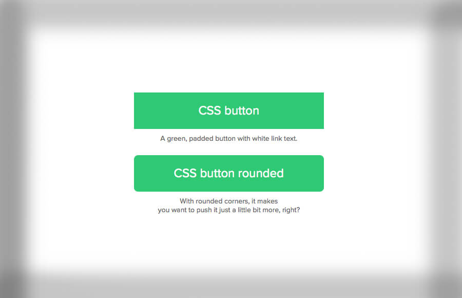
In addition to the border-radius property, you can also use other CSS properties to style your button. For example, you can use the background-color property to change the color of the button, the font-size property to change the size of the text, and the padding property to adjust the spacing between the button and its text. You can also use CSS box-shadow property to add a shadow effect to the button, making it look more three-dimensional.
To create a round button, you can use the following CSS code:
button {
  border-radius: 50%;
  background-color: #4CAF50;
  color: white;
  padding: 15px 32px;
  text-align: center;
  text-decoration: none;
  display: inline-block;
  font-size: 16px;
  margin: 4px 2px;
  cursor: pointer;
}
You can also use the :hover and :active selectors to change the button’s style when the user interacts with it. For example, you can change the background color or border-radius when the button is hovered over or clicked.
button:hover {
  background-color: #3e8e41;
}
button:active {
  box-shadow: 0 5px #666;
  transform: translateY(4px);
}
CSS Circle Button with Icon
Creating a CSS circle button with an icon using CSS and HTML is a great way to add a clean, modern touch to your website. The process involves using the border-radius property to make the button round and then using the :before or :after pseudo-elements to add an icon.
In HTML, you can create a button using the <button> or <input> elements and add a class or id to it to target it with CSS.
<button class="circle-button">
  <i class="fas fa-plus"></i>
</button>
In our example, we are using Font Awesome Icons so make sure you add them into web project.
In CSS, you can use the border-radius property to make the button round and set the width and height to be equal, creating a perfect circle. Additionally, you can use the :before or :after pseudo-elements to add an icon to the button.
.circle-button {
  border-radius: 50%;
  width: 50px;
  height: 50px;
  display: flex;
  align-items: center;
  justify-content: center;
  background-color: #4CAF50;
  color: white;
  padding: 15px 32px;
  text-align: center;
  text-decoration: none;
  display: inline-block;
  font-size: 16px;
  margin: 4px 2px;
  cursor: pointer;
}
.circle-button i {
  font-size: 24px;
}
You can also use the :hover and :active selectors to change the button’s style when the user interacts with it. For example, you can change the background color or border-radius when the button is hovered over or clicked.
.circle-button:hover {
  background-color: #3e8e41;
}
.circle-button:active {
  box-shadow: 0 5px #666;
  transform: translateY(4px);
}
Conclusion
In conclusion, making a button round in CSS is an easy task, and once you’ve learned how to create a round button, you can easily customize it to match your website’s design. With a little bit of CSS knowledge and these tips, you’ll be able to create beautiful, functional buttons for your website in no time.