A message box is one of the informative components on a webpage. It displays on various events like success or failure of a process. These messages are really important in regards to interactive web design. In this tutorial, we are going to style an error message with the CSS code example.
Here, you’ll find not only an error message but also info, warning, and success message box design. Because of the CSS style quite similar for these type of messages except minor changes of color and icon. You can check out the final output on the demo page.
The coding concept is for this type of message boxes is clean and easy. You just need to wrap your message text in only a div tag with a specific class name. Then we’ll style these message boxes with CSS.
HTML Structure
The HTML is as simple as one line of code. You just need to wrap your “error message” in a div tag with the class name "error". You can add any further elements inside this tag. Therefore, a basic HTML for an error message is as follows:
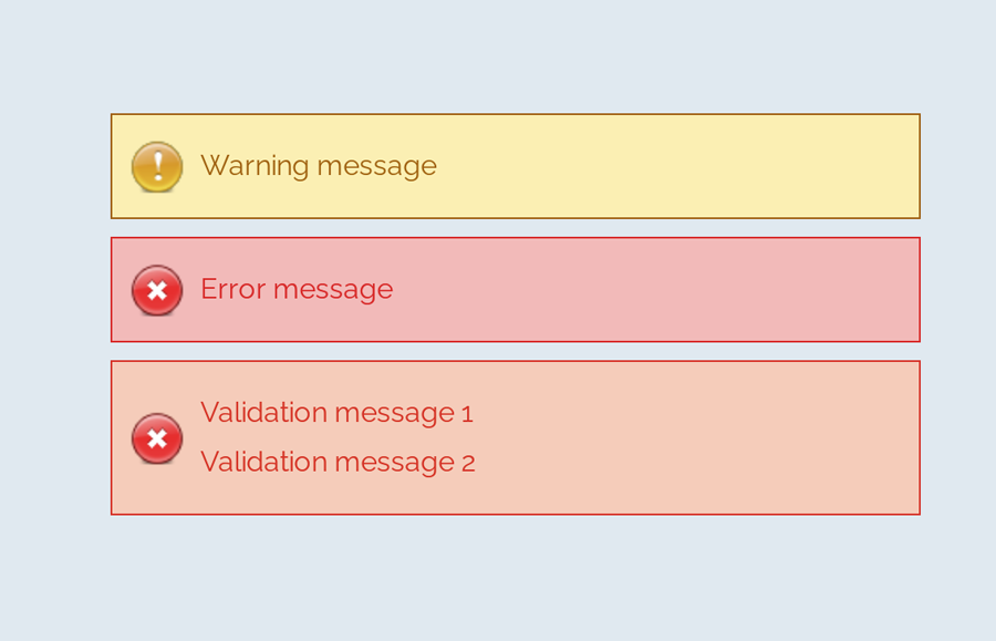
<div class="error">Error message</div>
Additionally, you can also create the message boxes for info, success, warning, and validation with the same method mentioned above. Just add a relevant class name to your message that we’ll style in CSS.
<div class="info">
   Info message
</div>
<div class="success">
   Successful operation message
</div>
<div class="warning">
   Warning message
</div>
<div class="validation">
   Validation message 1 <br>
   Validation message 2
</div>
You are not limited to add only plain text inside your message box element. You can also add any HTML elements such as images, buttons, links, or HTML5 videos. However, you’ll need to style these elements with additional CSS.
CSS Style for Error Message
First of all, define the common CSS for all types of messages. If you just need only an error message style, then simply erase the other class selector from the below code:
.info,
.success,
.warning,
.error,
.validation {
	border: 1px solid;
	margin: 10px auto;
	padding: 15px 10px 15px 50px;
	background-repeat: no-repeat;
	background-position: 10px center;
	max-width: 460px;
}
After that, create styles for an error message by targeting the "error" class. Define it’s color (for text), background color, and set error icon using CSS background-image property.
.error {
	color: #D8000C;
	background-color: #FFBABA;
	background-image: url('https://i.imgur.com/GnyDvKN.png');
}
You can also add Font Awesome icon if you don’t want to add an image icon. To do so, include the Font Awesome CSS library into your project and add the specific icon by targeting the “.error:before” pseudo-selector. The following is an example of the use of the Font Awesome icon.
.error:before{
   font-family: FontAwesome;
   content: '\f057';
   font-size: 24px;
   color: #D8000C;
}
Similarly, create CSS styles for validation message as follows:
.validation {
	color: #D63301;
	background-color: #FFCCBA;
	background-image: url('https://i.imgur.com/GnyDvKN.png');
}
You may also need to style a “warning message” box to the attention of the users.
.warning {
	color: #9F6000;
	background-color: #FEEFB3;
	background-image: url('https://i.imgur.com/Z8q7ww7.png');
}
Likewise, create CSS styles for info and success messages described as follows:
.info {
	color: #00529B;
	background-color: #BDE5F8;
	background-image: url('https://i.imgur.com/ilgqWuX.png');
}

.success {
	color: #4F8A10;
	background-color: #DFF2BF;
	background-image: url('https://i.imgur.com/Q9BGTuy.png');
}
That’s all! I hope you find this tutorial helpful to create an error message and successfully implement this CSS style example. If you need any further help in regards to CSS styling, let me know by comment below.