Sometimes, we need a really simple image slider that can navigate through thumbnails. In most cases, we have to use JavaScript and more often an image slider plugin for jQuery to get the required result. But, what’s your response if I say that we can create an image slider with stylized thumbnails navigation using only CSS3?
Well! it might be not shocking for CSS lovers who know its power. But when I was a beginner to HTML and CSS, I often wondered to see pure CSS assets like an image gallery and menu navigation, etc.
Anyhow, in this tutorial we’ll build a really simple and easy to integrate image slider using HTML radio input and CSS3 styles.
Besides this, we’ll also add some cool CSS3 based image transformation while keeping our code short and straightforward.
Making CSS3 Image Slider with Stylized Thumbnails
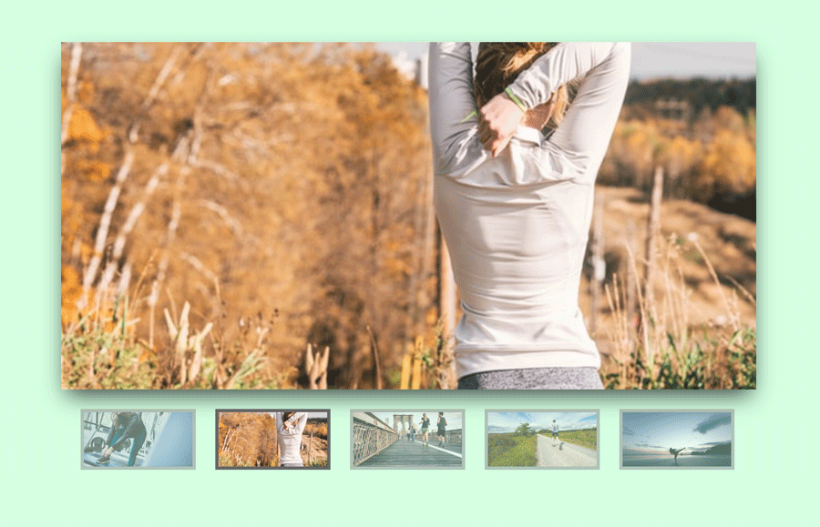
Before moving forward, I would like to explain a little bit about the working and coding concept of the image slider. It will look like the above image that you have seen at the starting of this article.
On the other hand, the coding concept is very simple. We’ll place each image of our slider inside label tag that will be used as thumbnails.
Similarly, we’ll define input tag with type “radio” at the beginning of each photo. After that, I’ll wrap all these elements into a div container for getting ready to style our image slider with CSS.
So, create a basic HTML structure for image slider as follows:
<div class="slider">
	<input type="radio" name="slide_switch" id="id1" checked="checked"/>
	<label for="id1">
		<img src="path/to/image1.jpg" width="100"/>
	</label>
	<img src="path/to/image1.jpg"/>
	<input type="radio" name="slide_switch" id="id2"/>
	<label for="id2">
		<img src="path/to/image2.jpg" width="100"/>
	</label>
	<img src="path/to/image2.jpg"/>
	.
	.
	.
	.
	<input type="radio" name="slide_switch" id="id-n"/>
	<label for="id-n">
		<img src="path/to/image-n.jpg" width="100"/>
	</label>
	<img src="path/to/image-n.jpg"/>
</div>
As you can see above, the HTML structure is really simple. All you need is that placing three elements input radio, label and img respectively inside the <div class="slider">.
You may have noticed, we placed the link of an image twice. The image URL inside the label tag describes thumbnail and the other link (just after the label tag) full-sized image.
The image tag for thumbnail has width property with the value 100 (counted in px). You can set custom size instead of this according to your needs.
The CSS Styles for Image Slider
Now its time to style our image slider with CSS. In styling, first we set the basic properties for .slider selector and similarly for other elements as well. The complete CSS code looks like below:
/* Basic style for Slider */
.slider{
 position: relative;
	width: 640px;
	padding-top: 320px;
	margin: 100px auto;
	box-shadow: 0 10px 20px -5px rgba(0, 0, 0, 0.75);
}

/* Style for Image*/
.slider>img{
	position: absolute;
	left: 0; top: 0;
	transition: all 0.5s;
}

.slider input[name='slide_switch'] {
	display: none;
}

.slider label {
	margin: 18px 0 0 18px;
	border: 3px solid #999;
	float: left;
	cursor: pointer;
	transition: all 0.5s;
	opacity: 0.6;
}

.slider label img{
	display: block;
}

.slider input[name='slide_switch']:checked+label {
	border-color: #666;
	opacity: 1;
}
/* Main images */
.slider input[name='slide_switch'] ~ img {
	opacity: 0;
	transform: scale(1.1);
}

.slider input[name='slide_switch']:checked+label+img {
	opacity: 1;
	transform: scale(1);
}
We set CSS width property for slider as same as the main image. The main image (that will show when thumbnail clicked) has some shadow.
We set the position absolute for the large (main) image of the slider. Each image switched by CSS opacity property. The CSS3 transition property used for the smooth slide animation.
The CSS :checked pseudo-element used to set the relationship between an image and its thumbnail. The CSS ~ select each image just after the input.
So, all we have done. You are absolutely free to play with the code (download, modify & customize) according to your needs. If you have any questions or suggestions, let me know by comment below.