Today we will create CSS Tooltip On Hover DIV HTML Element by using the :before and :after elements. It easy to customize by just editing the CSS.
Furthermore, it allows the user to mouse over the Tooltip so you place any kind of link over th tooltip and the user can easily click on it.
Moreover, You can easily change the div element anyway and customize the tooltip background, change the font and apply any kind of CSS properties.
Early days, The Tooltips are made with Javascript but now we can easily create them with pure CSS and also animated it by using CSS3 animation and many other properties.
The tooltip is great fun to show more info to let me know the user quickly. It is light-weight, cross-browser compatible, and easy to use.
How to Create CSS Tooltip On Hover DIV Element
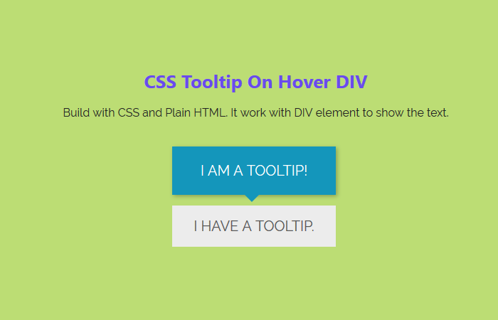
First of all, we will create the HTML markup that is simple and easy to understand. We have a div class name wrapper and wrote text inside it.
Next, we have a child div with the class name tooltip that hold the text whichi will show when you mouse over the wrapper div.
<div class="wrapper">
        I have a tooltip.
       <div class="tooltip">I am a tooltip!</div>
</div>
After that, we will write the CSS code. First, we have to design the wrapper element and add some styling to make it look nice and clean.
There is nothing complicated here. All we will add some background-color, font-size, padding and few other CSS properties.
.wrapper {
  text-transform: uppercase;
  background: #ececec;
  color: #555;
  cursor: help;
  font-size: 20px;
  margin: 0 auto;
  padding: 15px 20px;
  position: relative;
  text-align: center;
  width: 230px;
  -webkit-transform: translateZ(0); /* webkit flicker fix */
  -webkit-font-smoothing: antialiased; /* webkit text rendering fix */
}
Similarly, Here we will do the same as we have done with the main wrapper but here we will use the position absolute to keep it hidden. We also used the translate and transition to make it animated on hover.
.wrapper .tooltip {
  background: #1496bb;
  bottom: 100%;
  color: #fff;
  display: block;
  left: 0;
  margin-bottom: 15px;
  opacity: 0;
  padding: 20px;
  pointer-events: none;
  position: absolute;
  width: 100%;
  -webkit-transform: translateY(10px);
  -moz-transform: translateY(10px);
  -ms-transform: translateY(10px);
  -o-transform: translateY(10px);
  transform: translateY(10px);
  -webkit-transition: all .25s ease-out;
  -moz-transition: all .25s ease-out;
  -ms-transition: all .25s ease-out;
  -o-transition: all .25s ease-out;
  transition: all .25s ease-out;
  -webkit-box-shadow: 2px 2px 6px rgba(0, 0, 0, 0.28);
  -moz-box-shadow: 2px 2px 6px rgba(0, 0, 0, 0.28);
  -ms-box-shadow: 2px 2px 6px rgba(0, 0, 0, 0.28);
  -o-box-shadow: 2px 2px 6px rgba(0, 0, 0, 0.28);
  box-shadow: 2px 2px 6px rgba(0, 0, 0, 0.28);
}
The :before element will help us to show the tooltip on-hover.
/* This bridges the gap so you can mouse into the tooltip without it disappearing */
.wrapper .tooltip:before {
  bottom: -20px;
  content: " ";
  display: block;
  height: 20px;
  left: 0;
  position: absolute;
  width: 100%;
}
With the help of :after element, we can easily create the down arrow indication.
/* CSS Triangles - see Trevor's post */
.wrapper .tooltip:after {
  border-left: solid transparent 10px;
  border-right: solid transparent 10px;
  border-top: solid #1496bb 10px;
  bottom: -10px;
  content: " ";
  height: 0;
  left: 50%;
  margin-left: -13px;
  position: absolute;
  width: 0;
}
Let’s apply some more animation on-hover stats by using the transform property.
.wrapper:hover .tooltip {
  opacity: 1;
  pointer-events: auto;
  -webkit-transform: translateY(0px);
  -moz-transform: translateY(0px);
  -ms-transform: translateY(0px);
  -o-transform: translateY(0px);
  transform: translateY(0px);
}
Sometimes we have seen transition issues on IE so we will disable it on the Older version of IE.
/* IE can just show/hide with no transition */
.lte8 .wrapper .tooltip {
  display: none;
}
.lte8 .wrapper:hover .tooltip {
  display: block;
}
That’s it. Please refer to the demo and customize it to fit into your project.
Thank you so much! this solution is so simple yet functional, I loved it!! thanks again greatings from Mexico
Hi Yvonne Bautista!
You’re welcome. Glad to read your feedback! keep visiting us for more HTML, CSS codes. 🙂