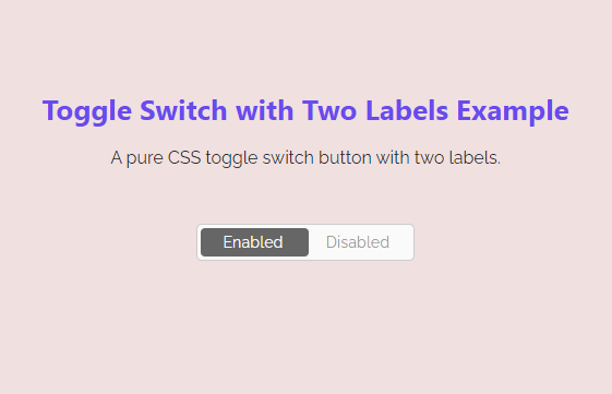
Creating a toggle switch button using pure CSS is an easy process. But when we need to add labels, it becomes a little bit challenging task. Similarly, it becomes more difficult while design a toggle switch button with dual labels. Maybe, you have tried to set two labels inside a toggle switch but couldn’t achieve the working output. Don’t worry, here you will come to know how to create a toggle switch button with two labels using CSS.
A toggle button is mostly used to switch between two states to enable/disable a specific feature. One of these uses, the toggle button is used to switch between day and night mode. Similarly, it may use to turn on/off various options in a webpage/app.
In order to achieve a working output, we’ll create a checkbox input and place it into a container element. The container element will be a label tag and we’ll wrap the text of the label into a span element. After creating that structure, we will design the toggle button using CSS before and after pseudo selectors and also apply some transitions to make the smooth sliding while toggling between enabled/disabled states.
The HTML Structure
In HTML, create the label element with a class name "toggleSwtich" and place a checkbox input inside it. Likewise, create two span elements for labels with class names "left-span" and "right-span" respectively.
 <label class="toggleSwitch nolabel" onclick="">
    <input type="checkbox" checked />
    <a></a>
    <span>
        <span class="left-span">Enabled</span>
        <span class="right-span">Disabled</span>
    </span>
</label>
You can place the above HTML structure anywhere on your webpage where you want to display the toggle button. Similarly, you can define your own text instead of “Enabled/Disabled” for the labels.
CSS Styles for Toggle Switch Button
After creating the HTML, now it’s time to style the toggle button with CSS. So, target the span element of the toggleSwitch class and hide it using the display none property.
.toggleSwitch span span {
	display: none;
}
The "toggleSwitch" is the container element for the toggle button. Target this class and display it as an inline block. Similarly, define the height, and width as 18px and 200px respectively. Keep the relative position, define the border, background color, and border-radius property as follows:
.toggleSwitch {
	display: inline-block;
	height: 18px;
	position: relative;
	overflow: visible;
	padding: 0;
	cursor: pointer;
	width: 200px;
	background-color: #fafafa;
	border: 1px solid #ccc;
	border-radius:5px;
	height:34px;
        user-select: none;
}
.toggleSwitch * {
	-webkit-box-sizing: border-box;
	-moz-box-sizing: border-box;
	box-sizing: border-box;
}
Now, target the label element and span element of the toggleSwitch class and define a 20px value for both height and line-height properties. Likewise, define the middle value for the vertical-align property in order to set its alignment vertically center. After that, hide the outline for the focus event using the CSS outline property using plus selector for the span element.
.toggleSwitch label,
.toggleSwitch > span {
	line-height: 20px;
	height: 20px;
	vertical-align: middle;
}
.toggleSwitch input:focus ~ a,
.toggleSwitch input:focus + label {
	outline: none;
}
.toggleSwitch label {
	position: relative;
	z-index: 3;
	display: block;
	width: 100%;
}
We don’t need to show the default checkbox to the users. So, target the input and set its opacity to 0. Similarly, define its absolute position along with the z-index 5 in order to keep the checkbox behind the scene in older browsers. Similarly, define the CSS styles for the span and child span as described below:
.toggleSwitch input {
	position: absolute;
	opacity: 0;
	z-index: 5;
}
.toggleSwitch > span {
	position: absolute;
	left: 0;
	width: calc(100% - 6px);
	margin: 0;
	text-align: left;
	white-space: nowrap;
        margin:0 3px;
}
.toggleSwitch > span span {
	position: absolute;
	top: 0;
	left: 0;
	z-index: 5;
	display: block;
	width: 50%;
	margin-left: 50px;
	text-align: left;
	font-size: 0.9em;
	width: auto;
	left: 0;
	top: -1px;
	opacity: 1;
	width:40%;
	text-align: center;
        line-height:34px;
}
The label text is stored in an anchor tag, select it, and define its absolute position along with z-index 4 and 50% right value. Similarly, define 50% width, background color, box-shadow, and transition as described below:
.toggleSwitch a {
	position: absolute;
	right: 50%;
	z-index: 4;
	display: block;
	top: 3px;
	bottom: 3px;
	padding: 0;
	left: 3px;
	width: 50%;
	background-color: #666;
	border-radius: 4px;
	-webkit-transition: all 0.2s ease-out;
	-moz-transition: all 0.2s ease-out;
	transition: all 0.2s ease-out;
	box-shadow: 0 1px 2px rgba(0, 0, 0, 0.05);
}
.toggleSwitch > span span:first-of-type {
	color: #FFF;
	opacity: 1;
	left: 0;
	margin: 0;
        width: 50%;
}
.toggleSwitch > span span:last-of-type {
	left:auto;
	right:0;
	color: #999;
	margin: 0;
        width: 50%;
}
.toggleSwitch > span:before {
	content: '';
	display: block;
	width: 100%;
	height: 100%;
	position: absolute;
	left: 0;
	top: -2px;
	/* background-color: #fafafa;
	border: 1px solid #ccc; */
	border-radius: 30px;
	-webkit-transition: all 0.2s ease-out;
	-moz-transition: all 0.2s ease-out;
	transition: all 0.2s ease-out;
}
Now, target the span element using CSS first-of-type pseudo selector and define the styles for the active label text as described below:
.toggleSwitch input:checked ~ a {
	left: calc(50% - 3px);
}
.toggleSwitch input:checked ~ span:before {
	/* border-color: #0097D1;
	box-shadow: inset 0 0 0 30px #0097D1; */
}
.toggleSwitch input:checked ~ span span:first-of-type {
	left:0;
	color:#999;
}
.toggleSwitch input:checked ~ span span:last-of-type {
	/* opacity: 1;
	color: #fff;	 */
	color:#FFF;
}
Finally, create different size classes and define the width, height, and line-height for the switch button. Basically, these styles are optional you can skip these if you don’t want to have varients of sizes.
/* Switch Sizes */
.toggleSwitch.large {
	width: 60px;
	height: 27px;
}
.toggleSwitch.large a {
	width: 27px;
}
.toggleSwitch.large > span {
	height: 29px;
	line-height: 28px;
}
.toggleSwitch.large input:checked ~ a {
	left: 41px;
}
.toggleSwitch.large > span span {
	font-size: 1.1em;
}
.toggleSwitch.large > span span:first-of-type {
	left: 50%;
}
.toggleSwitch.xlarge {
	width: 80px;
	height: 36px;
}
.toggleSwitch.xlarge a {
	width: 36px;
}
.toggleSwitch.xlarge > span {
	height: 38px;
	line-height: 37px;
}
.toggleSwitch.xlarge input:checked ~ a {
	left: 52px;
}
.toggleSwitch.xlarge > span span {
	font-size: 1.4em;
}
.toggleSwitch.xlarge > span span:first-of-type {
	left: 50%;
}
That’s all! I hope, you have successfully created CSS toggle switch button with two labels with the help of this tutorial. If you have any questions or suggestions, let me know by comment below.