Learn how to create CSS down slide animation on click using nothing by HTML and CSS. I will make a quick example to show you how it works.
Things which look seems really hard not always difficult to do. The case we’ll look today is creating a slide down animation on-click using pure CSS with the help of :target property.
Furthermore, To add the animation I will use the transition element to open the hidden div element.
Are you not sure about slide-down animation, please check out the slideDown method from jQuery? By using this function, the element by default hidden and make visible by increasing the element’s height from 0 to whatever the height of the element should be. That’s quite simple and easy to do, right?
We will implement a similar idea but by using only CSS. What I will do is to set the height to 0 then expand it and set the height to the number that shows the whole content inside it.
Without animation, the element will not look nice so we will apply some transition on it.
How to Create Slide Animation On Click
We will start with HTML markup. Let’s create an anchor link and place text inside the span tag. Next, we will have a sliding div which will hold the description.
However, We will also create an additional function. When the user clicks on the second element, the first one automatically close.
For this, I will add #nav for the link then define an id attribute to sliding div.
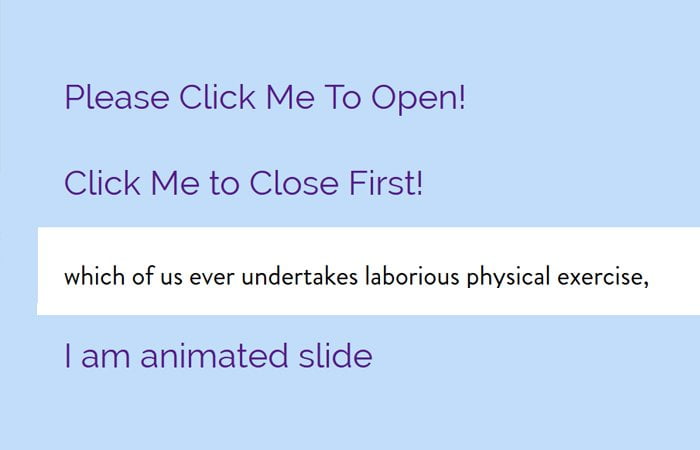
<a href="#nav"><span>Please Click Me To Open!</span></a>
<div class="sliding" id="nav">
	<p>But I must explain to you how all this mistaken idea of denouncing pleasure and praising pain was born and I will give you a complete account of the system, and expound</p>
</div>

<a href="#nav2"><span>Click Me to Close First!</span></a>
<div class="sliding" id="nav2">
	<p>which of us ever undertakes laborious physical exercise, except to obtain some advantage from it. But who has any right to find fault with a man who chooses to enjoy</p>
</div>
The Style
Now we will apply the style. To make look the links good, we will apply some padding, text-decoration, font-size, and font-weight.
Similar, we will also style the sliding div but the important thing to be note is transition: all .5s ease-in-out; and the height: 0;
As we said earlier, you need to set the height value to 0 and then to expand it, set the height according to our element content need.
a {
	text-decoration: none;
	padding: 0 15px;
	font-size: 20px;
	font-weight: 300;
}
.sliding {
  background: #fff;
  overflow: hidden;
  color: #000;
  margin: 12px 0;
  transition: all .5s ease-in-out;
  height: 0;
}
.sliding p{
	padding:0 15px;
}
.sliding:target {
  height: 50px;
}Note: By using the :target and anchor links, we can activate the animations so the links should not toggles.
That’s awesome and work perfectly right? Yes, it’s work well if you know the height of the element but what about if you don’t know the height?
Possible Options
Well, if you are happy with generic animation then you can go with auto height. It’s a good idea to use the auto height if you want a responsive site where the height change depending on screen size.
.sliding:target {
  height: auto;
}
A little drawback is a transition only work with numeric values. But how about using the CSS Transforms? We can set the scaleY to zero then set it into one when expanding.
This will work well but the issue it creates big gaps between the links. Moreover, the animation didn’t look nice.
.sliding {
  background: #fff;
  overflow: hidden;
  color: #000;
  margin: 12px 0;
  transition: all .5s ease-in-out;

  transform-origin: left top;
  transform: scaleY(0);
}
.sliding:target {
  transform: scaleY(1);
}
If you are good with CSS and know it’s basic properties then you can go with this solution which I discovered. By using this solution you need to set the vertical padding, line-height to 0 and color: transparent; for a sliding element.
After that, you need to set the value you’d like for expanded element ( :target )
.sliding {
  background: #fff;
  overflow: hidden;
  color: #000;
  margin: 12px 0;

  transition: all .5s ease-in-out;
  line-height: 0;
  padding: 0 1em;
  color: transparent;
}
.sliding:target {
  line-height: 1.5;
  padding-top: 1em;
  padding-bottom: 1em;
  color: black;
}
You need to be a little bit careful with this solution because there are lots of things that can affect height. That’s It!