Border around the elements is something really exciting thing in design. We can stand out the elements using different kinds of border styles. We all know that we can simply use the border property to define it but this is a simple thing and there is no uniqueness.
So, I come up with something different that surely makes your design more neat and clean. Here I will create a CSS partial border around the box elements. This will be an incomplete border on the two sides of the element.
Moreover, to make this CSS corner border effect nicer, I will also use a two-tone color scheme which will make it a more appealing-looking design. You can implement it into any website and make elements more attractive. I am sure it will help you to better design your website elements.
To achieve a partial border, I will use :before and :after elements because this will help us to control the border sizes. So Let’s get started!
HTML Source Code Example
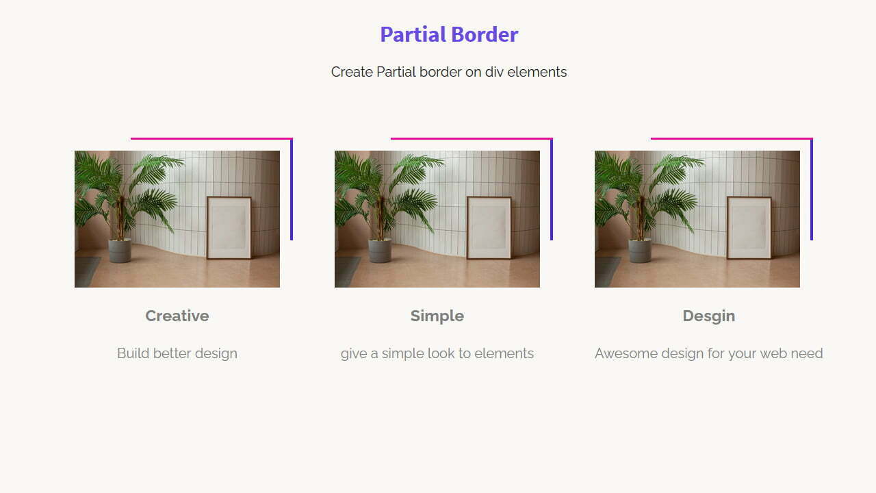
Our HTML code consists of the main section then a container and wrapper. We simply place a div with the class the ” image_box ” inside the wrapper and define a path for a photo. We also place some content inside the wrapper to make the design look a little nicer.
You can play with the below and can remove the image if you don’t need it. Similarly, you can see we have HTML for three boxes so you can extend them by simply copying/pasting the container code to create more.
<section class="partial_borders">
<div class="partial_container">
  <div class="partial_wrapper">
	<div class="image_box"><img src="img/monstera.jpg" alt="monstera"></div>
	<h3>Creative</h3>
	<span>Build better design</span>
  </div>
</div><!--
--><div class="partial_container">
  <div class="partial_wrapper">
	<div class="image_box"><img src="img/monstera.jpg" alt="monstera"></div>
	<h3>Simple</h3>
	<span>give a simple look to elements</span>
  </div>
</div><!--
--><div class="partial_container">
  <div class="partial_wrapper">
	<div class="image_box"><img src="img/monstera.jpg" alt="monstera"></div>
	<h3>Desgin</h3>
	<span>Awesome design for your web need</span>
  </div>
</div><!--
-->
</section>
Apply CSS Partial Border to Element
Now it’s time to style the shorten border using CSS. First, we will make the section center align and then define the width and spaces for the box container.
.partial_borders{
  position: relative;
  text-align: center;
}
.partial_container {
  width: 19em;
  height: auto;
  padding: 2em;
  display: inline-block;
  vertical-align: top;
}
.partial_wrapper{
  width: 100%;
  height: 100%;
}
Now we will set the sizes for the image box. You can even remove the width and height if you want the box size according to your column size or want it to full width.
To make the image responsive inside the box, we will set width:100% and height:auto
.image_box{
  width: 15em;
  height: 10em;
  background-color: #95989A;
  position: relative;
}
.image_box img{
	width: 100%;
	height: auto;
}
Our top border will be handled using :after element and you can customize it as you want. You can control the length of the partial border by setting the width. In the same way, you can set the height to control the thickness of the border.
.image_box:after{
  content:'';
  width:75%;
  height:2px;
  background:#E4129C;
  position:absolute;
  top:-15px;
  right: -15px;
}
The right side of the border is designed using :before element. Similar to :after the element here you can also do the same. Can resize border, change the border color, and set the border thickness.
.image_box:before{
  content:'';
  width:3px;
  height:75%;
  background:#4829DE;
  position:absolute;
  top:-15px;
  right: -15px;
}
In the end, we will apply some style to the heading and content. These are generally styles so you can change as you want.
.partial_wrapper h3{
  margin-top: 1em;
  margin-bottom: 0em;
  color: grey;
  padding: 0;
  text-align: left;
  position: relative;
  text-align: center;
}
.partial_wrapper span{
  margin-top: 1em;
  color: grey;
  text-align: left;
  position: relative;
  display: block;
 text-align: center;
}
Finally, we are finished with creating a partial border using CSS. Hope you like this tutorial, if you like please share and in case have a question let me know in below comment box