In this tutorial, I’m going to share a pack of cool CSS border animation for the HTML input element. These border animations play on focus event. You can apply these border effects on all types of input except checkbox or radio.
Basically, this is a set of 9 different border effects, comes with dedicated class names like effect-1 to effect-9. After including the CSS, you just need to add a class name to your input element, then the border draw animation starts working when the input gets focus.
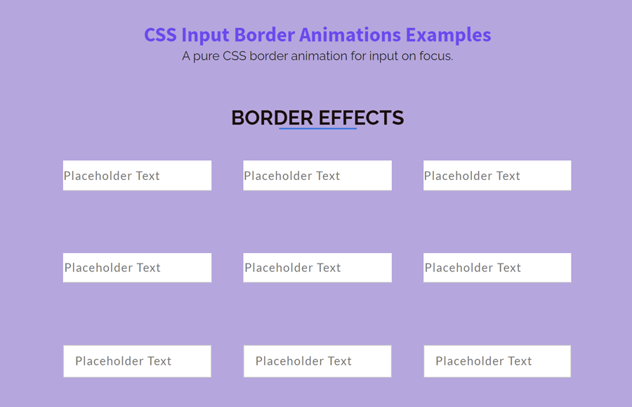
Before getting started with coding, have a look at the demo page to see the border animations in action. Which border effect did you like most? well! download this project, load the "style.css" file into your HTML document if you want to integrate all these effects into your project. On the other hand, you can use one of the following CSS snippets related to that effect that you wanna apply to your input.
The HTML Structure
In order to apply the border animation, you just need to add an animation class into your input element. Additionally, you need to create a span element just after the input with a class name "focus-border". The following is the basic HTML structure for one input border animation.
<input class="effect-1" type="text" placeholder="Placeholder Text">
<span class="focus-border"></span>
There are nine different animation effects. The following is the complete HTML structure for all these border animation effects.
<div class="row">
    <div class="container">
    	<h2>Border effects</h2>
    	<div class="col-3">
        	<input class="effect-1" type="text" placeholder="Placeholder Text">
            <span class="focus-border"></span>
        </div>
        <div class="col-3">
        	<input class="effect-2" type="text" placeholder="Placeholder Text">
            <span class="focus-border"></span>
        </div>
        <div class="col-3">
        	<input class="effect-3" type="text" placeholder="Placeholder Text">
            <span class="focus-border"></span>
        </div>

        <div class="col-3">
        	<input class="effect-4" type="text" placeholder="Placeholder Text">
            <span class="focus-border"></span>
        </div>
        <div class="col-3">
        	<input class="effect-5" type="text" placeholder="Placeholder Text">
            <span class="focus-border"></span>
        </div>
        <div class="col-3">
        	<input class="effect-6" type="text" placeholder="Placeholder Text">
            <span class="focus-border"></span>
        </div>

        <div class="col-3">
        	<input class="effect-7" type="text" placeholder="Placeholder Text">
            <span class="focus-border">
            	<i></i>
            </span>
        </div>
        <div class="col-3">
        	<input class="effect-8" type="text" placeholder="Placeholder Text">
            <span class="focus-border">
            	<i></i>
            </span>
        </div>
        <div class="col-3">
        	<input class="effect-9" type="text" placeholder="Placeholder Text">
            <span class="focus-border">
            	<i></i>
            </span>
        </div>

    </div>
</div>
Basic CSS Styles for Inputs
Before getting started with input focus animation, first of all, we need to apply some basic CSS style to the input element. So, define the font size, color, width, and box-sizing property as described below:
input[type="text"] {
	font: 15px/24px "Lato", Arial, sans-serif;
	color: #333;
	width: 100%;
	box-sizing: border-box;
	letter-spacing: 1px;
}
The first three border animations are similar. So, the common CSS style for first these effects is as follows:
.effect-1,
.effect-2,
.effect-3 {
	border: 0;
	padding: 7px 0;
	border-bottom: 1px solid #ccc;
}
The first border animation is about to increase the width of the bottom border. This effect draws the border from left to right on input focus. Here, the transition property defines the speed of the animation. You can set the custom value for transition in milliseconds.
.effect-1:focus~.focus-border {
	width: 100%;
	transition: 0.4s;
}
The second border effect draws the bottom border starting from the center. The CSS styles for the "effect-2" animation is as follows:
.effect-2~.focus-border {
	position: absolute;
	bottom: 0;
	left: 50%;
	width: 0;
	height: 2px;
	background-color: #3399FF;
	transition: 0.4s;
}

.effect-2:focus~.focus-border {
	width: 100%;
	transition: 0.4s;
	left: 0;
}
The third effect draws the border starting from the sides and end in the center. If you want to integrate only this border animation, then you can use the following CSS snippet:
.effect-3~.focus-border {
	position: absolute;
	bottom: 0;
	left: 0;
	width: 100%;
	height: 2px;
	z-index: 99;
}

.effect-3~.focus-border:before,
.effect-3~.focus-border:after {
	content: "";
	position: absolute;
	bottom: 0;
	left: 0;
	width: 0;
	height: 100%;
	background-color: #3399FF;
	transition: 0.4s;
}

.effect-3~.focus-border:after {
	left: auto;
	right: 0;
}

.effect-3:focus~.focus-border:before,
.effect-3:focus~.focus-border:after {
	width: 50%;
	transition: 0.4s;
}
Full Border Animation for Input
The second set of effects (effect-4 to effect-6) draw a full border around the input element. The common CSS style for these effects is as follows:
.effect-4,
.effect-5,
.effect-6 {
	border: 0;
	padding: 5px 0 7px;
	border: 1px solid transparent;
	border-bottom-color: #ccc;
	transition: 0.4s;
}

.effect-4:focus,
.effect-5:focus,
.effect-6:focus {
	padding: 5px 14px 7px;
	transition: 0.4s;
}
The effect-4 class draws the border from the bottom to the top of the input. You can use the following CSS in order to integrate this effect. If you want to customize the border color and width, set the custom value for the CSS border property.
.effect-4~.focus-border {
	position: absolute;
	height: 0;
	bottom: 0;
	left: 0;
	width: 100%;
	transition: 0.4s;
	z-index: -1;
}

.effect-4:focus~.focus-border {
	transition: 0.4s;
	height: 36px;
	border: 2px solid #3399FF;
	z-index: 1;
}
Similarly, the effect-5 class draws the full border from the left to the right of the input.
.effect-5~.focus-border {
	position: absolute;
	height: 36px;
	bottom: 0;
	left: 0;
	width: 0;
	transition: 0.4s;
}

.effect-5:focus~.focus-border {
	width: 100%;
	transition: 0.4s;
	border: 2px solid #3399FF;
}
The effect-6 is opposite to the 5th effect. It draws the full border to the right of the input.
.effect-6~.focus-border {
	position: absolute;
	height: 36px;
	bottom: 0;
	right: 0;
	width: 0;
	transition: 0.4s;
}

.effect-6:focus~.focus-border {
	width: 100%;
	transition: 0.4s;
	border: 2px solid #3399FF;
}
CSS to Randomly Draw Input Border
The following are some border effects to randomly draw a border around the input. This set of effects classes (from effect-7 to effect-9) comes with an attractive user-experience. The common CSS style for these effects is as follows:
.effect-7,
.effect-8,
.effect-9 {
	border: 1px solid #ccc;
	padding: 7px 14px 9px;
	transition: 0.4s;
}

.effect-7~.focus-border:before,
.effect-7~.focus-border:after {
	content: "";
	position: absolute;
	top: 0;
	left: 50%;
	width: 0;
	height: 2px;
	background-color: #3399FF;
	transition: 0.4s;
}
The following effect draws all four borders starting from the center and ending in the sides.
.effect-7~.focus-border:after {
	top: auto;
	bottom: 0;
}

.effect-7~.focus-border i:before,
.effect-7~.focus-border i:after {
	content: "";
	position: absolute;
	top: 50%;
	left: 0;
	width: 2px;
	height: 0;
	background-color: #3399FF;
	transition: 0.6s;
}

.effect-7~.focus-border i:after {
	left: auto;
	right: 0;
}

.effect-7:focus~.focus-border:before,
.effect-7:focus~.focus-border:after {
	left: 0;
	width: 100%;
	transition: 0.4s;
}

.effect-7:focus~.focus-border i:before,
.effect-7:focus~.focus-border i:after {
	top: 0;
	height: 100%;
	transition: 0.6s;
}
The effect-8 class draws the border starting from the corners of the input element. The CSS snippet for this border animation is given below:
.effect-8~.focus-border:before,
.effect-8~.focus-border:after {
	content: "";
	position: absolute;
	top: 0;
	left: 0;
	width: 0;
	height: 2px;
	background-color: #3399FF;
	transition: 0.3s;
}

.effect-8~.focus-border:after {
	top: auto;
	bottom: 0;
	left: auto;
	right: 0;
}

.effect-8~.focus-border i:before,
.effect-8~.focus-border i:after {
	content: "";
	position: absolute;
	top: 0;
	left: 0;
	width: 2px;
	height: 0;
	background-color: #3399FF;
	transition: 0.4s;
}

.effect-8~.focus-border i:after {
	left: auto;
	right: 0;
	top: auto;
	bottom: 0;
}

.effect-8:focus~.focus-border:before,
.effect-8:focus~.focus-border:after {
	width: 100%;
	transition: 0.3s;
}

.effect-8:focus~.focus-border i:before,
.effect-8:focus~.focus-border i:after {
	height: 100%;
	transition: 0.4s;
}
The last border animation draws the border around the input and ending with the starting point. Like all the above effects, you can customize it by defining the custom values for the border, transition, and background-color property.
.effect-9~.focus-border:before,
.effect-9~.focus-border:after {
	content: "";
	position: absolute;
	top: 0;
	right: 0;
	width: 0;
	height: 2px;
	background-color: #3399FF;
	transition: 0.2s;
	transition-delay: 0.2s;
}

.effect-9~.focus-border:after {
	top: auto;
	bottom: 0;
	right: auto;
	left: 0;
	transition-delay: 0.6s;
}

.effect-9~.focus-border i:before,
.effect-9~.focus-border i:after {
	content: "";
	position: absolute;
	top: 0;
	left: 0;
	width: 2px;
	height: 0;
	background-color: #3399FF;
	transition: 0.2s;
}

.effect-9~.focus-border i:after {
	left: auto;
	right: 0;
	top: auto;
	bottom: 0;
	transition-delay: 0.4s;
}

.effect-9:focus~.focus-border:before,
.effect-9:focus~.focus-border:after {
	width: 100%;
	transition: 0.2s;
	transition-delay: 0.6s;
}

.effect-9:focus~.focus-border:after {
	transition-delay: 0.2s;
}

.effect-9:focus~.focus-border i:before,
.effect-9:focus~.focus-border i:after {
	height: 100%;
	transition: 0.2s;
}

.effect-9:focus~.focus-border i:after {
	transition-delay: 0.4s;
}
That’s all! I hope you found one of the best CSS input border animation from these effects for your input. If you have any questions or suggestions, let me know by comment below.