Looking for fancy but pure CSS horizontal accordion with nice transition effects? Here we will create one with a unique design that looks really awesome in design.
It is a simple accordion that is good enough in modern-day designing. I am sure you love this different & stylish accordion menu and you will surely do not found such an example on the internet before.
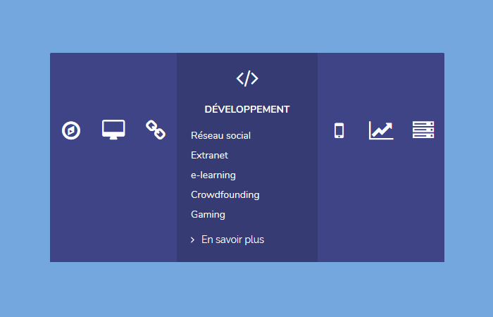
The design is simple but creative. It comes with a nice blue color which makes it look more attractive.
In the initial state, the accordion item will only show an icon and when a user clicks, it animate and show the content inside it.
Furthermore, you can easily customize it. You can add any type of content inside the accordion items. It supports, text, HTML element, anchor links or images, etc.
How to Create Horizontal Accordion
Let’s start with the markup. We will use the simple HTML structure to better understand. We will define the unorder list items and place everything inside it.
Our UL element will our main wrapper and then we will place a label element to define each accordion item. Inside the label element, we will add a li element and define an input type radio button. This button will control though CSS to create the toggle functionality.
After that, we will create an inner container "item--container" which will hold all the content that will show when the user clicks on any item.
Inside the inner element, we will place an icon and description. You can place any type of content such as video, heading, images, etc. We use the fontawesome for adding the icons.
<ul class="horizontal-accordion">
<label for="one">
  <li class="item">
    <input checked type="radio" name="accordion" id="one">

    <div class="item--container">
      <header class="item--header">
        <span class="item--header--icon"><i class="fa fa-compass"></i></span>
        <h4 class="item--header--title">Maîtrise d'ouvrage</h4>
      </header>

      <ul class="item--description">
        <li>Cahier des charges</li>
        <li>Spec fonctionnelle</li>
        <li>Spec technique</li>
        <li>Audit</li>
        <li>Gestion de projet</li>
      </ul>

      <footer class="item--footer">
        <a href="#"><i class="fa fa-angle-right"></i>En savoir plus</a>
      </footer>
    </div>

  </li>
</label>
</ul>
The Style
The stylesheet is a little long so I would recommend you to refer to demo to see how its style. But you can customize it as per your design need.
There are some basic styles which you can easily understand but some of the styles little complicated because it uses the transition and animation.
Moreover, we use the :checked target element to handle the click functionality.
.horizontal-accordion {
  list-style: none;
  padding-left: 0;
  margin: 0 auto;
  font-size: 0;
  text-align: center;
  width: 100%;
  height: 300px;
  color: #fff;
}
.horizontal-accordion label {
  margin: 0;
  font-weight: inherit;
  height: 100%;
  display: inline-block;
}
.horizontal-accordion label:first-child .item {
  border-top-left-radius: 2px;
  border-bottom-left-radius: 2px;
}
.horizontal-accordion label:last-child .item {
  border-top-right-radius: 2px;
  border-bottom-right-radius: 2px;
}
.horizontal-accordion input[name="accordion"] {
  display: none;
}
.horizontal-accordion .item {
  display: inline-block;
  overflow: hidden;
  height: 100%;
  font-size: 14px;
  text-align: center;
  background: #363b74;
}
.horizontal-accordion .item .item--container {
  cursor: pointer;
  position: relative;
  transition: width 0.3s cubic-bezier(0.55, 0, 0.1, 1), background-color 0.3s cubic-bezier(0.55, 0, 0.1, 1), padding 0.3s cubic-bezier(0.55, 0, 0.1, 1);
  width: 60px;
  height: 100%;
  padding: 0;
  background: #3e4485;
}
.horizontal-accordion .item .item--container .item--header {
  transition: transform 0.3s cubic-bezier(0.55, 0, 0.1, 1);
  transform: translateY(95px);
}
.horizontal-accordion .item .item--container .item--header .item--header--icon {
  cursor: pointer;
  width: 100%;
  height: 100%;
  margin: 0;
}
.horizontal-accordion .item .item--container .item--header .item--header--icon i.fa {
  font-size: 30px;
}
.horizontal-accordion .item .item--container .item--header .item--header--title {
  transition: transform 0.3s cubic-bezier(0.55, 0, 0.1, 1);
  transform: scale(0);
  white-space: nowrap;
  font-size: 14px;
  text-transform: uppercase;
  font-weight: bold;
  color: inherit;
  margin: 10px 0;
}
.horizontal-accordion .item .item--container .item--description {
  opacity: 0;
  position: absolute;
  list-style: none;
  padding-left: 0;
  text-align: left;
  transition: transform 0.3s cubic-bezier(0.55, 0, 0.1, 1), opacity 0.2s cubic-bezier(0.55, 0, 0.1, 1);
  transform: translateY(20px);
}
.horizontal-accordion .item .item--container .item--footer {
  position: absolute;
  bottom: 20px;
  white-space: nowrap;
  transition: transform 0.3s cubic-bezier(0.55, 0, 0.1, 1);
  transform: translateY(40px);
}
.horizontal-accordion .item .item--container .item--footer a {
  color: #fff;
  text-decoration: none;
}
.horizontal-accordion .item .item--container .item--footer a i.fa {
  margin-right: 10px;
}
.horizontal-accordion .item input[name="accordion"]:checked + .item--container {
  cursor: default;
  width: 200px;
  padding: 20px;
  background: #363b74;
}
.horizontal-accordion .item input[name="accordion"]:checked + .item--container .item--header {
  transform: translateY(0px);
}
.horizontal-accordion .item input[name="accordion"]:checked + .item--container .item--header .item--header--title {
  transform: scale(1);
}
.horizontal-accordion .item input[name="accordion"]:checked + .item--container .item--description {
  opacity: 1;
  transform: translateY(0px);
  transition-delay: .2s;
}
.horizontal-accordion .item input[name="accordion"]:checked + .item--container .item--footer {
  transform: translateY(0);
  transition-delay: .2s;
}