A heartbeat or heart rate monitoring is a visual animation to display the record of heartbeats. Basically, it used in hospitals in medical gadgets related to the heart. But, this web-based heart rate animation is also useful to use as a page preloader or heartbeat monitoring apps. In this tutorial, we are going to create a heartbeat monitor animation using SVG and CSS.
Generally, we’ll create static SVG heart rate lines and cover them with a div mask. Then we’ll animate that mask using CSS animation keyframes. So, it’ll produce a realistic heart rate monitoring animation that you can see on the demo page.
You can use this heartbeat monitoring animation anywhere in your HTML projects. Whether you want to place it in a widget or as a page loading animation, it can be added according to your needs. Moreover, it can also be customized (custom background and lines color, etc) as you need. So, let’s get started with HTML to create a heartbeat monitor animation.
The HTML Code
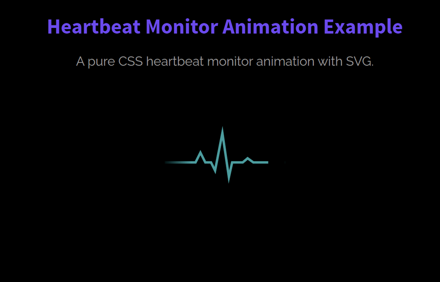
In HTML, create a div element with a class name "heart-rate" and place the following SVG element inside it. Similarly, create two div elements with the class name "fade-in" and "fade-out" respectively. These div elements are the mask for the SVG to animate heart rate lines.
<div class="heart-rate">
  <svg version="1.0" xmlns="http://www.w3.org/2000/svg" xmlns:xlink="http://www.w3.org/1999/xlink" x="0px" y="0px" width="150px" height="73px" viewBox="0 0 150 73" enable-background="new 0 0 150 73" xml:space="preserve">
    <polyline fill="none" stroke="#009B9E" stroke-width="3" stroke-miterlimit="10" points="0,45.486 38.514,45.486 44.595,33.324 50.676,45.486 57.771,45.486 62.838,55.622 71.959,9 80.067,63.729 84.122,45.486 97.297,45.486 103.379,40.419 110.473,45.486 150,45.486"
    />
  </svg>
  <div class="fade-in"></div>
  <div class="fade-out"></div>
</div>
You can also add any extra element (like text, image, links, etc) that you wanted to display along with the heartbeat animation.
The CSS for Heartbeat Monitor Animation
After creating the HTML structure, now it’s time to style the heart rate widget. To do so, target the "heart-rate" class that is the container element. Define its width, height, and keep its relative position. If you wanted to align this container to the center of the page, define the "20px auto" value for the margin property.
.heart-rate {
  width: 150px;
  height: 73px;
  position: relative;
  margin: 20px auto;
}
The "fade-in" class is the first div mask that is used to fade in the heartbeat lines. Keep its absolute position, define 100% width and height with 0 value for the top and right property. As we are using it as a mask element (to hide some part of heart lines), we need to set its background color similar to the body of the page. So, define background color and "heartRateIn" animation.
.fade-in {
  position: absolute;
  width: 100%;
  height: 100%;
  background-color: #000;
  top: 0;
  right: 0;
  animation: heartRateIn 2.5s linear infinite;
}
Similarly, define the CSS style for the "fade-out" class that is used to hide the heart lines. Keep its absolute position, define 120% width, 100% height and set it out of view by define -120% value for the left property. Likewise, define gradient background color as follows:
.fade-out {
  position: absolute;
  width: 120%;
  height: 100%;
  top: 0;
  left: -120%;
  animation: heartRateOut 2.5s linear infinite;
  background: rgba(0, 0, 0, 1);
  background: -moz-linear-gradient(left, rgba(0, 0, 0, 1) 0%, rgba(0, 0, 0, 1) 50%, rgba(0, 0, 0, 0) 100%);
  background: -webkit-linear-gradient(left, rgba(0, 0, 0, 1) 0%, rgba(0, 0, 0, 1) 50%, rgba(0, 0, 0, 0) 100%);
  background: -o-linear-gradient(left, rgba(0, 0, 0, 1) 0%, rgba(0, 0, 0, 1) 50%, rgba(0, 0, 0, 0) 100%);
  background: -ms-linear-gradient(left, rgba(0, 0, 0, 1) 0%, rgba(0, 0, 0, 1) 50%, rgba(0, 0, 0, 0) 100%);
  background: linear-gradient(to right, rgba(0, 0, 0, 1) 0%, rgba(0, 0, 0, 1) 80%, rgba(0, 0, 0, 0) 100%);
}
Finally, define the CSS animation keyframes for the "heartRateIn" animation as follows:
@keyframes heartRateIn {
  0% {
    width: 100%;
  }
  50% {
    width: 0;
  }
  100% {
    width: 0;
  }
}

@keyframes heartRateOut {
  0% {
    left: -120%;
  }
  30% {
    left: -120%;
  }
  100% {
    left: 0;
  }
}
That’s all! I hope this tutorial was helpful for you to create a heartbeat monitor animation. If you have any questions or suggestions, feel free to comment below.