It’s a simple tutorial about creating CSS Heart Shape or Icon using HTML. If you are already using any kind of font icon labiary then you can easily use the heart icon from it.
But in some cases, you are not using any kind of icon library and you want to add a heart icon. In this case, this simple tutorial going to you help you a lot.
Furthermore, it’s a bad particse to use the whole library when you need only one hert shape so if this is a case with then you can use our hart icon by just adding the one line of HTML code along with a little CSS.
Another scenario you can use the heart graphic but why you add an extracted image when we have a simple and easy CSS solution that works perfectly with all browsers?
I always try to do things with CSS and avoid graphics because of CSS easy to change and lightweight. Whenever I need to change the color scheme of things, I don’t need to change the whole element, instead of that, I will simply change the background color from CSS.
How to Create CSS Heart Shape or Icon
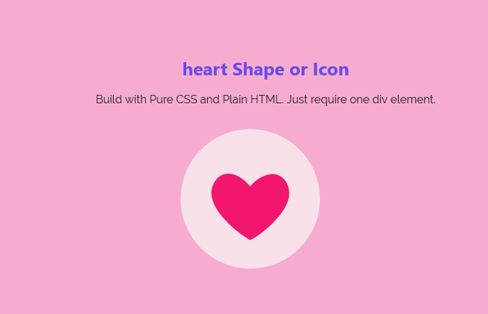
We have a simple div with the class name heart-shape. We don’t need to do anything more than a div, so we move on with CSS implementation.
<div class="heart-shape"></div>
After that, we will only style the div by putting the background. To transform the div into a rounded shape, we will use the border-radius property.
The width and height should be the same then we will align in the center of the body by adding margin 0 autos.
.heart-shape {
    background: #f9e1ea none repeat scroll 0 0;
    border-radius: 50%;
    display: block;
    height: 200px;
    margin: 5em auto 0;
    text-align: center;
    width: 200px;
}
The actual game starts from here, and we will use the :before an element. To add the heart icon, we will use the HTML symbol and we define it inside the main div. You can see it look like content: "♥";
Next, you can add the color of heart and set the font-size. The font size is used to control the size of the heart. If you want to make the heart smaller, then you can reduce the size.
.heart-shape:before{
	color: #f3166e;
	content: "❤";
	font-size: 8em;
	position: relative;
	top: 100px;
}
Heart Symbols
Here are few heart symbols which you can easily copy and the paste inside the content:””; to change it.
- ❤
- ♥
- ♡
Let’s have a look at the demo. It’s the easiest way of making a heart. There is more complex way but this one easy to use for any developer.