The glow effect is one of the eye catchy and attention-capturing elements on a webpage. This effect is useful to point out important section or attracts users to particular content. In this tutorial, we’re going to create a CSS gradient color glow effect with spin animation.
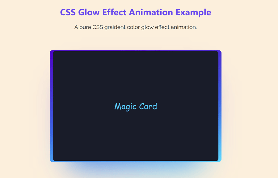
We’ll visualize this animation with the help of a card element. Basically, you can integrate this glow effect into buttons, navigations, or any other HTML element. Similarly, you can reveal this glow effect on several events like click, hover, or focus. Here, I will demonstrate a beautiful glowing animation with a card element, I named this a magic card.
The idea is simple, we’ll create a simple card component using a div element. Then we’ll apply the gradient color glowing effect using CSS background-image property. After that, we’ll use the CSS animation keyframes to rotate the colors around the card. Additionally, I will use the hover pseudo class to stop the animation on mouseover. So, let’s get started with HTML code to execute this idea.
The HTML Code
In order to create a glow effect, we need an element to visualize the glowing animation. For this purpose, we’ll create a card element and implement a glowing effect on it. So, create a div element with a class name "card" and place your content inside it. In my case, I’m just placing “Magic Card”, a sample text inside it. You can put anything like text, image, video, or any HTML element.
<div class="card">
  Magic Card
</div>
You can also integrate this glow effect with your existing elements. To do so, you need to modify the CSS code blocks according to the class name of your element.
The CSS Styles for Glow Effect Animation
In CSS, define the root variables for the height and width of the card element. Usually, we can define the width inside the card’s CSS block. Still, I kept them separate for easy customization for the card dimension as these values will be repeatedly used in glowing effect animation.
:root {
  --card-height: 320px;
  --card-width: 480px;
}
Now, select the "card" class and define the background color according to your choice. In my case, I set a black color with a shade of dark blue matching the glowing gradient color. Define the card dimension using the CSS variable function and display it as flex. Justify the content to the center using justify-content flex property. Similarly, define the center value for align-items and text-align property.
Here, the important thing to define is position property with the relative position as it will handle the absolute elements of the glow effect. Besides this, the padding, margin, font size and can be defined with custom values as per your requirements.
.card {
  background: #191c29;
  width: var(--card-width);
  height: var(--card-height);
  padding: 3px;
  position: relative;
  border-radius: 6px;
  justify-content: center;
  align-items: center;
  text-align: center;
  display: flex;
  font-size: 1.5em;
  color: rgb(88 199 250 / 0%);
  cursor: pointer;
  font-family: cursive;
  color: rgb(88 199 250 / 100%);
  margin: 10px auto;
}
Likewise, target the card class with the hover pseudo selector and define its color and transition values as follows. Basically, the hover styles are optional, I just used this to stop the animation on the mouseover event. The card before and after pseudo classes contains the glowing effect that we’ll define in the next step.
.card:hover {
  color: rgb(88 199 250 / 100%);
  transition: color 1s;
}
.card:hover:before, .card:hover:after {
  animation: none;
  opacity: 0;
}
After that, select the card class with before and after pseudo selector and define the content property with an empty string value. The content property is necessary to display the glow effect, so don’t skip this. Define the width, height, and border-radius property as mentioned below.
The necessary properties are position with absolute value and top animation with the spin value. We’ll define the keyframes for the spin animation in the next step. Similarly, we’ll use the CSS background-image property with the linear-gradient value to create an attractive gradient color glowing effect.
.card::before {
  content: "";
  width: 104%;
  height: 102%;
  border-radius: 8px;
  background-image: linear-gradient(
    var(--rotate)
    , #5ddcff, #3c67e3 43%, #4e00c2);
    position: absolute;
    z-index: -1;
    top: -1%;
    left: -2%;
    animation: spin 2.5s linear infinite;
}
.card::after {
  position: absolute;
  content: "";
  top: calc(var(--card-height) / 6);
  left: 0;
  right: 0;
  z-index: -1;
  height: 100%;
  width: 100%;
  margin: 0 auto;
  transform: scale(0.8);
  filter: blur(calc(var(--card-height) / 6));
  background-image: linear-gradient(
    var(--rotate)
    , #5ddcff, #3c67e3 43%, #4e00c2);
    opacity: 1;
  transition: opacity .5s;
  animation: spin 2.5s linear infinite;
}
Finally, define the CSS animation keyframes as follows in order to animate the gradient glowing colors. By default, the colors will be rotated clock-wise from 0 degrees to 360 degrees. If you want to animate the glowing effect ant-clock-wise, just define the negative angle values (-36odeg).
@property --rotate {
  syntax: "<angle>";
  initial-value: 132deg;
  inherits: false;
}
@keyframes spin {
  0% {
    --rotate: 0deg;
  }
  100% {
    --rotate: 360deg;
  }
}
That’s all! I hope, you have successfully created a glow effect animation in CSS. If you have any questions or suggestions, let me know by the comment below.