Today, we are super excited to create a responsive fullscreen overlay with blur background by using CSS. When a user clicks on a button, It will cover all the screen and blur the background content.
The modal & popup are the great things to implement when you want to provide more information to the user on the same page. It also can be used to provide a full version of photos or content.
To make modal boxes attractive We always play with CSS3 advance queries. There are different ways to implement overlay and one of way is to add an animated overlay on hover the images to show important content.
It is a CSS transparent overlay but does blur the background text or images behind the overlay and show all the text over the model box.
To make it little more interesting, I will take help of Zoom-in CSS3 property so when a user clicks on a button, it will provide Zooming effect.
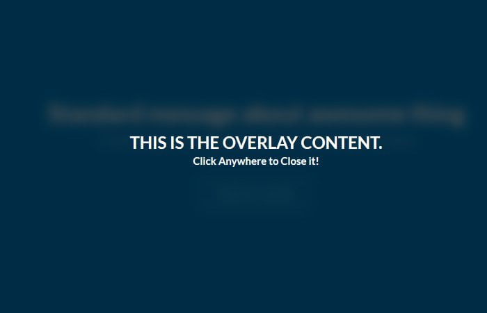
This overly doesn’t have any close button and allow to shut down the screen by click on anywhere on overall.
It’s a simple overlay and doesn’t need to write a lot of codes. We will make it by using HTML, CSS and bit of JavaScript which will only control the click functionality.
How to Create Fullscreen Blurry Background Overlay with CSS
The markup is simple and easy to understand. We have added a div class name overlay which includes the content.
In our case, we only have an H1 tag, but you can place your content or define the navigation too.
<div class="overlay">
  <h1>This is the overlay content.</h1>
</div>
Next, we need to set the button which will control the overlay. We added ahref HTML button and also mentioned a few other texts which many don’t require for your case.
<div class="intro">
  <div class="content">
    <h1>Standard message about awesome thing</h1>
    <h2>Continued message about level of awesomeness</h2><a class="ui big inverted blue button" href="#">FIND OUT MORE</a>
  </div>
</div>
CSS for Overlay
After creating HTML, now its time to code CSS styles for fullscreen overlay with blur background. In CSS, the intro class needs bit of attention. We need to set the position absolute and 100% width and height.
Next, we also need to add position absolute to its child div which class name is a content, but the also need to set the values for top and left 50% to align the overlay in the center of the body.
.intro {
  position: absolute;
  height: 100%;
  width: 100%;
  background: #0082c8;
}
.intro .content {
  position: absolute;
  top: 50%;
  left: 50%;
  width: 80%;
  margin: -6em -40% 0;
  display: block;
  text-align: center;
}
Because of the overlay is fullscreen so that we will add position fixed for it. To make it look awesome, we added transform and set scale value to 1.8. By default, it’s opacity will be 0, so it stays hidden.
.overlay {
  opacity: 0;
  visibility: hidden;
  position: fixed;
  width: 100%;
  height: 100%;
  background: rgba(0, 0, 0, 0.65);
  z-index: 100;
  -webkit-transform: scale(1.8);
  -moz-transform: scale(1.8);
  -o-transform: scale(1.8);
  transform: scale(1.8);
}
When the user active the overlay by clicking on the button, the opacity value change into 1 and visibility: visible;
.overlay.active {
  opacity: 1;
  visibility: visible;
  -webkit-transform: scale(1);
  -moz-transform: scale(1);
  -o-transform: scale(1);
  transform: scale(1);
}
The JavaScript
The JavaScript is straightforward and easy to understand. You can notice that the button and overlay call on click.
$( document ).ready(function() {
    $('.button, .overlay').on('click', function(e) {
      e.preventDefault();
      $('.overlay').toggleClass('active');
      $('.content').toggleClass('smaller');
    });
});
You can download the source code for quick implementation and see the demo. If you are implementing from our guide, Make sure to add main jQuery file to make it work successful on your website.