Today, We come up with another tutorial called CSS Circle Button and we will create different buttons with 10 different color schemes. We will also apply three different sizes so you have more choice to pick the right one.
You can easily implement fixed-size and responsive circular buttons with text or images but here we will use font icons to make them load fast.
Furthermore, The beauty of font icons is easy to customize in terms of size and color. For icons, I am going to use font fill which is very easy to implement and allow unlimited icon size.
It’s easy to use the font fill icons. All you need to add a class like tolightbulb any HTML element and you are done.
Likewise, All of the buttons are compatible with all major browsers. I have included 10 Different colors scheme and to implement a specific color, You need to apply a single class. I will list out all the color classes.
Such circle CSS buttons make your site more attractive and your site visitor loves to click.
To build the buttons, I will use the modern css3 technique that is constructed purely with an anchor HTML tag.
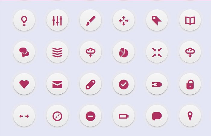
How to Create CSS Circle Button
The HTML part is very simple and easy to understand. Let’s define a div with a class name button. To get the size according to your choice, We have three different classes for that.
- large
- medium
- small
You can apply any class according to your choice with buttons div.
<div class="buttons large">
    <a class="maroon" href=""><span class="iconic lightbulb"></span></a>
    <a class="maroon" href=""><span class="iconic equalizer"></span></a>
    <a class="maroon" href=""><span class="iconic brush_alt"></span></a>
    <a class="maroon" href=""><span class="iconic move"></span></a>
</div>
Apply Different CSS Classes to Button
- To change the size of the button, Just change
largeintomediumorsmall - If you want to change the color of a button, You need to change the class name
blueinto black, orange, pink, etc. - To change an icon of the button you need to change the class name
lightbulbSee the example code below:
<div class="buttons large">
    <a class="blue" href="">
       <span class="iconic lightbulb"></span>
    </a>
</div>
To add the icon to a href link you need to add the class name iconic lightbulb into span . However, iconic the class will say remain for every icon but lightbulb can be changed according to what icon you want to use.
Adding Hover Effect
Let’s discuss the hover effect of the buttons. It’s very easy and simple. we have added opacity: 1; and light color of the main icon color.
See example below:
.buttons a:hover::before { opacity: 1; }
.buttons a.blue:hover::before {
	background-color: #c6f0f8;
}
Different Color Classes
Let’s check out different color classes available for icons.
- blue
- orange
- pink
- red
- purple
- mustard
- seaweed
- maroon
- liver
- black