Creating a flickering animation in CSS is a great way to add some dynamic visual interest to your website. The animation can be achieved by using keyframe animations and adjusting the text’s color and brightness over time.
Additionally, you can use CSS transforms to give the animation a realistic flickering effect. To create this animation, you will need to have a basic understanding of CSS and HTML, as well as some experience working with keyframe animations.
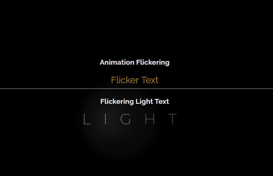
In this guide, we will walk you through the process of creating a flickering light text animation using CSS, including the necessary code snippets and examples.
How to Create CSS Animation Flickering
To create a flickering CSS animation using HTML and CSS, you can use a keyframe animation to change the text’s color and brightness over time.
We will create a div element with a class of “flicker-animation”. This div element will contain the text “Flickering Text” that will be animated. The class “flicker-animation” is used to apply the CSS animation to this specific element.
<div class="flicker-animation">Flicker Text</div>
Apply CSS
In the CSS, we apply an animation called “flicker” to it. The animation is set to run for 1 second and repeat indefinitely. The keyframe animation changes the text color and text-shadow property between white and yellow color, creating a flickering effect.
You can adjust the animation timing, colors, and other properties to your liking. Also, you can add CSS transforms to give the animation a more realistic flickering effect.
.flicker-animation{
  animation: flicker 1s infinite;
}

@keyframes flicker {
  0% {
    color: white;
    text-shadow: 0 0 10px white;
  }
  50% {
    color: yellow;
    text-shadow: 0 0 10px yellow;
  }
  100% {
    color: white;
    text-shadow: 0 0 10px white;
  }
}
Flickering Light Text Animation in CSS
Here we will create another example of CSS Highlight text that will flicker. This example inspires a lighting flickering effect where the light continues blinking.
We will start with HTML and creates an div element that contains multiple span elements. Each span the element represents a single letter of the word “LIGHT” and is given a unique id.
<div>
	<span id="L">L</span>
	<span id="I">I</span>
	<span id="G">G</span>
	<span id="H">H</span>
	<span id="T">T</span>
</div>
Each span element has a unique id, like “L”,”I”,”G”,”H”,”T” this ids will help you to select the specific letter in CSS and apply animation to it. This allows for more fine-grained control over the animation.
For example, in the CSS code, you could target the span element with an id of “L” to animate the letter “L” separately from the other letters. This gives you the ability to create a more complex animation, like animating each letter separately.
It is also worth noting that this code is creating the structure of the text, not the animation itself. In order to create the animation, you will need to use CSS to apply the keyframe animation to the span elements.
Apply Styling
The first CSS rule, .flickering-light span, selects all elements with the class “flickering-light” and applies some basic styling to them, such as setting the font-family and font-size, and also changes the color and spacing between the letters.
.flickering-light span {
margin: 0;
font-family: Montserrat;
font-size: 40px;
color: #f1f1f1;
letter-spacing: 0.7em;
opacity: 0.15;
}
The next set of CSS rules targets specific letters by their unique id, like “#I”,”#L”,”#G”,”#H”,”#T”.
For example, the “#I” id is targeted and given an animation named “flickerI” with a duration of 2 seconds, a linear timing function and infinite iterations. The opacity property is also set to 1 initially and then changed over the course of the animation.
#I {
opacity: 1;
animation: flickerI 2s linear reverse infinite;
}
Similarly, the animation is also applied to “#L” and “#G” using “flickerLG” animation and to “#H” and “#T” using “flickerH” animation.
#L, #G {
animation: flickerLG 2s linear reverse infinite;
position: relative;
}
#H {
animation: flickerH 2s linear reverse infinite
}
#T {
animation: flickerH 2s linear reverse infinite
}
The CSS code also uses the ::after and ::before pseudo-elements to add additional visual effects to the animation. These pseudo-elements are used to add a box-shadow and blur effect to the letters.
#I::after {
content: '';
width: 150%;
-webkit-box-shadow: -35px 0px 60px 8px rgba(255,255,255,1);
-moz-box-shadow: -35px 0px 60px 8px rgba(255,255,255,1);
box-shadow: -35px 0px 60px 8px rgba(255,255,255,1);
}

#L::after,
#L::before {
content:' ';
width: 100px;
height: 100px;
background: #f1f1f1;
position: absolute;
top: -50%;
left: 100%;
border-radius: 100%;
opacity: 0.05;
filter: blur(10px);
}
#L::after {
width: 200px;
height: 200px;
top: -150%;
left: -5%;
opacity: 0.1;
filter: blur(10px);
}
The keyframe animations defined with “@keyframes” are responsible for the animation effect. The keyframe animations change the opacity of the letters over time, creating the flickering effect.
@keyframes flickerI {
0% {
opacity: 0.4;
}
5% {
opacity: 0.5;
}
10% {
opacity: 0.6;
}
15% {
opacity: 0.85;
}
25% {
opacity: 0.5;
}
30% {
opacity: 1;
}
35% {
opacity: 0.1;
}
40% {
opacity: 0.25;
}
45% {
opacity: 0.5;
}
60% {
opacity: 1;
}
70% {
opacity: 0.85;
}
80% {
opacity: 0.4;
}
90% {
opacity: 0.5;
}
100% {
opacity: 1;
}
}

@keyframes flickerLG {
0% {
opacity: 0.19;
}
5% {
opacity: 0.2;
}
10% {
opacity: 0.25;
}
15% {
opacity: 0.35;
}
25% {
opacity: 0.2;
}
30% {
opacity: 0.4;
}
35% {
opacity: 0.1;
}
40% {
opacity: 0.25;
}
45% {
opacity: 0.2;
}
60% {
opacity: 0.4;
}
70% {
opacity: 0.35;
}
80% {
opacity: 0.4;
}
90% {
opacity: 0.2;
}
100% {
opacity: 0.4;
}
}

@keyframes flickerH {
0% {
opacity: 0.15;
}
5% {
opacity: 0.2;
}
10% {
opacity: 0.12;
}
15% {
opacity: 0.2;
}
25% {
opacity: 0.15;
}
30% {
opacity: 0.4;
}
35% {
opacity: 0.05;
}
40% {
opacity: 0.12;
}
45% {
opacity: 0.15;
}
60% {
opacity: 0.3;
}
70% {
opacity: 0.2;
}
80% {
opacity: 0.3;
}
90% {
opacity: 0.18;
}
100% {
opacity: 0.3;
}
}

@keyframes flickerT {
0% {
opacity: 0.01;
}
5% {
opacity: 0.05;
}
10% {
opacity: 0.03;
}
15% {
opacity: 0.1;
}
25% {
opacity: 0.07;
}
30% {
opacity: 0.1;
}
35% {
opacity: 0.05;
}
40% {
opacity: 0.06;
}
45% {
opacity: 0.1;
}
60% {
opacity: 0.;
}
70% {
opacity: 0.1;
}
80% {
opacity: 0.;
}
90% {
opacity: 0.0;
}
100% {
opacity: 0.1;
}
}
Conclusion
I hope that now you are well aware of how to create Flickering animation using the CSS and also Light Text Animation Effect.