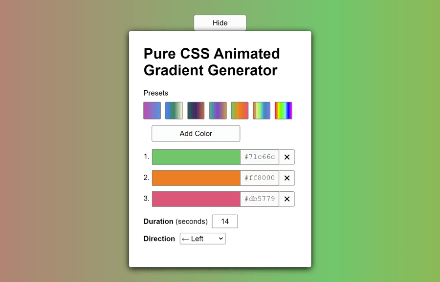
This animated gradient background generator helps you to easily generate CSS code for the gradient background. It comes with various built-in color presets and animations. Besides this, you can also add custom colors through a color picker or color entering the color value. Similarly, you can select background movement direction and animation duration.
If you want to generate CSS code for an animated gradient background, you can use the tool online by visiting the demo page. On the other hand, you can also integrate it into your web/app project to allow users to generate animated gradient background.
This gradient generator tool is based on React JS which generates pure copy-and-pasteable CSS for linearly animated gradients in HTML. The UI components of this tool are powered with ReactJS DOM without any other dependency.
How to Create CSS Animated Gradient Background Generator
First of all, load the Normalize CSS by adding the following CDN link into the head tag of your webpage. It will reset the browser’s default styles and standardize the CSS that we will use for our gradient generator app.
<link rel="stylesheet" href="https://cdnjs.cloudflare.com/ajax/libs/normalize/5.0.0/normalize.min.css">
We need a container element in which ReactJS renders the gradient background generator app. So, create a div element with an id “root” as follows:
<div id="root"></div>
Gradient Background Generator JavaScript
Now, load the React JS JavaScript library by adding the following CDN links just after the above HTML structure. You can also load these files into the head tag of the HTML document, but it’s best practice to include the JS file at the end of the body element for better performance.
<!-- React JS -->
<script src='https://cdnjs.cloudflare.com/ajax/libs/react/16.13.1/umd/react.production.min.js'></script>
<!-- React DOM JS -->
<script src='https://cdnjs.cloudflare.com/ajax/libs/react-dom/16.13.1/umd/react-dom.production.min.js'></script>
The following is the complete JavaScript code for the gradient background generator app. It renders the HTML, UI components, and all necessary functionalities for the app. You need to place it after the above CDN link between the <script> tag. You can also create a separate .js file for this code and include it in your project.
function _extends() {_extends = Object.assign || function (target) {for (var i = 1; i < arguments.length; i++) {var source = arguments[i];for (var key in source) {if (Object.prototype.hasOwnProperty.call(source, key)) {target[key] = source[key];}}}return target;};return _extends.apply(this, arguments);}const { useState, useEffect } = React;
const rootElement = document.getElementById('root');
const presets = [
["#bd4faf", "#5794db"],
["#0080ff", "#388363", "#fcf8d6"],
["#246655", "#462466", "#b66d52"],
["#41b497", "#7f47c5", "#c29c46"],
["#71c66c", "#ff8000", "#db5779"],
["#cf5c5c", "#c19b4a", "#def2a0", "#c6ee4a", "#42eca6", "#64b3d9", "#208ea2", "#498ada", "#5b73df", "#897ed3"],
["#ff0000", "#ffff00", "#00ff00", "#00ffff", "#0000ff", "#ff00ff"]];

const currentSet = ["#71c66c", "#ff8000", "#db5779"];
const isHidden = false;

function PresetsSection({ parentFunction }) {
  const [items, setItems] = React.useState(presets);
  return /*#__PURE__*/(
    React.createElement("section", null, /*#__PURE__*/
    React.createElement("span", { className: "label" }, "Presets"), /*#__PURE__*/
    React.createElement("div", { className: "presets" },
    items.map((item) => /*#__PURE__*/
    React.createElement(Preset, {
      key: item,
      colorSeries: item.toString(),
      changePreset: () => parentFunction(item) })))));

}
function Preset({ colorSeries, changePreset }) {
  return /*#__PURE__*/(
    React.createElement("div", { className: "preset",
      style: { backgroundImage: `linear-gradient(90deg, ${colorSeries})` },
      onClick: () => changePreset() }));

}
function ColorList({ colorSet, removeFunction, changeFunction }) {
  return /*#__PURE__*/(
    React.createElement("ol", { className: "color-list" },
    colorSet.map((color, index) => /*#__PURE__*/
    React.createElement(ColorItem, {
      key: index,
      colorValue: color,
      removeColor: () => removeFunction(index),
      changeColor: () => changeFunction(event, index) }))));

}
function ColorItem({ colorValue, removeColor, changeColor }) {
  const idAttribute = Math.random().toString(36).substr(2, 5);
  return /*#__PURE__*/(
    React.createElement("li", { className: "color" }, /*#__PURE__*/
    React.createElement("label", {
      htmlFor: idAttribute,
      className: "color__label" },
    colorValue), /*#__PURE__*/
    React.createElement("input", { type: "color",
      id: idAttribute,
      className: "color__input",
      value: colorValue,
      onChange: event => changeColor(event) }), /*#__PURE__*/
    React.createElement("button", { type: "button",
      className: "color__remove",
      "aria-label": "Remove Color",
      onClick: () => removeColor() }, "\u2716")));
}
function CopyToClipboardButton() {
  const copy = () => {
    const code = document.getElementById('output');
    code.select();
    code.setSelectionRange(0, 99999);
    document.execCommand("copy");
    code.setSelectionRange(0, 0);
  };
  return /*#__PURE__*/(
    React.createElement("button", {
      type: "button",
      className: "button button--copy",
      onClick: copy }, "Copy to Clipboard"));

}
function Output({ bg, bgwidth, bgheight, degrees, direction, duration }) {
  let code = getCssCodeForOutput({ bg, bgwidth, bgheight, degrees, direction, duration });
  return /*#__PURE__*/(
    React.createElement("section", null, /*#__PURE__*/
    React.createElement("div", { style: { display: `flex`, justifyContent: `space-between`, alignItems: `flex-end`, margin: `10px 0` } }, /*#__PURE__*/
    React.createElement("label", { htmlFor: "output" }, /*#__PURE__*/React.createElement("strong", null, "CSS Output")), /*#__PURE__*/
    React.createElement(CopyToClipboardButton, null)), /*#__PURE__*/

    React.createElement("textarea", {
      value: code,
      readOnly: true,
      className: "output",
      id: "output" })));
}
function getCssKeyframes(direction) {
  switch (direction) {
    case 'left':
      return `@keyframes animateBg {
  0% { background-position: 0% 0%; }
  100% { background-position: 100% 0%; }
}`;
    case 'right':
      return `@keyframes animateBg {
  0% { background-position: 100% 0%; }
  100% { background-position: 0% 0%; }
}`;
    case 'up':
      return `@keyframes animateBg {
  0% { background-position: 0% 0%; }
  100% { background-position: 0% 100%; }
}`;
    case 'down':
      return `@keyframes animateBg {
  0% { background-position: 0% 100%; }
  100% { background-position: 0% 0%; }
}`;}

}
function getCssCodeForOutput({ bg, bgwidth, bgheight, degrees, direction, duration }) {
  const keyframes = getCssKeyframes(direction);
  return `.animated-gradient {
  animation: animateBg ${duration}s linear infinite;
  background-image: linear-gradient(${degrees}deg,${bg});
  background-size: ${bgwidth}% ${bgheight}%;
}
${keyframes}
`;
}
function useFormInput(initialValue) {
  const [value, setValue] = useState(initialValue);
  function handleChange(e) {
    setValue(e.target.value);
  }
  return {
    value,
    onChange: handleChange };

}
function Generator({ title }) {
  const [colorSet, setColorSet] = React.useState(currentSet);
  const [visibility, setVisibility] = React.useState(isHidden);
  const addColor = () => {
    let newColor = '#' + Math.floor(Math.random() * 16777215).toString(16).padStart(6, '0');
    setColorSet(colorSet => [...colorSet, newColor]);
  };
  const removeColor = index => {
    const temp = [...colorSet];
    temp.splice(index, 1);
    setColorSet(temp);
  };
  const changeColor = (event, index) => {
    const temp = [...colorSet];
    temp[index] = event.target.value;
    setColorSet(temp);
  };
  const toggleVisibility = visibility => {
    setVisibility(!visibility);
  };
  const duration = useFormInput(14);
  const bg = `${colorSet.toString()},${colorSet[0]},${colorSet[1]}`;
  const direction = useFormInput('left');
  const bgwidth = direction.value === 'left' || direction.value === 'right' ? 100 * (colorSet.length + 1) : 100;
  const bgheight = direction.value === 'left' || direction.value === 'right' ? 100 : 100 * (colorSet.length + 1);
  const degrees = direction.value === 'left' || direction.value === 'right' ? '90' : '0';

  return /*#__PURE__*/(
    React.createElement("div", {
      className: "generator",
      role: "main",
      style: { backgroundImage: `linear-gradient(${degrees}deg, ${bg})`,
        backgroundSize: `${bgwidth}% ${bgheight}%`,
        animationDuration: `${duration.value}s`,
        animationName: `animateBg-${direction.value}` } }, /*#__PURE__*/
    React.createElement("button", { className: !visibility ? 'button' : 'button button--faded', onClick: () => {toggleVisibility(visibility);} }, !visibility ? `Hide` : `Unhide`),
    !visibility ? /*#__PURE__*/
    React.createElement("article", {
      className: "container" }, /*#__PURE__*/
    React.createElement("h1", {
      className: "title" }, "Pure CSS Animated Gradient Generator"), /*#__PURE__*/
    React.createElement(PresetsSection, {
      parentFunction: item => {setColorSet(item);} }), /*#__PURE__*/
    React.createElement("button", {
      type: "button",
      className: "button button--add",
      onClick: addColor }, "Add Color"), /*#__PURE__*/
    React.createElement(ColorList, {
      colorSet: colorSet,
      removeFunction: index => removeColor(index),
      changeFunction: (event, index) => changeColor(event, index) }), /*#__PURE__*/

    React.createElement("section", null, /*#__PURE__*/
    React.createElement("label", { htmlFor: "duration" }, /*#__PURE__*/
    React.createElement("span", null, /*#__PURE__*/React.createElement("strong", null, "Duration"), " (seconds)"), /*#__PURE__*/
    React.createElement("input", _extends({ id: "duration",
      className: "input--textlike duration",
      type: "number",
      min: "1",
      max: "1000" },
    duration)))), /*#__PURE__*/

    React.createElement("section", null, /*#__PURE__*/
    React.createElement("label", { htmlFor: "direction" }, /*#__PURE__*/
    React.createElement("strong", null, "Direction"), /*#__PURE__*/
    React.createElement("select", _extends({ id: "direction",
      className: "input--textlike direction" },
    direction), /*#__PURE__*/
    React.createElement("option", { value: "left" }, "\u2190 Left"), /*#__PURE__*/
    React.createElement("option", { value: "right" }, "\u2192 Right"), /*#__PURE__*/
    React.createElement("option", { value: "up" }, "\u2191 Up"), /*#__PURE__*/
    React.createElement("option", { value: "down" }, "\u2193 Down")))), /*#__PURE__*/

    React.createElement(Output, {
      bg: bg,
      bgwidth: bgwidth,
      bgheight: bgheight,
      direction: direction.value,
      degrees: degrees,
      duration: duration.value }), /*#__PURE__*/
    React.createElement("footer", null, /*#__PURE__*/
    React.createElement("p", null, /*#__PURE__*/
    React.createElement("small", null, "Created by ", /*#__PURE__*/React.createElement("a", { href: "https://granteben.com" }, "Grant Eben"), "."), /*#__PURE__*/React.createElement("br", null), /*#__PURE__*/
    React.createElement("small", null, "Open Source on ", /*#__PURE__*/React.createElement("a", { href: "https://github.com/gmeben/pure-css-animated-gradient-generator" }, "GitHub"), " and ", /*#__PURE__*/React.createElement("a", { href: "https://gitlab.com/gmeben/pure-css-animated-gradient-generator" }, "GitLab"))))) :
    null));
}
const app = /*#__PURE__*/React.createElement(Generator, null);
ReactDOM.render(app, rootElement);
The Style Customization
If you want to customize the interface of the gradient background generator app, you can override the CSS rules according to your needs. The following are the default styles for the container and "generator" app wrapper.
.container {
    background: #fff;
    border-radius: 0.25em;
    box-shadow: 0 3px 14px #000;
    margin-bottom: 1rem;
    min-width: 20rem;
    padding: 2em;
}
.generator {
    animation-name: animateBg-left;
    animation-duration: 14s;
    animation-timing-function: linear;
    animation-iteration-count: infinite;
    align-items: center;
    display: flex;
    padding-top: 2em;
    box-sizing: border-box;
    flex-direction: column;
    min-height: 100vh;
}
The "button" class is used for the buttons of the gradient generator app. You can set the custom values for the following styles if you want to have a different look for the buttons. Similarly, you can check this tutorial to apply hover effects on buttons.
.button {
    background-color: var(--button-color-bg);
    border-radius: 4px;
    border: 1px solid var(--button-color-border);
    cursor: pointer;
    height: 36px;
    padding-left: 40px;
    padding-right: 40px;
    transition: background-color 120ms ease,
        opacity 1s ease;
}
.button:hover {
    background: #c8e6c8;
}
.button:active {
    box-shadow: 0 2px 6px #555 inset;
    background-color: #999;
}
.button--add {
    margin-left: 18px;
    width: 194px;
}
.button--faded {
    opacity: 0.05;
}
.button--faded:hover {
    opacity: 0.9;
}
The "presets" class is the wrapper element for the color presets. The following are the default CSS styles for this class.
.presets {
    margin: 10px 0;
}
.preset {
    background: gray;
    border-radius: 2px;
    border: 1px solid var(--button-color-border);
    cursor: pointer;
    display: inline-block;
    height: 36px;
    margin-right: 10px;
    width: 36px;
}
.input--textlike {
    border-radius: 2px;
    border: 1px solid var(--button-color-border);
    display: inline-block;
    height: 26px;
    margin: 0 10px 10px;
}
If you want to customize the colors input fields, you can use the following mentioned classes to style the color add, remove, and color label elements.
.color-list {
    padding: 0 0 0 18px;
}
.color {
    margin-bottom: 10px;
    position: relative;
}
.color__input,
.color__remove {
    box-sizing: border-box;
    cursor: pointer;
    vertical-align: middle;
}
.color__label {
    background-color: #fafafa;
    border-left: 1px solid #888;
    cursor: pointer;
    font-family: Courier New, monospace;
    padding: 7px 8px;
    position: absolute;
    right: 40px;
    top: 1.5px;
}
.color__input {
    border-color: #aaa;
    border-block: 0 none rgba(0,0,0,0);
    border-collapse: collapse;
    border-inline: 0 none rgba(0,0,0,0);
    border-spacing: 0;
    border-style: solid;
    border-width: 1px;
    height: 36px;
    padding: 0;
    width: 280px;
}
.color__remove {
    background-color: var(--button-color-bg);
    border-color: var(--button-color-border);
    border-radius: 0 5px 5px 0;
    border-style: solid;
    border-width: 1px 1px 1px 0;
    display: inline-block;
    height: 34px;
    text-align: center;
    transition: background-color 200ms ease;
    width: 34px;
}
.color__remove:hover {
    background-color: #dbd1d3;
}
input[type="color"]::-webkit-color-swatch-wrapper {
    padding: 0;
}
input[type="color"]::-webkit-color-swatch {
    border-radius: 0;
}
The app generates the CSS code for the animated gradient background and displays it inside the textarea. The "output" class is used for that textarea element. If you want to set the custom style for generated code, you can override the following styles.
.output {
    background-color: #eee;
    border-radius: 5px;
    border: 1px solid var(--button-color-border);
    font-family: Courier New, monospace;
    height: 200px;
    max-width: 324px;
    padding: 5px;
    width: 324px;
    font-size: 12px;
}
.output:focus {
    box-shadow: 0 0 5px 1px green;
    outline: none;
}
The following are the CSS keyframes for the background movement. You can also define custom animation keyframes as per your requirements.
@keyframes animateBg-left {
    0% {
        background-position: 0% 0%;
    }
    100% {
        background-position: 100% 0%;
    }
}
@keyframes animateBg-right {
    0% {
        background-position: 100% 0%;
    }
    100% {
        background-position: 0% 0%;
    }
}
@keyframes animateBg-up {
    0% {
        background-position: 0% 0%;
    }
    100% {
        background-position: 0% 100%;
    }
}
@keyframes animateBg-down {
    0% {
        background-position: 0% 100%;
    }
    100% {
        background-position: 0% 0%;
    }
}
That’s all! hopefully, you have successfully integrated this gradient generator project in your website/app. If you have any questions or suggestions, let me know by comment below.