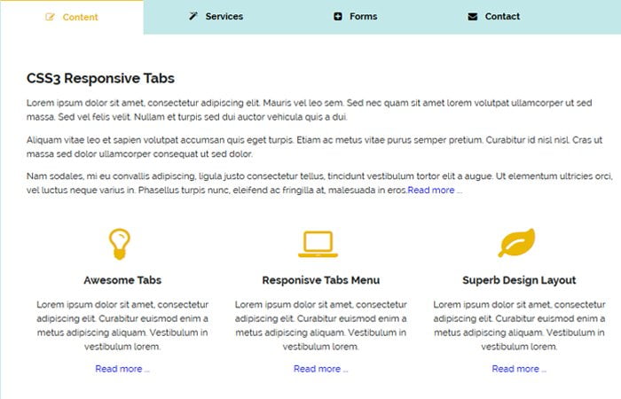
Today, I am going to create responsive and stylish pure CSS tabs which can be used to arrange content in a great way. Each tab comes with title and unique icon for title explanation.
The Tabs are very useful when you need to consider a significant amount of content.
If you haven’t much space available on your website but you want to add much more content then the Tabs are required to implement.
I recommended to used our awesome looking Tabs menus because these are purely created using CSS3. Due to pure CSS, it will not overload or slow down your website and provide you better performs.
It is very common to use the tabs in sidebar or product page like delivery options, item description, etc. These tabs are fully responsive and work on all kind of major devices.
I have included Contact Form, services element, registration & login form and arrange the content/heading in an awesome way so that you can get an idea of how you can add your own content.
I also added a simple 3 grid system which allows adding a different block of content.
Create HTML Tabs structure
The HTML code is so simple and easy to understand. You can see the code start from div class cctabs. Each panel div allow adding your own content. You can add text, images and form.
To handle the tab click functionality, I created radio input type.
<div class="cctabs">
    <input checked id="one" name="tabs" type="radio">
    <label for="one"><i class="fa fa-pencil-square-o"></i> Content</label>
    <input id="two" name="tabs" type="radio" value="Two">
    <label for="two"><i class="fa fa-magic"></i> Services</label>
    <input id="three" name="tabs" type="radio">
    <label for="three"><i class="fa fa-plus-square"></i> Forms</label>
    <input id="four" name="tabs" type="radio">
    <label for="four"><i class="fa fa-envelope"></i> Contact</label>
    <div class="panels">
        <div class="panel">
          	YOUR CONTENT GO HERE
        </div>
        <div class="panel">
          	YOUR CONTENT GO HERE
        </div>
        <div class="panel">
          	YOUR CONTENT GO HERE
        </div>
        <div class="panel">
          	YOUR CONTENT GO HERE
        </div>
    </div>
</div>
For example, If you want to add a form into any tab, you need to add the following form code, it’s not necessary that you should add my form code you can also add your own custom coded form.
<form id="cc-contact" action="" method="post">
  <input placeholder="your name" type="text" tabindex="1" autofocus>
  <input placeholder="Email Address" type="email" tabindex="2" required>
  <input placeholder="Phone Number" type="tel" tabindex="3" required>
  <input placeholder="Webite" type="text" tabindex="4" required>
  <textarea placeholder="Type your Message Here...." tabindex="5" required></textarea>
  <button name="submit" type="submit" id="contact-submit" data-submit="...Sending">Submit</button>
</form>
CSS for Tabs to Style & Make them Responsive
Now we need to make the tabs to work so you need to add the following code. This CSS code didn’t give you full design style but make the tabs functionality work.
To style the tabs like the demo, please find the download file and have a look the complete source code.
.cctabs {
    width: 100%;
    margin: 100px auto;
}
.cctabs input[type="radio"] {
    opacity: 0;
}
.cctabs .fa{
	margin-right:10px;
}
.cctabs label {
    color: #000;
    cursor: pointer;
    float: left;
    margin-right: 2px;
    padding: 1.5% 7%;
	font-size:16px;
	font-weight:bold;
}
.cctabs label:hover {
    background: -webkit-linear-gradient(#777, #666);
}
.cctabs input:checked + label {
    background: #fff;
    color: #ebb704;
	border-top:solid 2px #ebb704;
}
.cctabs input:nth-of-type(1):checked ~ .panels .panel:first-child, .cctabs input:nth-of-type(2):checked ~ .panels .panel:nth-child(2), .cctabs input:nth-of-type(3):checked ~ .panels .panel:nth-child(3), .cctabs input:nth-of-type(4):checked ~ .panels .panel:last-child {
    opacity: 1;
    -webkit-transition: .3s;
	/*position:relative;*/
	z-index:999;
}
.cctabs .panels {
    float: left;
    clear: both;
    position: relative;
    width: 100%;
    background: #fff;
}
.cctabs .panel {
    width: 100%;
    opacity: 0;
    position: absolute;
    background: #fff;
    padding: 4%;
    box-sizing: border-box;
}
The icons used in these pure CSS responsive tabs are from Font Awesome . That’s It! Do you need any kind of my help? Leave a comment below and I will get back to you.