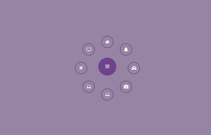
In this particular tutorial, I’m going to show you tips on how to build circular navigation menu with CSS transforms which Fly-Out when clicking on the toggle button.
To make such a menu, We will take the help of CSS3 transforms element and a bit of jQuery. It is a fixed type fancy menu for your website and perfects to use as an extra menu. It is also good if you want the user to quickly access some specific links on your website.
To create wheel navigation menu We need to use some elementary math along with CSS3 to produce these styles. Nevertheless, Don’t worry, the math is very simple, and I’ll be going through it comprehensive.
Build HTML for Circular Fly-Out Navigation Menu
As we are going to build navigation, So we will start with the standard menu structure. We need to define nav along class CircularNavigation and then an inner div class circleNavi.
Next, we will simply list the hyperlink, a link to trigger the opening and closing of the menu as show you below.
<nav class="CircularNavigation">
  <div class="circleNavi">
    <a href=""><i class="fa fa-home"></i></a>
    <a href=""><i class="fa fa-bell"></i></a>
    <a href=""><i class="fa fa-automobile"></i></a>
    <a href=""><i class="fa fa-camera"></i></a>
    <a href=""><i class="fa fa-laptop"></i></a>
    <a href=""><i class="fa fa-laptop"></i></a>
    <a href=""><i class="fa fa-plane"></i></a>
    <a href=""><i class="fa fa-television"></i></a>
  </div>
  <a href="" class="navbtn"><i class="fa fa-bars"></i></a>
</nav>
The icons we’re using in this demo are from Font Awesome.
Style Fly-Out Menu with CSS
Let’s start with styling main wrapper and in our this case, the wrapper is .CircularNavigation. We will set it’s width and height as we need and make sure to add position relative so others element should be relative to it.
.CircularNavigation {
  width: 250px;
  height: 250px;
  margin: 0 auto;
  position: relative;
}
After some basic coding for circular fly-out navigation menu, now we need to build CSS transforms to .circleNavi and then style each anchor links by setting the position to absolute and set the width and height.
Here we will also some basic style like color, background and font size etc.
.circleNavi {
  width: 250px;
  height: 250px;
  opacity: 0;

  -webkit-transform: scale(0);
  -moz-transform: scale(0);
  transform: scale(0);

  -webkit-transition: all 0.4s ease-out;
  -moz-transition: all 0.4s ease-out;
  transition: all 0.4s ease-out;
}
.circleNavi a {
  text-decoration: none;
  color: white;
  display: block;
  height: 40px;
  width: 40px;
  line-height: 40px;
  margin-left: -20px;
  margin-top: -20px;
  position: absolute;
  text-align: center;

}
.circleNavi a:hover {
  color: #eef;
}
.circleNavi i.fa {
    border: 1px solid #4c1b6f;
    border-radius: 50%;
    color: #fff;
    display: block;
    font-size: 14px;
    padding: 12px;
}
.open.circleNavi {
  opacity: 1;

  -webkit-transform: scale(1);
  -moz-transform: scale(1);
  transform: scale(1);
}
Finally, we need to style the toggle button which will be perform opening and closing function.
.navbtn {
    background: #6d438b none repeat scroll 0 0;
    border-radius: 50%;
    color: #fff;
    display: block;
    height: 60px;
    left: calc(50% - 50px);
    line-height: 40px;
    padding: 10px;
    position: absolute;
    text-align: center;
    text-decoration: none;
    top: calc(50% - 40px);
    width: 60px;
}
.navbtn:hover {
  background-color: #4c1b6f;
}
The JavaScript
Let’s start with the JavaScript, and you can see, we need to use Math.cos and Math. sin function to make each item should be open around the main toggle button.
$(document).ready(function(){
    var items = document.querySelectorAll('.circleNavi a');
    for(var i = 0, l = items.length; i < l; i++) {
      items[i].style.left = (50 - 35*Math.cos(-0.5 * Math.PI - 2*(1/l)*i*Math.PI)).toFixed(4) + "%";

      items[i].style.top = (50 + 35*Math.sin(-0.5 * Math.PI - 2*(1/l)*i*Math.PI)).toFixed(4) + "%";
    }
    document.querySelector('.navbtn').onclick = function(e) {
       e.preventDefault(); document.querySelector('.circleNavi').classList.toggle('open');
    }
})(jQuery);
And that’s is all! I hope you enjoy and liked this tutorial and found it very useful!